For this assignment four, it was very interesting at how all three drawings results came out. I find doing the preliminary drawing studies and notes with some research on inspiring artists as very helpful tips for this assignment.
For the A1 seated and reclining drawings, I used live models, who were friends of mine and were glad to pose for the assignment drawings.
1. Figure Study using Line (A1) – Seated Model in an Upright Chair.
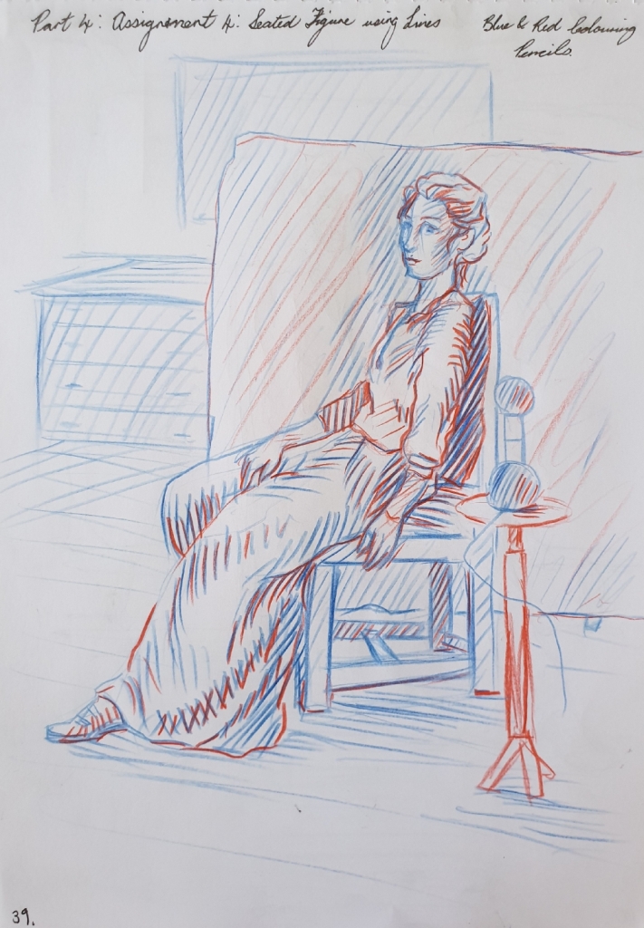
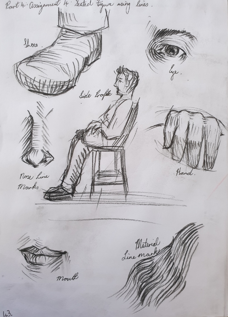
First I did some look back at my previous studies and research points to collect ideas and inspirations. I came across a line style that I used in previous exercises called Cross Contour Lines, which seems perfect for my final seated pose drawing.
I first used my female friend Tessa as the model for the first view preliminary sketches, but then she couldn’t pose for the longer pose for some reasons, so I got my male friend Chad who was willing to pose for the view more preliminary sketches and the final drawing pose.
Here you can see the different line style preliminary drawings of Tessa, below.
First drawing is done with a blue and red colouring pencil in the A4 sketchbook on page 39, see in Fig. 2 “Preliminary Sketch of Tessa – Blue and Red Pencil in A4 Sketchbook, Page 39“, below.
Fig. 2 Preliminary Sketch of Tessa – Blue and Red Pencil in A4 Sketchbook, Page 39
For the second drawing of Tessa, I used black, blue and red gel pens in this drawing. See in Fig. 3 “Preliminary Sketch of Tessa – Blue, Black and Red Gel Pen in A4 Sketchbook, Page 40“, below.
Fig. 3 Preliminary Sketch of Tessa – Blue, Black and Red Gel Pen in A4 Sketchbook, Page 40
In this final preliminary drawing of Tessa, I used a 2mm graphite clutch 2B pencil in the A4 sketchbook on page 41, see in Fig. 4 “Preliminary Sketch of Tessa – 2mm Graphite Clutch 2B Pencil in A4 Sketchbook, Page 41“, below.
Fig. 4 Preliminary Sketch of Tessa – 2mm Graphite Clutch 2B Pencil in A4 Sketchbook, Page 41
Preliminary Drawings of Chad – A4 Sketchbook
When Tessa couldn’t pose for any longer for some reasons, I managed to have my male friend Chad to pose for the rest of seated preliminary sketches and the final drawing.
First sketch of Chad was done with a black gel pen in the A4 sketchbook on page 42. I love this pose view point as it shows great foreshortening, which I will use the same pose in the final A1 seated drawing. You can see it in Fig. 5 “Preliminary Sketch of Chad – Black Gel Pen in A4 Sketchbook, Page 42“, below.
Fig. 5 Preliminary Sketch of Chad – Black Gel Pen in A4 Sketchbook, Page 42
In the second drawing, I used a black Conte pencil and loved the medium, so looking forward to using it in the A1 final drawing. These show some of the feature areas with using the cross contour lines style. You can see it in Fig. 6 “Preliminary Sketch of Chad – Black Conte Pencil in A4 Sketchbook, Page 43“, below.
Fig. 6 Preliminary Sketch of Chad – Black Conte Pencil in A4 Sketchbook, Page 43
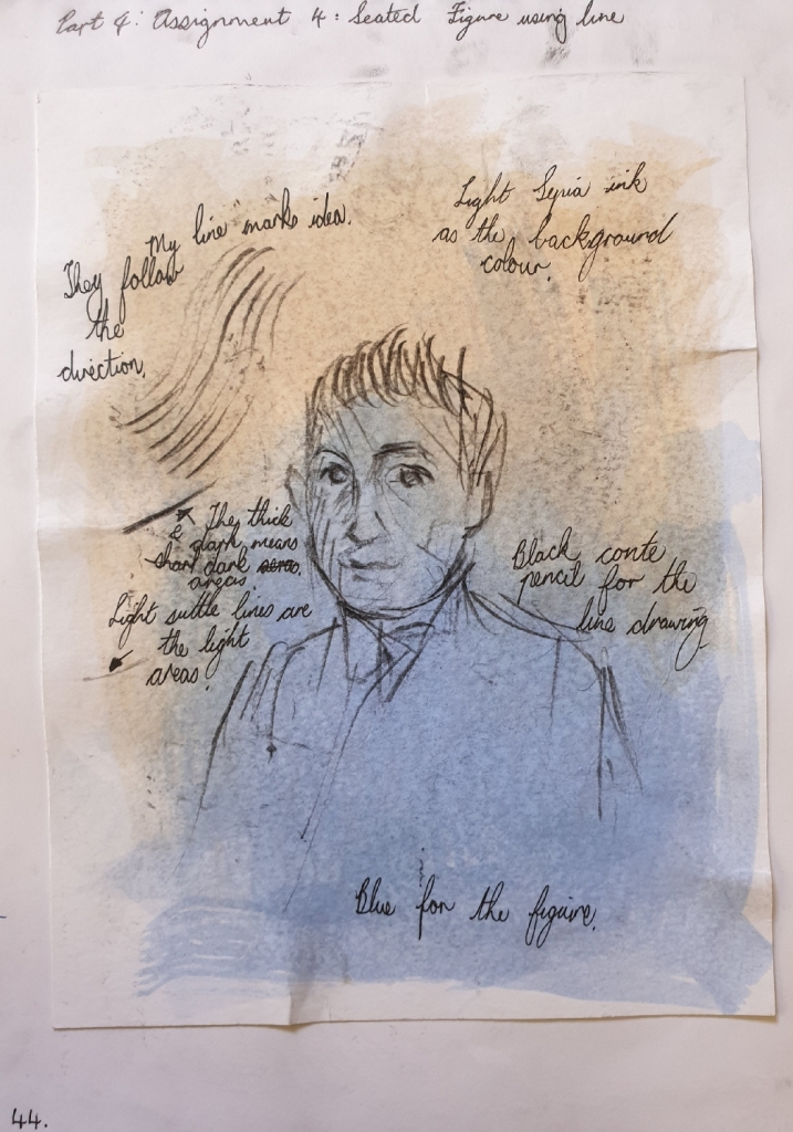
For the final preliminary sketch of Chad, I tried the black Conte pencil with sepia and navy blue acrylic drawing ink washes. I love how these mediums combine together and it shows great expressive feelings. I will be using these mediums in the final A1 drawing. See in Fig. 7 “Preliminary Sketch of Chad – Black Conte Pencil and Ink Wash in A4 Sketchbook, Page 44“, below.
Fig. 7 Preliminary Sketch of Chad – Black Conte Pencil and Ink Wash in A4 Sketchbook, Page 44
So finishing off with the preliminary drawings and updating my log book with written notes. Then I started on the A1 size final seated drawing of Chad.
Final Drawing (A1) – Seated Model using Lines
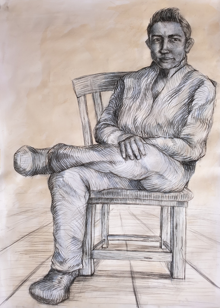
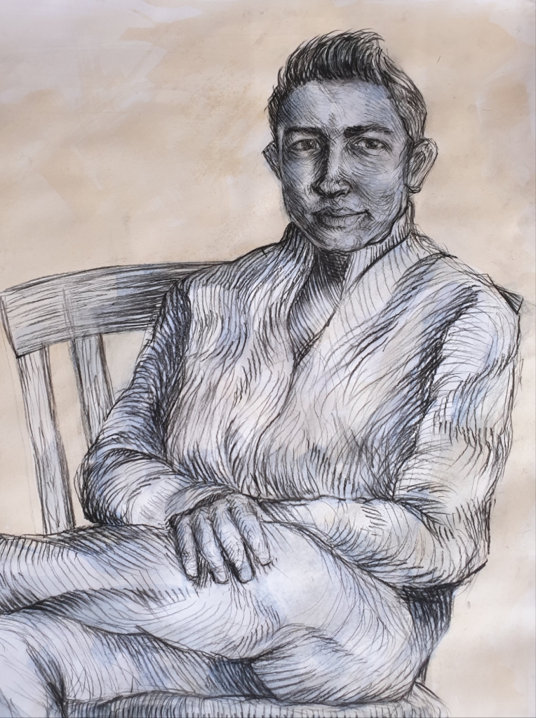
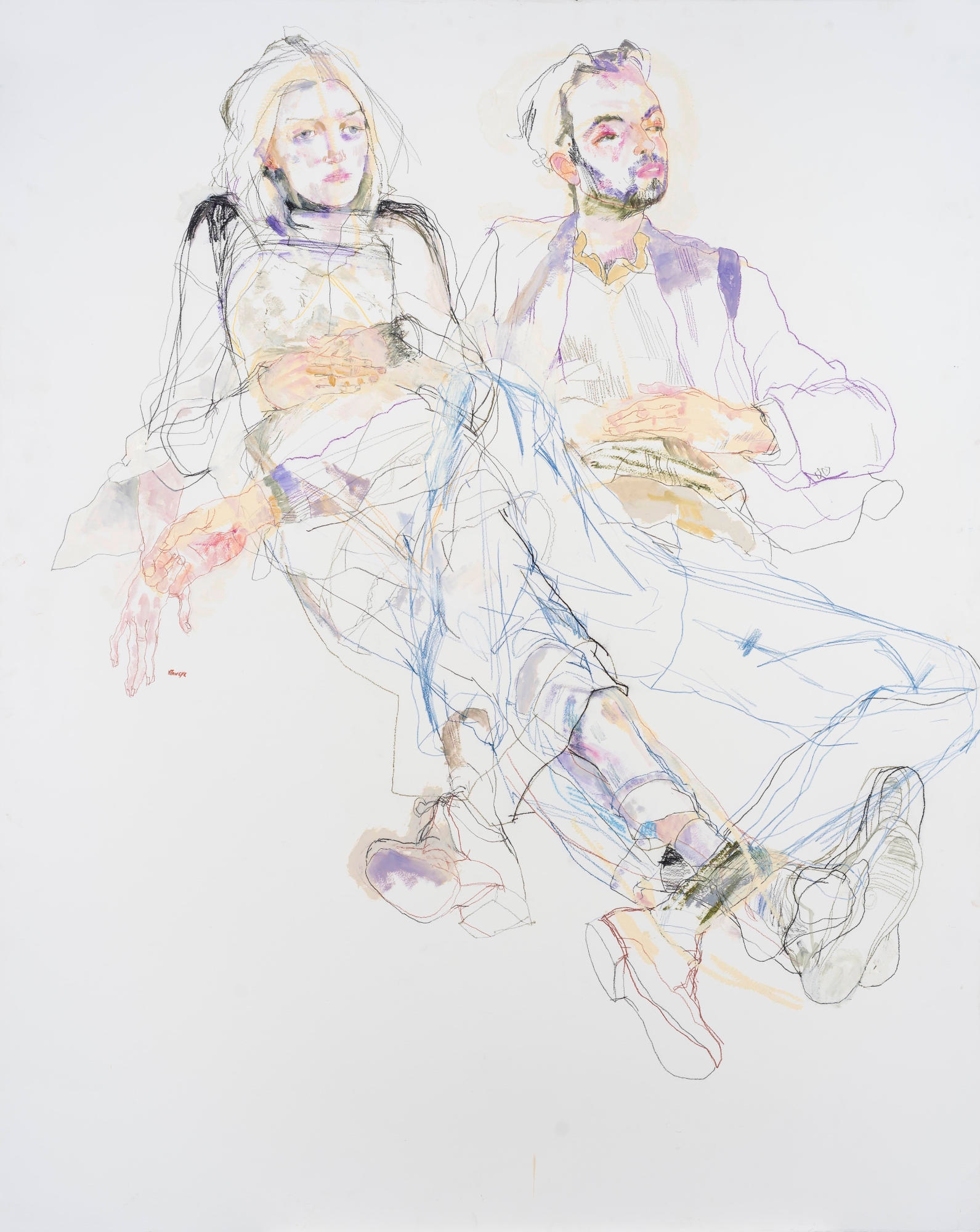
For the final drawing, I asked Chad to do the same pose as he did in one of the preliminary sketches as seen in Fig. 5 “Preliminary Sketch of Chad – Black Gel Pen in A4 Sketchbook, Page 42“, but this time, I used the natural sunlight source from the window.
I first painted the sepia and navy blue acrylic drawing ink washes on the A1 white cartridge paper 280gsm, which was mounted to a board. After doing the ink washes, I went to draw in the the big shapes like for example the chair and figure outlines with the black Conte pencil lightly.
After getting the shapes well proportioned, I then went into the figure with cross contour lines with the compression of the black Conte pencil or stick. Wide dark lines are for the shaded areas and light thin lines are the light areas. Bare in mind that my friend Chad is a short height person with a larger face.
Finishing this drawing was the best feeling and I love the outcome results of it, there is so much inspirations and techniques that stand out in this drawing. The way the cross contour lines follow the movement of the material and folds, has really well balanced the atmosphere of Chad’s figure.
There was a stage where I struggled in this drawing, which was trying to avoid of going into details with Chad’s face, because I feared that this drawing would end up as a portrait. But looking at it, all I can see is a seated figure who seems to have been very relaxed and enjoying the conversation that we shared during the 2-hours timeframe.
You can see the final A1 seated Chad using lines in Fig. 8 “Final Drawing of Chad Seated – Black Conte Pencil with Sepia and Navy Blue Ink Washes, A1 White Cartridge Paper, 280gsm“, below.
Fig. 8 Final Drawing of Chad Seated – Black Conte Pencil with Sepia and Navy Blue Ink Washes, A1 White Cartridge Paper, 280gsm
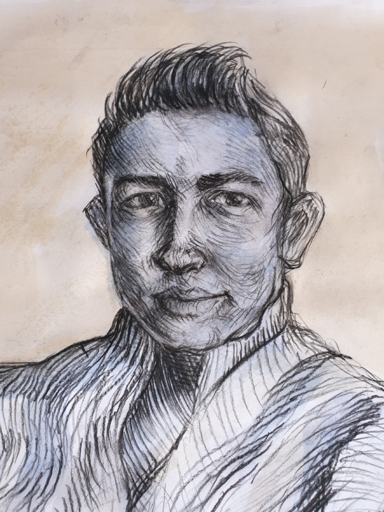
Here is a close up of Chad’s face and torso in Fig. 9 “Final Drawing of Chad, Close Up of the Details – Black Conte Pencil with Sepia and Navy Blue Ink Washes, A1 White Cartridge Paper, 280gsm“, below.
Fig. 9 Final Drawing of Chad, Close Up of the Details – Black Conte Pencil with Sepia and Navy Blue Ink Washes, A1 White Cartridge Paper, 280gsm
Here is also another close up of Chad’s face details, which gives a clear understanding of the cross contour line mark-makings. See in Fig. 10 “Final Drawing of Chad, Close Up of Face Details – Black Conte Pencil with Sepia and Navy Blue Ink Washes, A1 White Cartridge Paper, 280gsm“, below.
Fig. 10 Final Drawing of Chad, Close Up of Face Details – Black Conte Pencil with Sepia and Navy Blue Ink Washes, A1 White Cartridge Paper, 280gsm
Log Book Notes for the Seated Model using Lines
See in Fig. 11 “Log Book Notes“, below.
Fig. 11 Log Book Notes
2. Figure Study using Tone (A1) – Reclining Model.
For this reclining pose drawing, I used my artist friend Calista to pose for me as she was happy to do so.
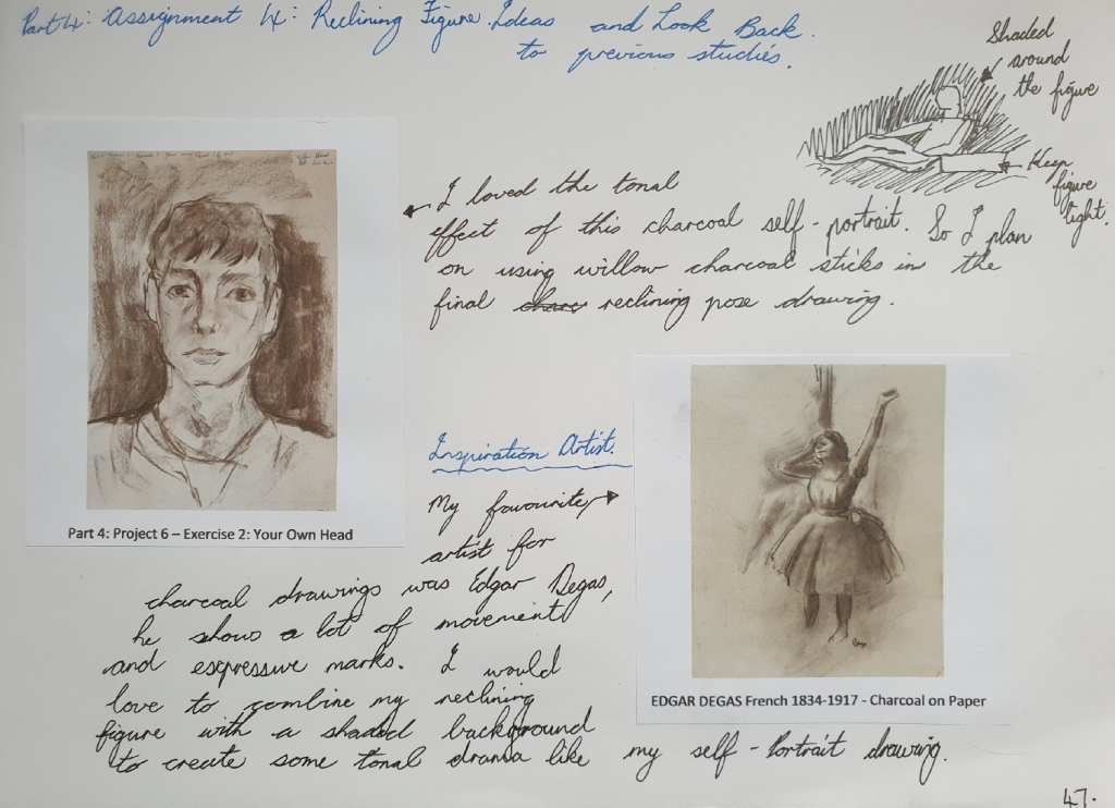
I did some look back at my previous studies and research points to collect ideas and inspirational ideas. I found an inspirational artist known for his expressive tonal charcoal drawings, which was Edgar Degas, here you can see a charcoal drawing in the link here: https://dygtyjqp7pi0m.cloudfront.net/i/35689/30744696_1.jpg?v=8D5E8FC771EC0E0 (Accessed 17/10/2020).
You can see my ideas in my A4 sketchbook on page 47, see in Fig. 12 “Look Back Notes, Ideas and Inspirations – A4 Sketchbook, Page 47“, below.
Fig. 12 Look Back Notes, Ideas and Inspirations – A4 Sketchbook, Page 47
Here is also link from previous study in Part 4: Project 6 – Exercise 2, that I used the charcoal expressive style idea for the final reclining pose drawing.
Preliminary Drawings of Reclining Calista – A4 Sketchbook (Page 45)
I did a page in the A4 sketchbook of preliminary sketches of Calista and getting the idea of which view angle will work for the A1 final reclining pose drawing. I also found the willow charcoal stick still the best medium to use for giving great tonal values and expressive marks, which I will use as my final A1 drawing medium.
Here you can see the preliminary sketches in Fig. 13 “Preliminary Sketches – Charcoal Pencil, Black Conte Pencil and Graphite Pencil, A4 Sketchbook, Page 45“, below.
Fig. 13 Preliminary Sketches – Charcoal Pencil, Black Conte Pencil and Graphite Pencil, A4 Sketchbook, Page 45
Final Drawing – Calista Reclining Pose
I first had Calista to do a reclining pose, wearing her black pants and light cream jersey, she also was instructed to rest her right arm on a fabric draped cardboard box. The light source came from natural sunlight from the window for this drawing.
I first drew the large body shapes lightly with the willow charcoal stick, then after that I went and blocked in the mid and dark tonal areas by using the flat side of the willow charcoal stick. When finished with using the willow charcoal stick, I then used a putty eraser to lift up the charcoal in some areas where there was some light source shining on, for example the face and jersey.
I love the results of the shaded dramatic tonal background, it makes the figure to be the main attention of the audience. The tonal values are well balanced and seeing this drawing as less detailed information makes it a very interesting reclining subject. Her figure size is well proportioned and her character can be seen clearly as a gentle lady.
You can see the final A1 reclining pose drawing in Fig. 14 “Final Drawing ‘Calista Reclining’ – Willow Charcoal Sticks on A1 White Cartridge Paper, 280gsm“, below.
Fig. 14 Final Drawing ‘Calista Reclining’ – Willow Charcoal Sticks on A1 White Cartridge Paper, 280gsm
Here is a close up of the final drawing, see in Fig. 15 “Final Drawing ‘Calista Reclining’ Close Up – Willow Charcoal Sticks on A1 White Cartridge Paper, 280gsm“, below.
Fig. 15 Final Drawing ‘Calista Reclining’ Close Up – Willow Charcoal Sticks on A1 White Cartridge Paper, 280gsm
Log Book Notes
Here is my written log book notes for the reclining pose drawing, see in Fig. 16 “Log Book Notes“, below.
Fig. 16 Log Book Notes
3. A Portrait or Self-Portrait Combining Line and Tone.
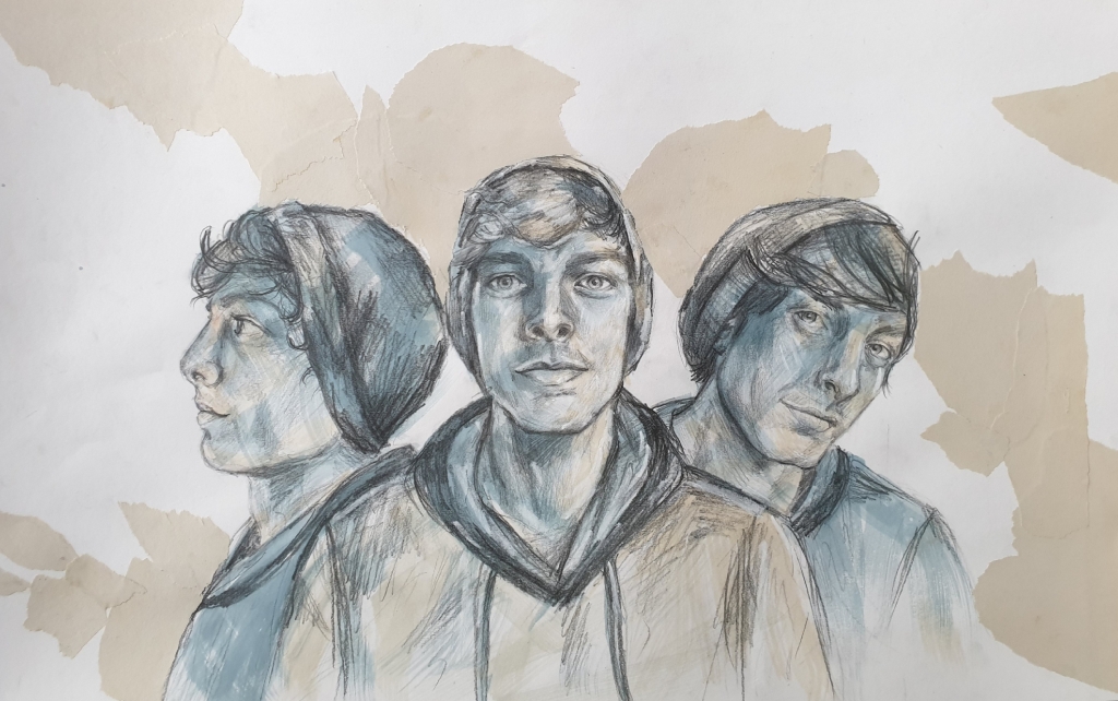
For this part of the assignment, I chose to do a self-portrait, but in a different subject style.
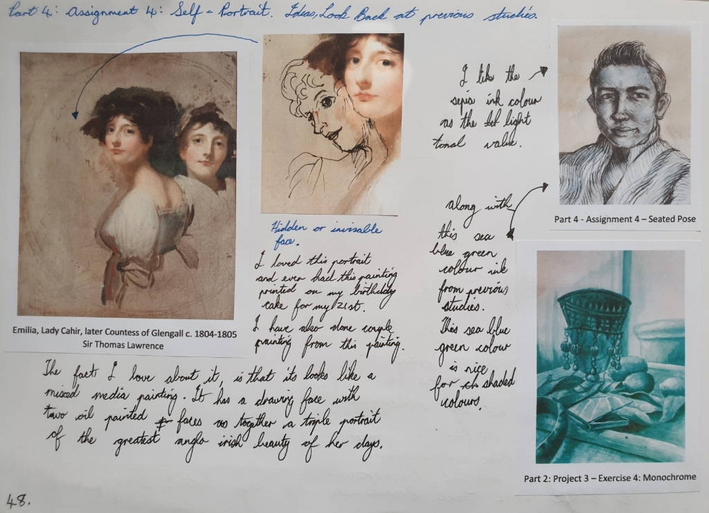
So firstly before I did some look back at my previous studies or researches, this image idea came into my mind and the idea is a triple self-portrait.
The triple portrait idea was an artwork of one of my ancestors by the celebrated artist Sir Thomas Lawrence, who has painted a couple of portraits of my ancestors in his days, so this triple portrait of my family ancestor Emilia Butler, Lady Cahir, later Countess of Glengall (1776-1836) c. 1804-1805, was the inspirational artwork of my childhood. It such an elegant artwork, that looks like a mixed media painting and was done with charcoal, pastel and oil paint.
You can see my written ideas for the self-portrait part of this assignment in Fig. 17 “Look Back Notes, Ideas and Inspirations – A4 Sketchbook, Page 48“, below.
Fig. 17 Look Back Notes, Ideas and Inspirations – A4 Sketchbook, Page 48
Here is also link from previous study in Part 2: Project 3 – Exercise 4 that I used the sea blue green ink colour idea for the final triple self-portrait drawing.
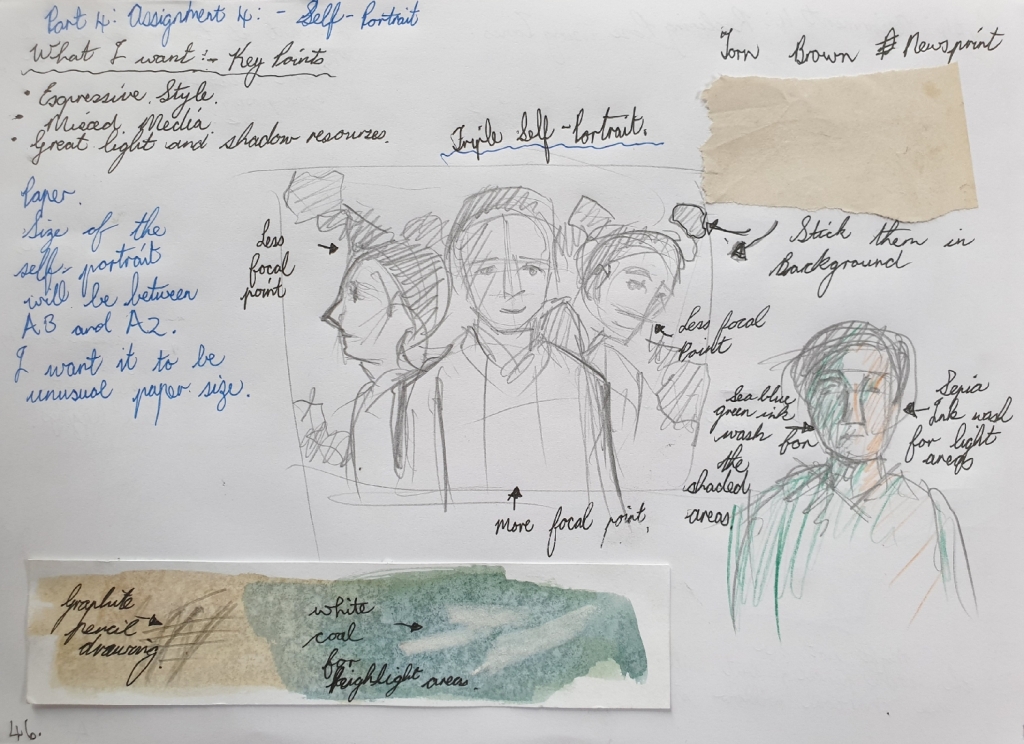
Preliminary Drawing for Triple Self-Portrait – A4 Sketchbook (Page 46)
I did a preliminary drawing and test on the colours and mediums that are combining together for the final drawing. I plan to use old newsprint paper and tear them up to stick in the background of the triple self-portrait. My chosen ink colours are the sepia for light areas and sea blue green for shadow areas. I also planned on using a graphite 4B pencil and white coal stick for adding highlights on top the dried ink at the end of the drawing.
You can see the preliminary drawing with mediums for the final drawing in Fig. 18 “Preliminary Sketches – A4 Sketchbook, Page 46“, below.
I started drawing the big shapes in like my three faces with the graphite pencil lightly, at the same time I used a mirror to look at while drawing, but I used a photo reference for the side profile face. After drawing in the three face shapes, then next is the overlaying line marks and shading the tonal areas.
After finishing the graphite pencil drawing, I used fixative spray to fixative the graphite medium before going over with the two ink colour washes, sepia for the light areas and sea blue green for the shaded areas. The ink washes create a good sense of feeling, like there is energy exploding from three different directions.
Lastly was the old torn up newsprint paper that I wanted to combine the same colour of Sir Thomas Lawrence’s triple portrait background into my triple self-portrait. But doing the tear up effect in the background makes it more abstract with a twist of old colour.
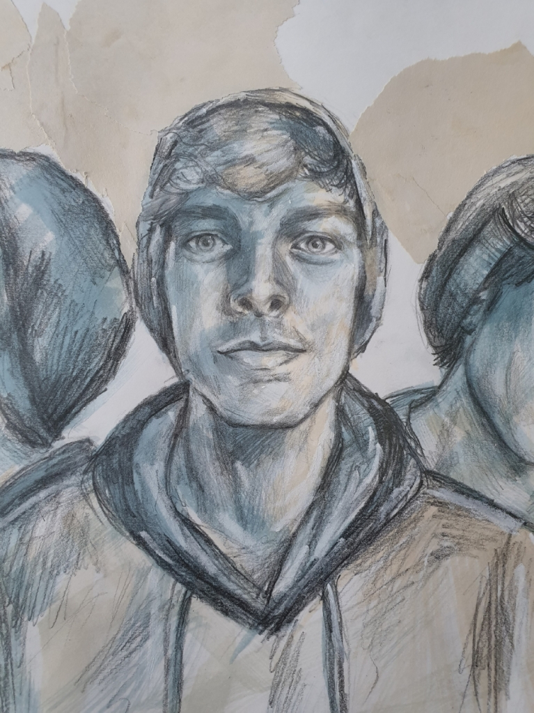
You can see the final self-portrait drawing in Fig. 19 “Final Self-Portrait Drawing – Graphite Pencil 4B, White Coal, Ink Washes and Torn Up Newsprint Paper on White Cartridge Paper 37 x 58cm, 280gsm“, below.
Fig. 19 Final Self-Portrait Drawing – Graphite Pencil 4B, White Coal, Ink Washes and Torn Up Newsprint Paper on White Cartridge Paper 37 x 58cm, 280gsm
Here is a close up of the looking ahead face from the final triple self-portrait, see in Fig. 20 “Final Self-Portrait Drawing ‘Looking Ahead’ – Graphite Pencil 4B, White Coal, Ink Washes and Torn Up Newsprint Paper on White Cartridge Paper 37 x 58cm, 280gsm“, below.
Fig. 20 Final Self-Portrait Drawing ‘Looking Ahead’ – Graphite Pencil 4B, White Coal, Ink Washes and Torn Up Newsprint Paper on White Cartridge Paper 37 x 58cm, 280gsm
Here is a close up of the slight angle face from the final triple self-portrait, see in Fig. 21 “Final Self-Portrait Drawing ‘Slight Angle’ – Graphite Pencil 4B, White Coal, Ink Washes and Torn Up Newsprint Paper on White Cartridge Paper 37 x 58cm, 280gsm“, below.
Fig. 21 Final Self-Portrait Drawing ‘Slight Angle’ – Graphite Pencil 4B, White Coal, Ink Washes and Torn Up Newsprint Paper on White Cartridge Paper 37 x 58cm, 280gsm
Here is a close up of the side profile face from the final triple self-portrait, see in Fig. 22 “Final Self-Portrait Drawing ‘Side Profile’ – Graphite Pencil 4B, White Coal, Ink Washes and Torn Up Newsprint Paper on White Cartridge Paper 37 x 58cm, 280gsm“, below.
Fig. 22 Final Self-Portrait Drawing ‘Side Profile’ – Graphite Pencil 4B, White Coal, Ink Washes and Torn Up Newsprint Paper on White Cartridge Paper 37 x 58cm, 280gsm
Log Book Notes
Here is my written notes for the triple self-portrait drawing, see in Fig. 23 “Log Book Notes“, below.
Here is the great portrait artist of his time known as Peter Paul Rubens, he was famously known for his portrait drawings with colour mediums such as using red and black chalk, with white chalk for light areas in his portraits. Using these colours help to make the face have more forms and shapes.
You can see an example of Rubens’ drawing of his first wife Isabella in Fig. 1 “Drawing of Isabella Brant (c.1621-1622)“, below.
Fig. 1 Drawing of Isabella Brant, c.1621-1622
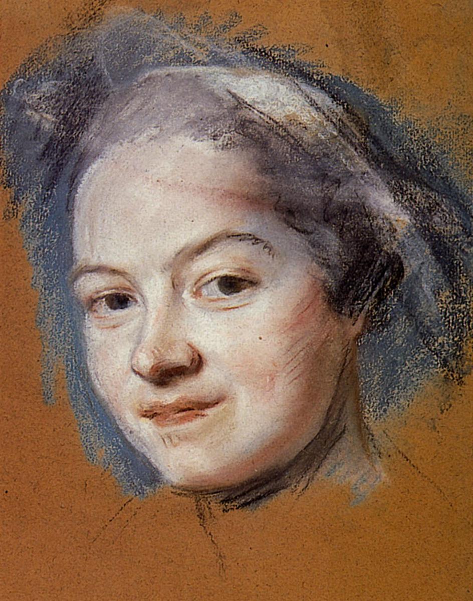
During the 18th century, an artist by the name Maurice Quentin de La Tour who was very brilliantly known for his drawings in pastels and chalks. His drawings show large interests in the way his mark-makings work well with the mediums. La Tour started bringing colour pastels into portrait drawings in a fresh and expressive way.
You can see an example of La Tour’s drawing of a female face in Fig. 2 “Madame Favart (Date Unknown)“, below.
Fig. 2 Madame Favart, Date Unknown
During the 19th century, there were a lot of portrait artists that used mixed medias and created portraits in different ways, such as the different techniques styles like the impressionists and realism style. But outstood was a great artist that we all may know as Edgar Degas, he is recognized for his pastel drawings of dancers and portraits. He showed great value in mixed colours and deep compression mark-makings.
Here we can see Degas pastel drawing of a male portrait depicting such striking mark-makings and out bursting colours, Fig. 3 “Zacherie Zacharian (1886)“, below.
Fig. 3 Zacherie Zacharian, 1886
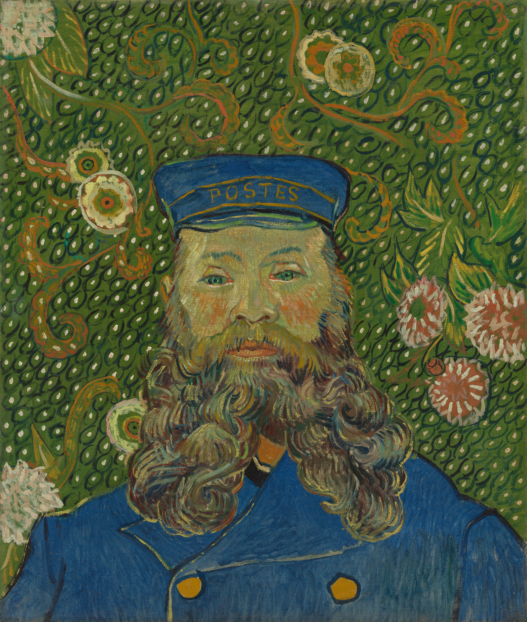
Next is also Vincent van Gogh, whose artworks followed a very different way with opposite colours, he mostly painted his portraits in unusual striking bold colours with wonderful background patterns. His portraits also showed a lot of different marks and capturing light well.
Here we can see one of van Gogh’s portrait in Fig. 4 “Joseph Roulin (Early 1889)“, below.
Fig. 4 Joseph Roulin, Early 1889
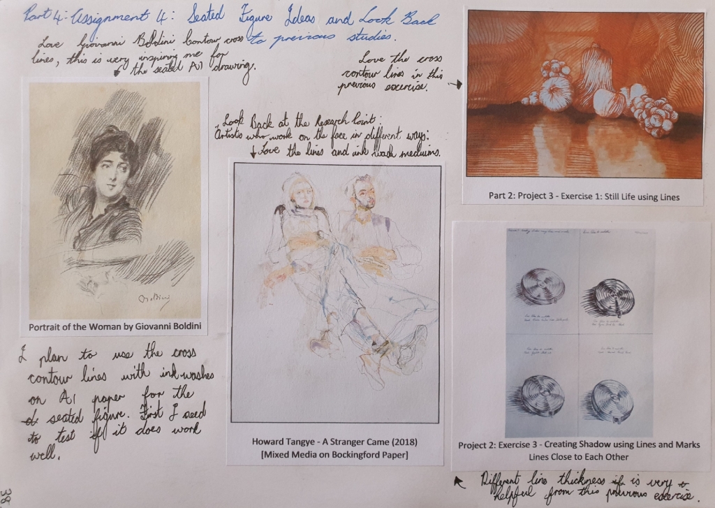
In the early 20th century, there was a little known artist named Giovanni Boldini, who did quick sketches with water colour and pencils, just like mixed media style. His style was very different and striking expressive movements.
Here we can see Boldini’s water colour paint and pencil sketch of a lady, which I assume to be Consuelo Vanderbilt, the Duchess of Marlborough, Fig. 5 “Head of a woman, looking to the left (1906)“, below.
Fig. 5 Head of a woman, looking to the left, 1906
During the 20th century, there was a pop art culture movement that was inspired my Andy Warhol, who did a lot of abstract portraits. Bright, bold and explosive style in most of his pop art portraits.
Here we can see a pop art portrait by Warhol in Fig. 6 “Marella Agnelli (1973)“, below.
Fig. 6 Marella Agnelli, 1973
Contemporary Artists
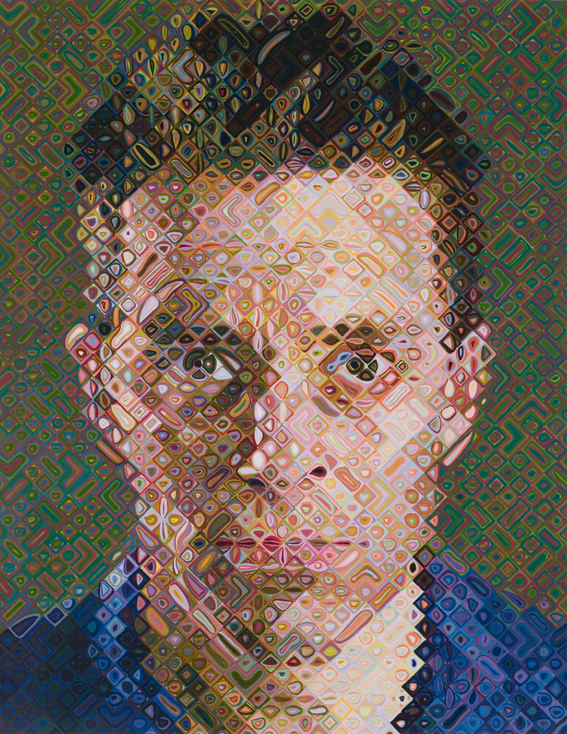
Here is a great contemporary artist by the name Chuck Close, whose recognized for his large size portraits with different shapes, illusions and tones of mixed colours that end up looking realistic once finished.
You can see one of Chuck Close large interesting portrait in Fig. 7 “James (2002)“, below.
Fig. 7 James, 2002
Here is another favourite contemporary artist of mine, who has similar style to the other two artists Graham Little and Elizabeth Peyton, but this artist by the name Howard Tangye has more sensual feelings and delighted colours, created by mixed medias.
You can see one of Tangye’s artworks in Fig. 8 “A Stranger Came (2018)“, below.
For this exercise, I did this drawing in the A4 sketchbook on page 29 at Moffett on Main Lifestyle Centre, which is a shopping centre where I work. This was during the afternoon around two o’clock when I did this drawing. I didn’t take any photos, but drew it from life like I do at live nude figure drawing classes.
I first positioned myself on a step and looked towards the supermarket which is in the far background, this was a nice view point. I first did quick scribble like sketches on the page with a 2B graphite pencil and no eraser was used for this exercise.
After doing the quick sketches in pencil, I went over with a black gel pen in the foreground and little in the middle ground, then I left the graphite pencil marks in background the same as it is. The reason I went with the black gel pen with more information in the foreground figures, so it can create a sense of movement and noise that’s coming towards the viewer.
Here you can see the groups of figures drawing in the A4 sketchbook on page 29 in Fig. 1 “Groups of Figures at Shopping Centre – Black Gel Pen and 2B Graphite Pencil, A4 Sketchbook (Page 29)“, below.
Fig. 1 Groups of Figures at Shopping Centre – Black Gel Pen and 2B Graphite Pencil, A4 Sketchbook (Page 29)
Log Book Notes
Here you can see my log book notes in Fig. 2 “Log Book Notes“, below.
For this exercise, I did these drawings at the live nude figure drawing class that I attend on Saturday mornings. This time, we had two models, one a female Aneesa and the other was a male Keagan.
The female model Aneesa had to leave earlier for emergency reasons, so she only posed for hour and half for us, so Keagan the male model, managed to help us by posing for another 2-hours.
Several Two-Minute Sketches
First I started with the two-minute sketches in the A3 sketchbook, I did drawings of Aneesa in the top right area on page 6. Then later on after Aneesa hour lounging pose had ended and she had to leave. Then I went on to carry on with more sketches on the same page of Keagan’s standing and seated poses. I find these quick and rough two-minute studies useful, it’s good to warm-up my mark-makings and tones.
You can see the 2-minute quick studies in Fig. 1 “Quick Rough 2-Minute Sketches – Cretacolor Monolith 2B Pencil, A3 Sketch Book (Page 6)“, below.
For the lounging pose, I used a Cretacolor monolith 6B pencil on an A2 white cartridge paper 200gsm. This was a one hour pose, so it gave me plenty time to draw in good tones and mark-makings in this drawing. I love how I captured her foreshortening pose and the depth of her body weight sinking into the large pillows. I struggled with her hand, so I left it alone and decided to not overwork it anymore, also I kept her face less detailed. The best thing about looking at this drawing after finishing it, was that I realized that I was sitting in a good position, because I had great light source.
The medium is wonderful and can be very tricky to erase it after making a mistake. So I recommend to start from a light pencil towards dark.
You can see this lounging pose drawing in Fig. 2 “Lounging Pose – Aneesa Lounging – Cretacolor Monolith 6B Pencil, A2 White Cartridge Paper, 200gsm“, below.
Fig. 2 Lounging Pose – Aneesa Lounging – Cretacolor Monolith 6B Pencil, A2 White Cartridge Paper 200gsm
Standing Pose
For the standing pose, we had Keagan our male model to stand after Aneesa left for emergency reasons, so this was a 45-minute long pose. Keagan stood against a plain screen divider, which gave me a good casting shadow from the figure against the screen divider. I used a Cretacolor monolith 6B pencil on an A2 white cartridge paper 200gsm in this drawing.
This pose was very tricky, because we had a 10-minute break for the model to stretch a bit, so after the break, the pose wasn’t exactly the same as before. So this made me struggle with the legs, which I ended up not getting good information in the feet, but still there’s plenty information in them.
I love the tonal values and mark-makings that settle against the screen divider that also helps to represent the body weight of Keagan. You can see this standing pose drawing in Fig. 3 “Standing Pose – Keagan Standing – Cretacolor Monolith 6B Pencil, A2 White Cartridge Paper, 200gsm“, below.
Fig. 3 Standing Pose – Keagan Standing – Cretacolor Monolith 6B Pencil, A2 White Cartridge Paper 200gsm
Seated Pose
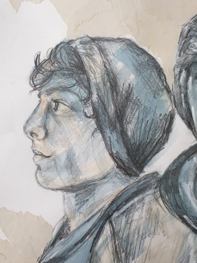
For the seated pose, which was a 45-minute long pose with one 10-minute break between. I drew this from side angle, the reason is that he had good light source and character motion happening from this view point. I used Cretacolor monolith 8B pencil and 2B clutch pencil on an A2 white cartridge paper 200gsm in this drawing.
I enjoy how the drawing finished results came out, it’s such an interesting view point with a lot of open space surrounding a peaceful Keagan who seems to wander off into a deep thoughtful conversation on his phone.
You can see the seated pose drawing in Fig. 4 “Seated Pose – Keagan Seated – Cretacolor Monolith 8B Pencil & 2B Clutch Pencil, A2 White Cartridge Paper, 200gsm“, below.
How accurately did you depict the overall proportions of the figure?
I believe in myself that I have managed to capture the body proportions well and giving them enough information within the muscles, tonal-values and mark-makings with the best chosen mediums.
Did imaging the sitter’s skeleton and muscles help you to convey the figure’s structure and form?
I find that if you have great light source on the figure, you will be able to understand the underlying skeleton of the figure clearly and this helped me to understand how to capture the body weight from the figure. The form part was created by the mark-makings and the way the marks direction follows the bent or curves, helps to give the structure a well more balanced understanding.


.jpg)
.jpg)


.jpg)