Demonstration of technical and visual skills – materials, observational skills, visual awareness and compositional skills (35%).
In part five, has so far given me a new way at discovering new skills with the use of my own chosen mediums that allow me to open up to new visual skills and technical skills. I have notice that my compositional skills have started improving from part one towards part five, which this has made me more comfortable in my final assignment five. My visual and observational skills have been the mostly focused on in the assignment five final drawing. I made more improvements in what I been depicting by the creation use of my own visual skills. The observational skills were developed by looking at the sense of emotions that I have captured in my final drawing.
In my final drawing, I focused on improving these skills by experimenting with mixed medias and doing rough sketches, but I need to look out into developing a connection with other materials that I haven’t used before.
Quality of outcome – content, application of knowledge, presentation of work in a coherent manner, discernment, conceptualisation of thoughts, communication of ideas (20%).
When I look back at my final drawing that I have created, I see a very strong communication ideas at how I captured the emotional feelings with the application of the knowledge in the use of different materials and tones. The quality outcome in the final drawing has influenced me to create a coherent manner and discernment at connecting with my story and ideas that I visualized in my final drawing .
I have given my final drawing a connection with realism and presenting it with expressive mark-makings by using strong understanding in mixed medias. I wanted to share more ideas with my final drawing, but I had to take risky choices in not overworking my final drawing too much. So I am very happy in the finished results in the final drawing.
Demonstration of creativity – imagination, experimentation, invention, development of a personal voice (25%).
In the assignment five, I have shared my imagination of understanding the emotions and feelings that have given me a personal voice in a context story way. There were experimentations and inventions that I tried in my sketch book with the use of different mediums. My imagination was to share a personal event that happened in the past, a voice that I’m not afraid to talk about my mental health issues by giving it in an expressive style and tones within my artwork piece. The creativity in my final drawing is the best part I have captured so far.
Context reflection – research, and critical thinking (learning logs and, at second and third level, critical reviews and essays) (20%).
I used the research ideas from the previous parts to create my final artwork. I find my way of presenting my story and emotions in a context way as a strong reflection on who I am and my personal life. I did indeed do some critical thinking as I was going along in my final drawing by looking at the drawing and telling myself what needed to be adjusted, added or fixed. I also shared my critical ideas in the context with my past life mental health issues by telling viewers what so important about my final art piece.
I intend to keep my essays clear and more understanding for others to read, also I kept my learning log as a proof of what was all it about and it’s progress from beginning to the end.
Title: Reflecting the Self Expression with the connections to tones and used of mixed media.
Finding the knowledge of understanding the expression in tones, colours and emotions is always a chasing adventure to discovery. A subject that always stands out to me is how I understand myself and how I express this in my works to create a story for others. There is always a tackle to solve in the emotions of the marks that strive towards the edge of changing the image into a different emotion. This course has given me an opportunity to improve my passion of art, on building my freedom towards the drawing techniques and reflections on what I love to achieve in the progress.
Looking at the expressive emotions and use of tones in Gustave Courbet’s portraits have a strong personal connections with me, he always had the story for viewers to ask questions to themselves such as “Why he has a mischief look on his face?” or “Why she looks so boredom?”. I have aimed my connection with his tones and realism mark-makings that inspired me to use in my assignment five, it’s the tones and colours that tell a feeling or story.
Looking into the previous parts of Drawing One Module is a very challenging moment for me to tackle like a football match, there’s always a struggle that come across in such mark-makings that don’t want to work with that colour or the subject. But learning to accept those issues can reflect an self expression in many ways, where I look at my colours are bright when I’m happy, or when I’m feeling down, then the colours are looking so dull with sick messy tones.
It’s important for me to learn to depict in my artworks with the use of art words such as ‘expressive’, ‘movement’, ‘style’ or ‘elements’, because they find a way to introduced themselves with mixed of medias that create self expression.
In my assignment five final drawing, called “Freedom from Depression”, I gave it another meaning to describe it as self expression. The mark-makings show a realism style as a movement style similar to Gustave Courbet’s drawings, also I created a theme for the background with the use of dark tones along with messy and expressive marks to show the feelings of what I was going through in life. There is a strong sense of emotions in the figure of myself with the use of ink colours that shows light, joyful and freedom, that I have removed myself from the past mental health issues. I positioned myself looking towards light as a new step to future and not looking back to the dark shadowed past. My chosen medias are mediums that I enjoy using and makes me comfortable to give the drawing an expressive emotional feeling. All these technical skills, visual knowledge and materials have created a story for my self expression final drawing.
For this assignment, I want this subject to be based on my past mental health issues, also in other words I suffer from depression, which at one stage affected my studies and causing me to not finish my first year with the OCA on time, but I’m thankful to receive an extension to complete my first year in Drawing One course.
This all started halfway in my first year studies, after my family and friends realized my mental health with depression was getting dangerous, they feared I would try to commit suicide again, so their help reached out to me in time and got me to refresh a new start with the desperate help from my psychologist Toni who I’ve been going for years, from there on, serious concerns over my medication dosage started pouring in, which had been found out that I’ve been on the wrong medication dosage size and medicine for years, which doctors had to put me into a chaos state to restart fresh with new medication, this process took me a long time to develop my connection with the new medications.
Now to the present day, I have recovered from my mental health issues, I feel a wonderful spirit, which is called “Freedom”. I have never felt freedom from my sufferings in a long time, which I feel it’s real, the heavyweight has come off my chest and made me feel good to start these studies again, which I’m so grateful.
So this final assignment drawing will be based on the freedom from my past life sufferings, so I hope that those who going through similar mental health issues will understand the background story, to be honest from my heart, to say in my own words “It’s not that easy to escape from depression or other mental health issues, it’s like a disease that spreads throughout your body that controls your emotions in a painful state”, for those I tell you to be strong and think about how much you are loved by those that are there for you, I’m also here for you.
Sketch Book
For the beginning stage of my final assignment, I did some rough sketches and experiments with mixed medias, I also kept the log book up to date throughout my assignment five.
First I did the experiments with mixed medias, firstly in the A3 sketchbook to find the best media for the final drawing. I used different inks, pencils, household products, paints and other resources I could find. This was fun to do, but I never used these techniques in my final assignment later on as there wasn’t a strong connection with my emotions in looking at these techniques. The experiment studies were bold, bright and abstract, so I left them out the way and focused on using some of the materials like inks, conte crayons and graphite pencils.
Here below you can see the experiments in the A3 sketchbook from pages eleven to fourteen, labeled as Fig. 1 to Fig. 4.
Fig.1 Experiments with Mixed Media – A3 Sketchbook, Page 11
Fig. 2 Experiments with Mixed Media – A3 Sketchbook, Page 12
Fig.3 Experiments with Mixed Media – A3 Sketchbook, Page 13
Fig.4 Experiments with Mixed Media – A3 Sketchbook, Page 14
Then after doing the experiments with mixed medias in my A3 sketchbook, I went to do some rough sketches in the A4 and A3 sketch book.
The first rough sketch was done on a separate single paper that I could use watercolour paint on, I later pasted it in the A4 sketchbook, this drawing was based on light and bright colours and myself in a floating motion away from the darker tones, but I found the idea was too much of me in a fun way, than the emotions of what I wanted to capture. The emotional feelings I was looking for is what it feels like being depressed and combining with what it feels like being freed from that depression feeling in one plot.
Here below in Fig. 5, you can see the rough sketches on a single paper on page fifty in the A4 sketchbook.
Also I did a larger sketch in the A3 sketchbook of the similar pose to the Fig. 5 sketches, you can see the rough graphite pencil sketch in Fig. 6 on page fifteen, below.
I figured out a way of doing the next rough sketches by thinking back to the expressive mark-makings I did in Drawing One: Part One, Project One – Exercise 1: Experimenting with Expressive Lines and Marks. So the idea is to use dark tonal expressive marks that describes depression, frustration and confusion feeling in the background. Then for my figure in a realism style to give it a true emotional feeling with the soften mark-makings and along with colourful inks that represents freedom and joyful feelings.
Here below you can see the rough sketches in the A4 Sketchbook as Fig. 7 – Page forty-nine and A3 Sketchbook as Fig. 8 – Page sixteen below.
I found the idea in Fig. 7 and Fig. 8 wonderful, it has all the aspects I wanted for my final drawing, especially the way I look towards light is expressive along with the background marks that represents the background story of my past sufferings. I used this idea in the final assignment drawing.
Final Assignment Five – Drawing progress
In the beginning of the final drawing, I started with an outline graphite pencil on white Fabriano Accademia Paper, 200gsm and the size is 54.5cm x 70cm. Starting with HB graphite pencil to get the proportions and figure well balanced is important for me as it’s the main subject. I used natural light for this drawing of myself, because I stood near my art studio window sketching my figure by looking at a mirror, but for the face, I used a photo reference to copy from. You can see the outline drawing progress in Fig. 9, below.
Fig. 9 Beginning Progress of Final Drawing – HB Graphite Pencil on Fabriano Accademia White Paper, 54.5cm x 70cm.
Next I started with the cross-hatching and hatching marks by using an HB, 2B and 4B graphite pencils. This can be seen below of the progress from the beginning until the end of the mark-makings with the graphite pencils.
Beginning mark-makings progress seen in Fig. 10 and the close-up in Fig. 11, below.
Fig. 10 Beginning Mark-Makings Progress of Final Drawing – HB, 2B and 4B Graphite Pencil on Fabriano Accademia White Paper, 54.5cm x 70cm
Fig. 11 Beginning Mark-Makings Progress of Final Drawing: Close-Up – HB, 2B and 4B Graphite Pencil on Fabriano Accademia White Paper, 54.5cm x 70cm
Here is the finished progress results of the mark-makings with the graphite pencils in Fig. 12, below.
Fig. 12 Finished Mark-Makings Progress of Final Drawing – HB, 2B and 4B Graphite Pencil on Fabriano Accademia White Paper, 54.5cm x 70cm
Next was using mixed mediums such as using the Conte Black Sketching Crayons for giving that rough effect marks in the background and the Acrylic Drawing Inks for the black heavy scribbles surround my head in the background, also I used light colourful inks on my figure where freedom light is shining on me. But before I started the inks, I did a quick test on a printed image of the Fig. 12 drawing, to see which mark-makings style would be great for the background, this was done in the A4 sketchbook on page 51. You can see it in Fig. 13, below.
Fig. 13 Test on Printed of the Fig. 12 Sketch – Conte Black Sketching Crayon, A4 Sketchbook, Page 51.
After doing the test, I liked the Frame 1 on the far left in Fig. 13. So I started doing the progress on the final drawing. Now you can see the half-way progress in Fig. 14, below.
Fig. 14 Half-Way Progress of Final Drawing – Mixed Media on Fabriano Accademia White Paper, 54.5cm x 70cm
Then I finished off my final drawing with the darker inks on the darker shadows on the figure. Which at this stage I felt that I was done with everything in the final drawing and I loved the results of it. There is a lot of emotions and connections in it, the background gives a feeling of depressive, heavyweight, confusion and emotional, but then my figure full of colourful light shows me in a happy freedom way. I gave this final drawing a title: “Freedom from Depression“.
You can see the final Assignment Five drawing in Fig. 15, below.
Fig. 15 Finished Progress of Final Drawing “Freedom from Depression” – Mixed Media on Fabriano Accademia White Paper, 54.5cm x 70cm
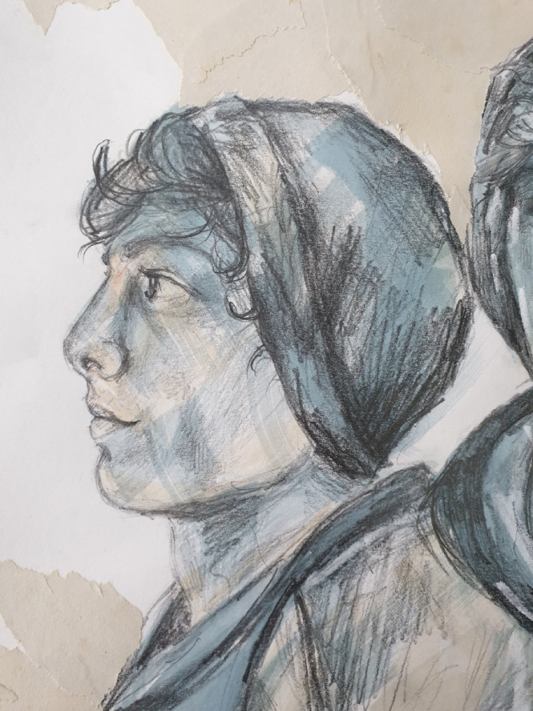
Here is close-ups of the final drawing in Fig. 15 “Finished Progress of Final Drawing – Mixed Media on Fabriano Accademia White Paper, 54.5cm x 70cm“. Seen them below in Fig. 16; Fig. 17 and Fig. 18.
Fig. 16 Final Drawing Close-Up of Face – Mixed Media on Fabriano Accademia White Paper, 54.5cm x 70cm
Fig. 17 Final Drawing Close-Up of Background Marks – Mixed Media on Fabriano Accademia White Paper, 54.5cm x 70cm
Fig. 18 Final Drawing Close-Up of Figure Marks – Mixed Media on Fabriano Accademia White Paper, 54.5cm x 70cm
I loved this assignment so far, it’s nice to share my ideas, choosing own mediums and telling a story about myself and my struggling past, this was a project where I gave myself a true meaning of who I am and what I shouldn’t be afraid of telling my emotional feeling, but it was a great feeling to explain the impact of what I was going through by showing it in a drawing that shows two worlds I was in, a world where it was depressing and was fighting at same time to find my freedom, which I would find it after so many years. I hope you enjoy this project.
I enjoyed the process finding new ways to build a stronger foundation of understanding how part four has asked me to do many researches and learning new challenges, which this shows me on how important that resources and images can give me a new direction on what’s going to happen in the next part. In this part four so far, it has broken some boundaries that I refused to go any further over my drawing comfort zone. For example such as I like to be very detailed in my drawings, but I had to forced myself to break away from being too detailed in some exercises and be a bit loose in my drawings, which this has made me to develop another comfort zone and therefore I feel stronger and relaxed in moving forward onto the next part. I have learnt to face the struggling challenges throughout drawing one so far and following my tutor advices with helpful tips from the previous assignments reports. So now I’m prepared to take another big challenging step into the next new part, which is part five, and learn to develop more ideas and sharing my thoughts in contexts.
Assessment Criteria Points:
Demonstration of technical and visual skills – materials, observational skills, visual awareness and compositional skills (35%).
For this part four so far has given me the understanding of developing new skills in the technical and visual side, with the use of different mediums. I also have placed myself in between the technical and visual skills by combining them to blend into each other together by allowing my observational skills develop more and giving my drawings more accurate and well compositional.
I made sure that whenever I struggled or made a mistake in a skill in the exercises, I will tell myself to go back and start it over again with the help of my visual acknowledge skills, that help to point me out to the skills that needed to be fixed or practiced a bit more, for example do more preliminary drawings.
Quality of outcome – content, application of knowledge, presentation of work in a coherent manner, discernment, conceptualisation of thoughts, communication of ideas (20%).
Looking back at the two A1 size assignment drawings that I have produced, which was a very exciting experience at same time with very strong communication ideas and thoughts that are developed by different materials and research resources. The most astonishing fact about the assignment four that has given me a new understanding foundation is that this was my first time doing larger size drawings, which I have never drawn anything larger than an A2 size since beginning of drawing one, part one.
I find the quality outcome as a strongly influenced by seeing other old and modern artworks from the research points that inspired me throughout part four and helped me in assignment four. My knowledge and presentation of the work in a coherent manner is developed by how much I understand which media will work in the final drawings and, picturing in my mind on how I want it’s final results to turn out in an interesting and expressive manner, that will show the viewers how much I have learnt from this drawing one course. There are areas within part four, that I wished to share it in contents and thoughts more in the assignment four, so for my next assignment, I will show the developing quality of outcome with the use of information.
Demonstration of creativity – imagination, experimentation, invention, development of a personal voice (25%).
In the part four so far, I have seen a great chance on the way that I layout my plans for the demonstration of creativity, with the use of different resources and materials, such as inventing different mediums and ideas in my sketchbook and writing down how I see my own imagination ideas relate to some inspired artworks from the research points.
I have created a new personal voice within the assignment four, which I see my voice as a freed and exciting style, I also started experimenting on a new skill which is to be less detailed and be more loose with using different expressive marks.
Context reflection – research, and critical thinking (learning logs and, at second and third level, critical reviews and essays) (20%).
I found it interesting in the research points throughout this part four, it has shared the same interest that I favour at doing, which is portraiture and figures. I find my essays have become less written information, which is good fact for not making it look too jumbled up with too many unnecessary words, but also not impressive as I have seen a weaken side in writing down the important facts that would make my essay a strongly interest to look at.
I try keep my critical thinking and critical reviews in a simple context and not making it overflow in a controlling way, I made sure that if I’m criticized for an drawing, then I don’t let it affect me as I will fix it myself. I find motivational critical reviews helpful and pushes me forward into a better direction. I haven’t had the chance to visit any galleries or exhibitions due to the outbreak of Covid-19, but my research points has given me a reflection on how I can picture these artworks and their information in a gallery or exhibition.
For this assignment four, it was very interesting at how all three drawings results came out. I find doing the preliminary drawing studies and notes with some research on inspiring artists as very helpful tips for this assignment.
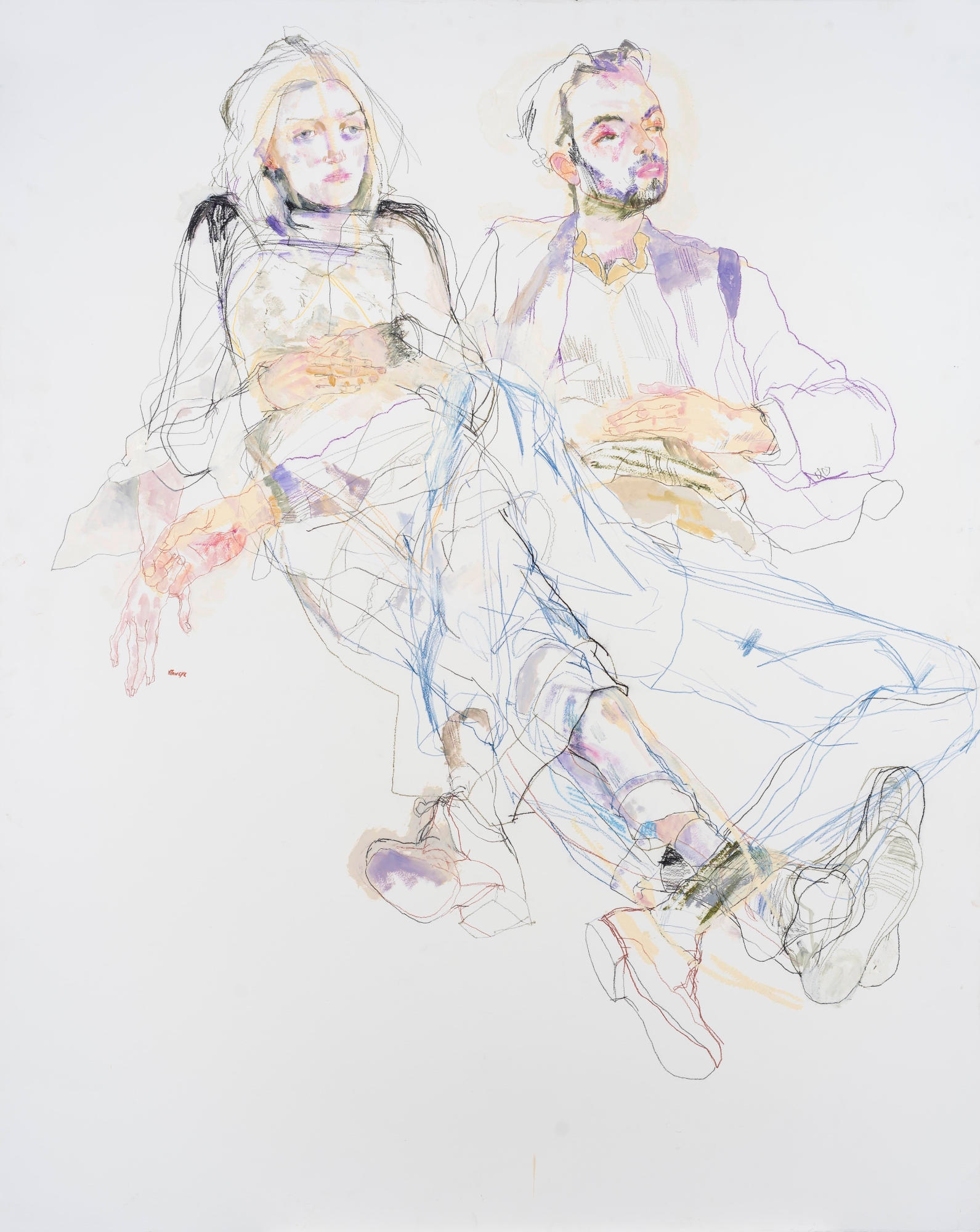
For the A1 seated and reclining drawings, I used live models, who were friends of mine and were glad to pose for the assignment drawings.
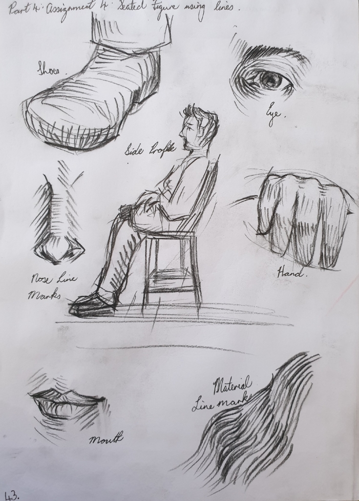
1. Figure Study using Line (A1) – Seated Model in an Upright Chair.
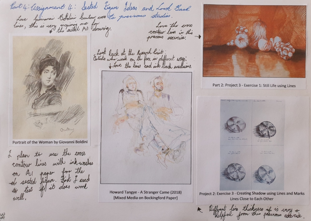
First I did some look back at my previous studies and research points to collect ideas and inspirations. I came across a line style that I used in previous exercises called Cross Contour Lines, which seems perfect for my final seated pose drawing.
I first used my female friend Tessa as the model for the first view preliminary sketches, but then she couldn’t pose for the longer pose for some reasons, so I got my male friend Chad who was willing to pose for the view more preliminary sketches and the final drawing pose.
Here you can see the different line style preliminary drawings of Tessa, below.
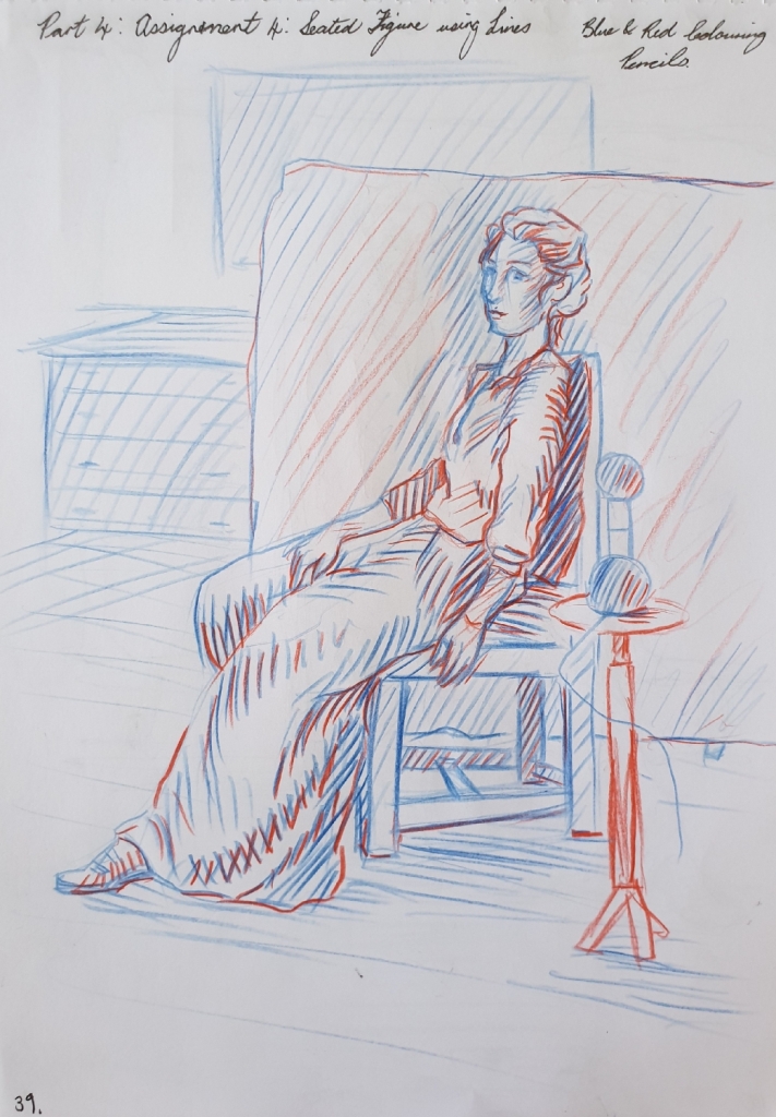
First drawing is done with a blue and red colouring pencil in the A4 sketchbook on page 39, see in Fig. 2 “Preliminary Sketch of Tessa – Blue and Red Pencil in A4 Sketchbook, Page 39“, below.
Fig. 2 Preliminary Sketch of Tessa – Blue and Red Pencil in A4 Sketchbook, Page 39
For the second drawing of Tessa, I used black, blue and red gel pens in this drawing. See in Fig. 3 “Preliminary Sketch of Tessa – Blue, Black and Red Gel Pen in A4 Sketchbook, Page 40“, below.
Fig. 3 Preliminary Sketch of Tessa – Blue, Black and Red Gel Pen in A4 Sketchbook, Page 40
In this final preliminary drawing of Tessa, I used a 2mm graphite clutch 2B pencil in the A4 sketchbook on page 41, see in Fig. 4 “Preliminary Sketch of Tessa – 2mm Graphite Clutch 2B Pencil in A4 Sketchbook, Page 41“, below.
Fig. 4 Preliminary Sketch of Tessa – 2mm Graphite Clutch 2B Pencil in A4 Sketchbook, Page 41
Preliminary Drawings of Chad – A4 Sketchbook
When Tessa couldn’t pose for any longer for some reasons, I managed to have my male friend Chad to pose for the rest of seated preliminary sketches and the final drawing.
First sketch of Chad was done with a black gel pen in the A4 sketchbook on page 42. I love this pose view point as it shows great foreshortening, which I will use the same pose in the final A1 seated drawing. You can see it in Fig. 5 “Preliminary Sketch of Chad – Black Gel Pen in A4 Sketchbook, Page 42“, below.
Fig. 5 Preliminary Sketch of Chad – Black Gel Pen in A4 Sketchbook, Page 42
In the second drawing, I used a black Conte pencil and loved the medium, so looking forward to using it in the A1 final drawing. These show some of the feature areas with using the cross contour lines style. You can see it in Fig. 6 “Preliminary Sketch of Chad – Black Conte Pencil in A4 Sketchbook, Page 43“, below.
Fig. 6 Preliminary Sketch of Chad – Black Conte Pencil in A4 Sketchbook, Page 43
For the final preliminary sketch of Chad, I tried the black Conte pencil with sepia and navy blue acrylic drawing ink washes. I love how these mediums combine together and it shows great expressive feelings. I will be using these mediums in the final A1 drawing. See in Fig. 7 “Preliminary Sketch of Chad – Black Conte Pencil and Ink Wash in A4 Sketchbook, Page 44“, below.
Fig. 7 Preliminary Sketch of Chad – Black Conte Pencil and Ink Wash in A4 Sketchbook, Page 44
So finishing off with the preliminary drawings and updating my log book with written notes. Then I started on the A1 size final seated drawing of Chad.
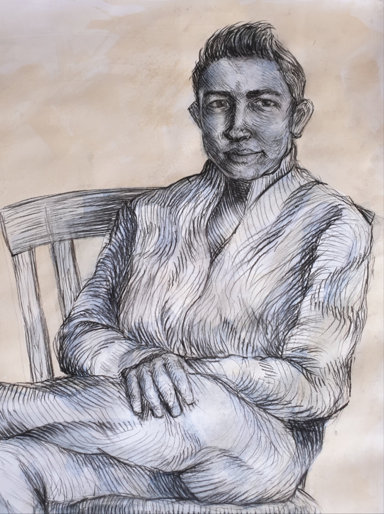
Final Drawing (A1) – Seated Model using Lines
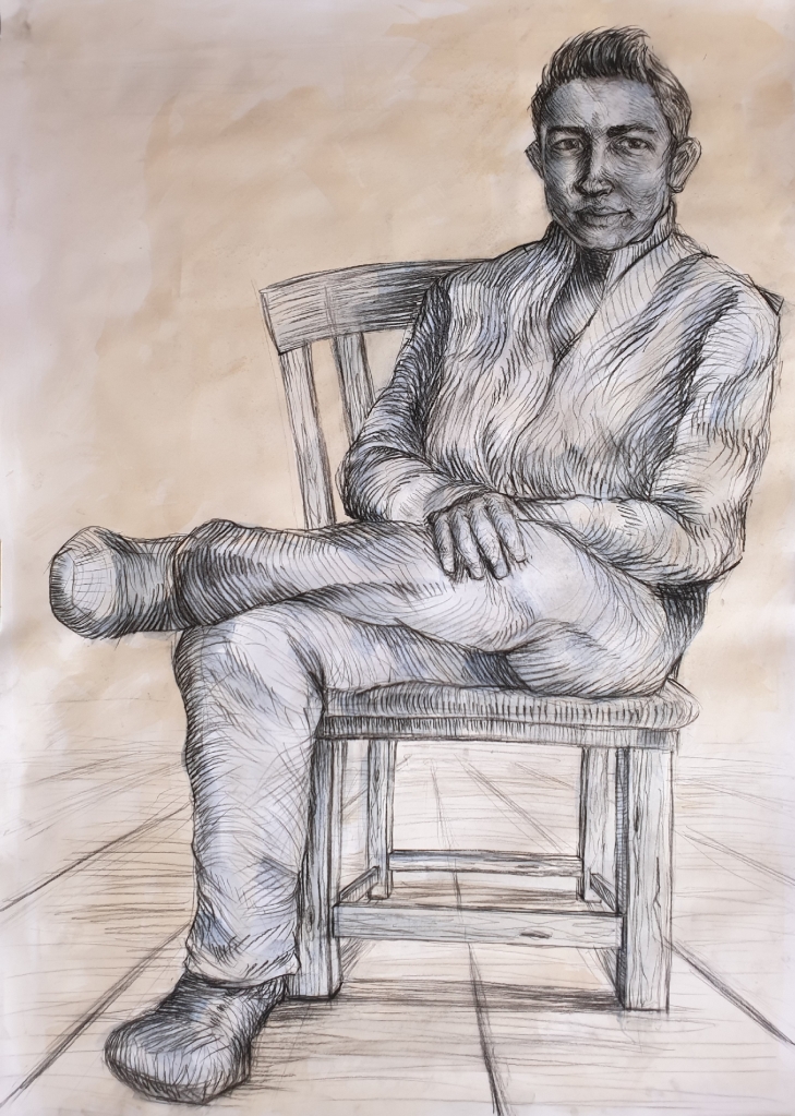
For the final drawing, I asked Chad to do the same pose as he did in one of the preliminary sketches as seen in Fig. 5 “Preliminary Sketch of Chad – Black Gel Pen in A4 Sketchbook, Page 42“, but this time, I used the natural sunlight source from the window.
I first painted the sepia and navy blue acrylic drawing ink washes on the A1 white cartridge paper 280gsm, which was mounted to a board. After doing the ink washes, I went to draw in the the big shapes like for example the chair and figure outlines with the black Conte pencil lightly.
After getting the shapes well proportioned, I then went into the figure with cross contour lines with the compression of the black Conte pencil or stick. Wide dark lines are for the shaded areas and light thin lines are the light areas. Bare in mind that my friend Chad is a short height person with a larger face.
Finishing this drawing was the best feeling and I love the outcome results of it, there is so much inspirations and techniques that stand out in this drawing. The way the cross contour lines follow the movement of the material and folds, has really well balanced the atmosphere of Chad’s figure.
There was a stage where I struggled in this drawing, which was trying to avoid of going into details with Chad’s face, because I feared that this drawing would end up as a portrait. But looking at it, all I can see is a seated figure who seems to have been very relaxed and enjoying the conversation that we shared during the 2-hours timeframe.
You can see the final A1 seated Chad using lines in Fig. 8 “Final Drawing of Chad Seated – Black Conte Pencil with Sepia and Navy Blue Ink Washes, A1 White Cartridge Paper, 280gsm“, below.
Fig. 8 Final Drawing of Chad Seated – Black Conte Pencil with Sepia and Navy Blue Ink Washes, A1 White Cartridge Paper, 280gsm
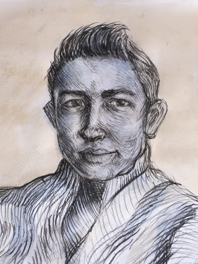
Here is a close up of Chad’s face and torso in Fig. 9 “Final Drawing of Chad, Close Up of the Details – Black Conte Pencil with Sepia and Navy Blue Ink Washes, A1 White Cartridge Paper, 280gsm“, below.
Fig. 9 Final Drawing of Chad, Close Up of the Details – Black Conte Pencil with Sepia and Navy Blue Ink Washes, A1 White Cartridge Paper, 280gsm
Here is also another close up of Chad’s face details, which gives a clear understanding of the cross contour line mark-makings. See in Fig. 10 “Final Drawing of Chad, Close Up of Face Details – Black Conte Pencil with Sepia and Navy Blue Ink Washes, A1 White Cartridge Paper, 280gsm“, below.
Fig. 10 Final Drawing of Chad, Close Up of Face Details – Black Conte Pencil with Sepia and Navy Blue Ink Washes, A1 White Cartridge Paper, 280gsm
Log Book Notes for the Seated Model using Lines
See in Fig. 11 “Log Book Notes“, below.
Fig. 11 Log Book Notes
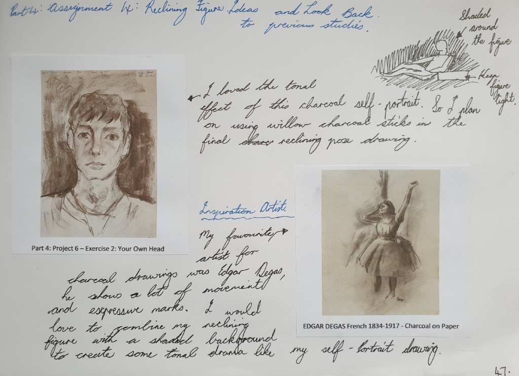
2. Figure Study using Tone (A1) – Reclining Model.
For this reclining pose drawing, I used my artist friend Calista to pose for me as she was happy to do so.
I did some look back at my previous studies and research points to collect ideas and inspirational ideas. I found an inspirational artist known for his expressive tonal charcoal drawings, which was Edgar Degas, here you can see a charcoal drawing in the link here: https://dygtyjqp7pi0m.cloudfront.net/i/35689/30744696_1.jpg?v=8D5E8FC771EC0E0 (Accessed 17/10/2020).
You can see my ideas in my A4 sketchbook on page 47, see in Fig. 12 “Look Back Notes, Ideas and Inspirations – A4 Sketchbook, Page 47“, below.
Fig. 12 Look Back Notes, Ideas and Inspirations – A4 Sketchbook, Page 47
Here is also link from previous study in Part 4: Project 6 – Exercise 2, that I used the charcoal expressive style idea for the final reclining pose drawing.
Preliminary Drawings of Reclining Calista – A4 Sketchbook (Page 45)
I did a page in the A4 sketchbook of preliminary sketches of Calista and getting the idea of which view angle will work for the A1 final reclining pose drawing. I also found the willow charcoal stick still the best medium to use for giving great tonal values and expressive marks, which I will use as my final A1 drawing medium.
Here you can see the preliminary sketches in Fig. 13 “Preliminary Sketches – Charcoal Pencil, Black Conte Pencil and Graphite Pencil, A4 Sketchbook, Page 45“, below.
Fig. 13 Preliminary Sketches – Charcoal Pencil, Black Conte Pencil and Graphite Pencil, A4 Sketchbook, Page 45
Final Drawing – Calista Reclining Pose
I first had Calista to do a reclining pose, wearing her black pants and light cream jersey, she also was instructed to rest her right arm on a fabric draped cardboard box. The light source came from natural sunlight from the window for this drawing.
I first drew the large body shapes lightly with the willow charcoal stick, then after that I went and blocked in the mid and dark tonal areas by using the flat side of the willow charcoal stick. When finished with using the willow charcoal stick, I then used a putty eraser to lift up the charcoal in some areas where there was some light source shining on, for example the face and jersey.
I love the results of the shaded dramatic tonal background, it makes the figure to be the main attention of the audience. The tonal values are well balanced and seeing this drawing as less detailed information makes it a very interesting reclining subject. Her figure size is well proportioned and her character can be seen clearly as a gentle lady.
You can see the final A1 reclining pose drawing in Fig. 14 “Final Drawing ‘Calista Reclining’ – Willow Charcoal Sticks on A1 White Cartridge Paper, 280gsm“, below.
Fig. 14 Final Drawing ‘Calista Reclining’ – Willow Charcoal Sticks on A1 White Cartridge Paper, 280gsm
Here is a close up of the final drawing, see in Fig. 15 “Final Drawing ‘Calista Reclining’ Close Up – Willow Charcoal Sticks on A1 White Cartridge Paper, 280gsm“, below.
Fig. 15 Final Drawing ‘Calista Reclining’ Close Up – Willow Charcoal Sticks on A1 White Cartridge Paper, 280gsm
Log Book Notes
Here is my written log book notes for the reclining pose drawing, see in Fig. 16 “Log Book Notes“, below.
Fig. 16 Log Book Notes
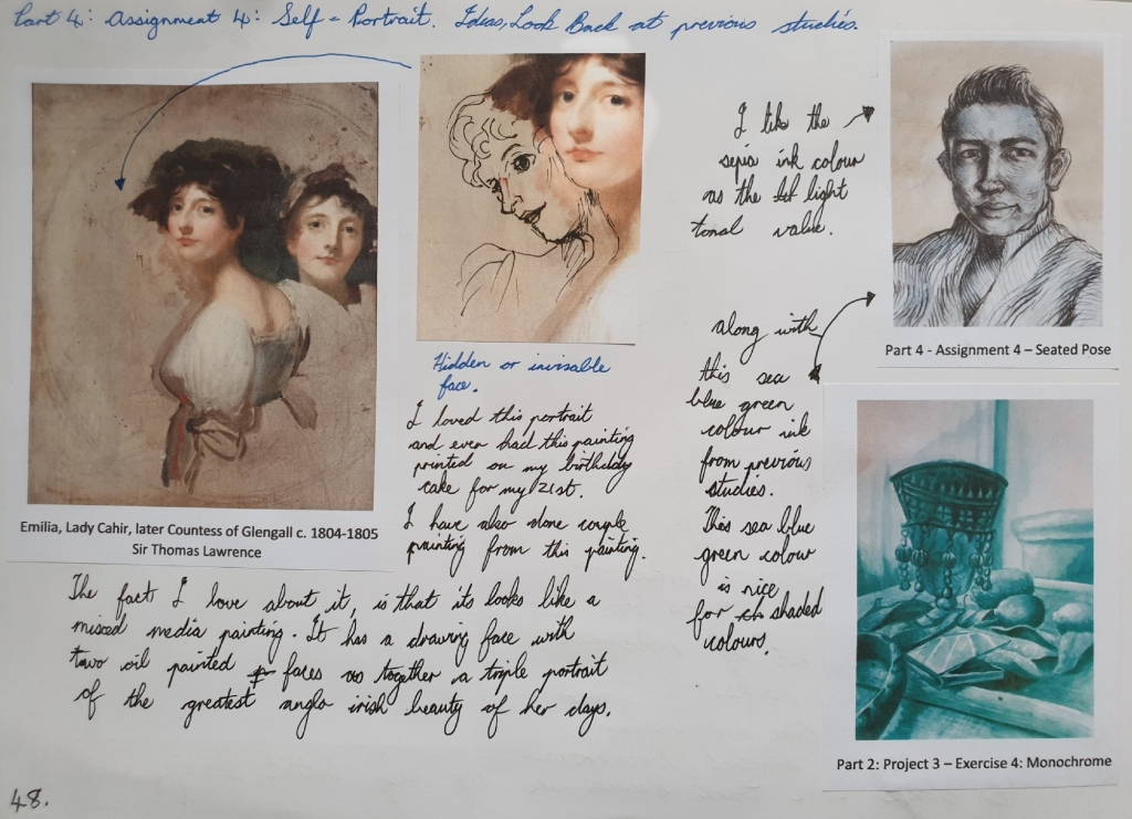
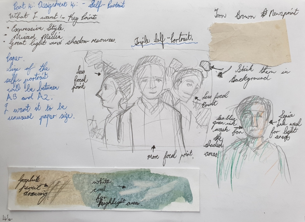
3. A Portrait or Self-Portrait Combining Line and Tone.
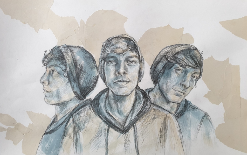
For this part of the assignment, I chose to do a self-portrait, but in a different subject style.
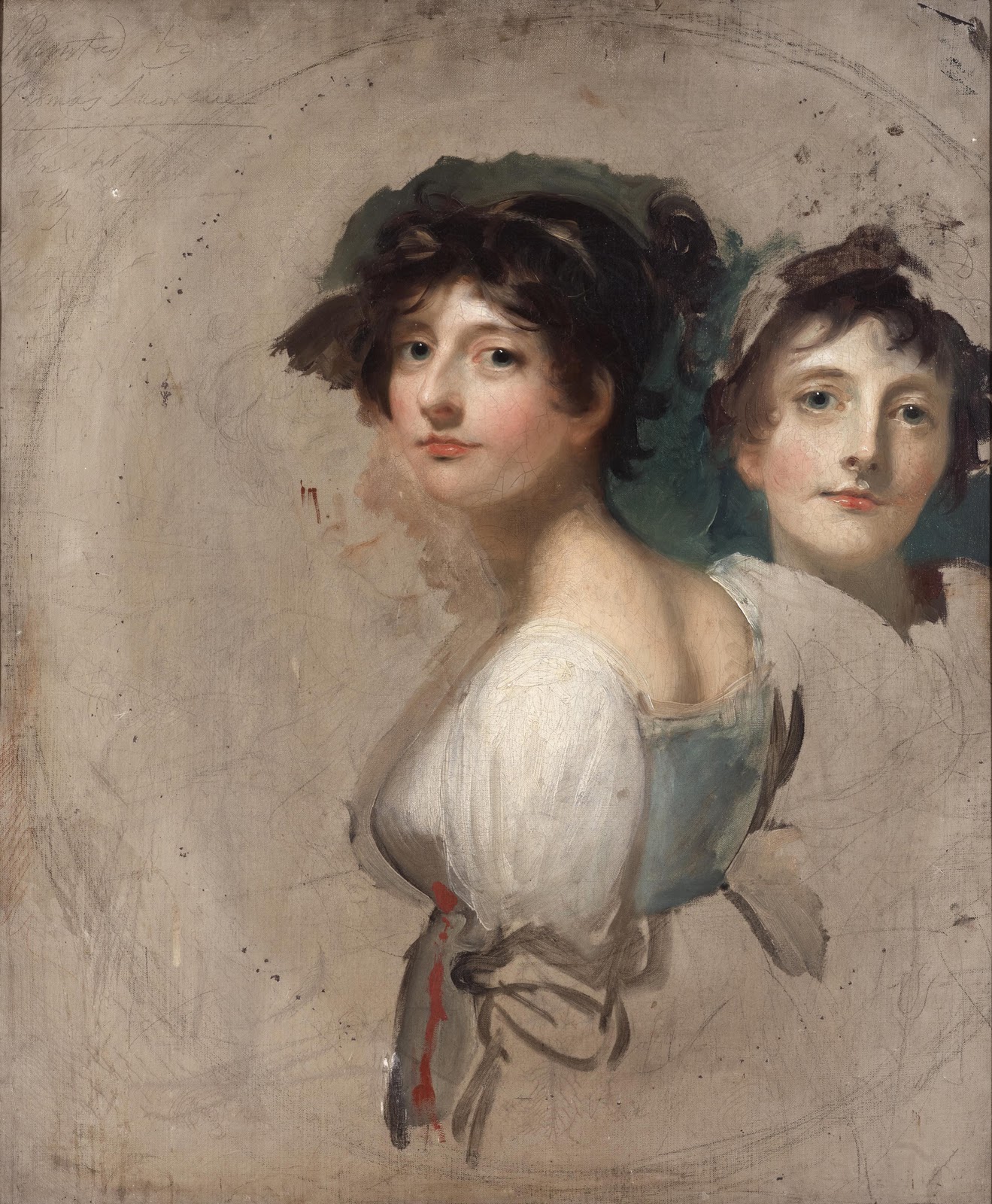
So firstly before I did some look back at my previous studies or researches, this image idea came into my mind and the idea is a triple self-portrait.
The triple portrait idea was an artwork of one of my ancestors by the celebrated artist Sir Thomas Lawrence, who has painted a couple of portraits of my ancestors in his days, so this triple portrait of my family ancestor Emilia Butler, Lady Cahir, later Countess of Glengall (1776-1836) c. 1804-1805, was the inspirational artwork of my childhood. It such an elegant artwork, that looks like a mixed media painting and was done with charcoal, pastel and oil paint.
You can see my written ideas for the self-portrait part of this assignment in Fig. 17 “Look Back Notes, Ideas and Inspirations – A4 Sketchbook, Page 48“, below.
Fig. 17 Look Back Notes, Ideas and Inspirations – A4 Sketchbook, Page 48
Here is also link from previous study in Part 2: Project 3 – Exercise 4 that I used the sea blue green ink colour idea for the final triple self-portrait drawing.
Preliminary Drawing for Triple Self-Portrait – A4 Sketchbook (Page 46)
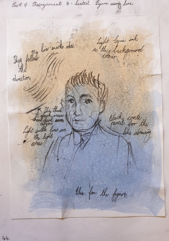
I did a preliminary drawing and test on the colours and mediums that are combining together for the final drawing. I plan to use old newsprint paper and tear them up to stick in the background of the triple self-portrait. My chosen ink colours are the sepia for light areas and sea blue green for shadow areas. I also planned on using a graphite 4B pencil and white coal stick for adding highlights on top the dried ink at the end of the drawing.
You can see the preliminary drawing with mediums for the final drawing in Fig. 18 “Preliminary Sketches – A4 Sketchbook, Page 46“, below.
I started drawing the big shapes in like my three faces with the graphite pencil lightly, at the same time I used a mirror to look at while drawing, but I used a photo reference for the side profile face. After drawing in the three face shapes, then next is the overlaying line marks and shading the tonal areas.
After finishing the graphite pencil drawing, I used fixative spray to fixative the graphite medium before going over with the two ink colour washes, sepia for the light areas and sea blue green for the shaded areas. The ink washes create a good sense of feeling, like there is energy exploding from three different directions.
Lastly was the old torn up newsprint paper that I wanted to combine the same colour of Sir Thomas Lawrence’s triple portrait background into my triple self-portrait. But doing the tear up effect in the background makes it more abstract with a twist of old colour.
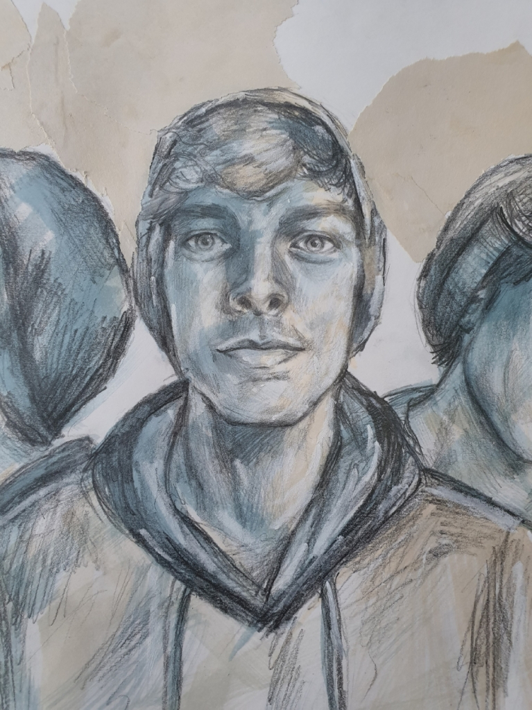
You can see the final self-portrait drawing in Fig. 19 “Final Self-Portrait Drawing – Graphite Pencil 4B, White Coal, Ink Washes and Torn Up Newsprint Paper on White Cartridge Paper 37 x 58cm, 280gsm“, below.
Fig. 19 Final Self-Portrait Drawing – Graphite Pencil 4B, White Coal, Ink Washes and Torn Up Newsprint Paper on White Cartridge Paper 37 x 58cm, 280gsm
Here is a close up of the looking ahead face from the final triple self-portrait, see in Fig. 20 “Final Self-Portrait Drawing ‘Looking Ahead’ – Graphite Pencil 4B, White Coal, Ink Washes and Torn Up Newsprint Paper on White Cartridge Paper 37 x 58cm, 280gsm“, below.
Fig. 20 Final Self-Portrait Drawing ‘Looking Ahead’ – Graphite Pencil 4B, White Coal, Ink Washes and Torn Up Newsprint Paper on White Cartridge Paper 37 x 58cm, 280gsm
Here is a close up of the slight angle face from the final triple self-portrait, see in Fig. 21 “Final Self-Portrait Drawing ‘Slight Angle’ – Graphite Pencil 4B, White Coal, Ink Washes and Torn Up Newsprint Paper on White Cartridge Paper 37 x 58cm, 280gsm“, below.
Fig. 21 Final Self-Portrait Drawing ‘Slight Angle’ – Graphite Pencil 4B, White Coal, Ink Washes and Torn Up Newsprint Paper on White Cartridge Paper 37 x 58cm, 280gsm
Here is a close up of the side profile face from the final triple self-portrait, see in Fig. 22 “Final Self-Portrait Drawing ‘Side Profile’ – Graphite Pencil 4B, White Coal, Ink Washes and Torn Up Newsprint Paper on White Cartridge Paper 37 x 58cm, 280gsm“, below.
Fig. 22 Final Self-Portrait Drawing ‘Side Profile’ – Graphite Pencil 4B, White Coal, Ink Washes and Torn Up Newsprint Paper on White Cartridge Paper 37 x 58cm, 280gsm
Log Book Notes
Here is my written notes for the triple self-portrait drawing, see in Fig. 23 “Log Book Notes“, below.
For this exercise, I decided to draw a female portrait from imagination. I always have this habit of drawing a beautiful young female face in a regency era hairstyle, this would often depict her face features with a beautiful nose and eyes that catch your attention.
I’m very used to drawing faces from my own vision or imagination, which I have been doing since a little child.
First Drawing – Final Drawing
For the first drawing in the A4 sketchbook, which I call this one as the final drawing. I used a black Conte pencil to do this drawing.
I love her piercing beautiful eyes and the elegant nose that draws your attention towards her eyes, she also is shown in an inspired regency hairstyle that appeared during the 1790’s. You can see this drawing in Fig. 1 “Imagination Portrait – Black Conte Pencil in A4 Sketchbook, Page 35“, below.
Fig. 1 Imagination Portrait – Black Conte Pencil in A4 Sketchbook, Page 35
Second Drawing
For the second drawing which I used a 2mm graphite clutch pencil 2B in the A4 sketchbook. This shows her face in a slight turned angle and looking up in a calming mood. You can see the drawing in Fig. 2 “Imagination Portrait – 2mm Graphite Clutch Pencil 2B in A4 Sketchbook, Page 36“, below.
For this drawing, I used a black gel pen in the A4 sketchbook. These show my imaginative lady in her different mood looks and these were quick sketches. You can see them in Fig. 3 “Imagination Portrait Different Moods – Black Gel Pen in A4 Sketchbook, Page 37“, below.
Fig. 3 Imagination Portrait Different Moods – Black Gel Pen in A4 Sketchbook, Page 37
Log Book Notes
Here is a page from my log book, these are the answers for the questions that were asked in the exercise 3 on page 110. You can see it in Fig. 4 “Log Book Note“, below.
Research artists’ self-portraits. Begin by looking at historic examples, such as Rembrandt and van Gogh, and then use the reading list and other resources at your disposal to look at some self-portrait styles that have emerged in contemporary art. How do contemporary artists approach tone, medium, pose, story, etc., in self-portraiture. Make notes in your learning log.
Historical Artists Self-Portraiture
In the early centuries, artists would often paint themselves in a religious and classical style, such as the Renaissance era, where the subject was based on religions. Here we can see below in Fig. 1 “Albrecht Dürer Self-Portrait” (1500), this was painted by the classical German Renaissance artist Albrecht Dürer, who seems to look like a very religious artist of his time. You can see the deep tonal values that surrounded his head, while great light source casts over his face that brings out more sharp details.
Fig. 1 “Albrecht Dürer Self-Portrait” (1500)
Here moving on towards the 18th century where artists would paint or draw themselves in different emotions such as horror, flirty, playful and theatrical facial expressions. Here is a great self-portrait drawing by Sir Joshua Reynolds, showing off his horror facial expressions. You can see the drawing below in Fig. 2 “Self-Portrait as a Figure of Horror” (c. 1784).
Fig. 2 “Self-Portrait as a Figure of Horror” (c. 1784)
Moving towards the 19th century, during the early 19th century, this is where artists would change the facial expression to a calm and romanticism style. Here is an good self-portrait drawing of the celebrated artist John Constable who is showing off his handsome romanticism facial expressions in a striking contrast pose, see below in Fig. 3 “Self-Portrait” (1806).
Fig. 3 “Self-Portrait” (1806)
During the mid towards the end of the 19th century, artists would paint themselves in their studios or surround by a theme or subject that they often enjoyed painting or drawing. This also was an era where many art movements became involved in their own painting and drawing styles, such as the impressionist fleeting brush strokes.
Here we can see a very interesting self-portrait by Henri Fantin-Latour, who has a slight twist style that related to contemporary artists, we can see the atmosphere he has going on in his art studio. The artists’ painting style gives a sense as if he is trying to hide away, but also intends to look at himself in the mirror. It’s a loose and expressive artwork. You can see it below in Fig. 4 “Self-Portrait” (1860).
Fig. 4 “Self-Portrait” (1860)
During the 20th century, self-portraits came in many different roles such as an artist would paint themselves with someone else in the artwork, but still called it as a self-portrait. Here is a charming example of an artist by the name Christian Schad with a nude female, the artist stands out as a focal point, because of his glaring eyes that catch your attention, see the artwork below in Fig. 5 “Self-Portrait” (1927).
Fig. 5 “Self-Portrait” (1927)
During the mid towards the end of the 20th century, artists used different mix medias in their self-portraits, such as art movement Pop Art came into popularity, if we look at artist Andy Warhol’s self-portrait using different mediums such as screenprint and acrylic paints on canvas. His colours are approached in three tones that are bright and bold, giving a pop twist of fun.
You can see the Warhol’s self-portrait below in Fig. 6 “Self-Portrait” (1967).
Fig. 6 “Self-Portrait” (1967)
From the pop art style, this is when contemporary art ideas started developing and moving into the 21st century as an important new foundation.
Contemporary Artists SELF-PORTRAITURE
If we look at Tracey Emin’s self-portrait below in Fig. 7 “Self Portrait in Mirror” (2014), we can see the violence ink marks as if she was so frustrated, this falls under the modern art and contemporary art style. In her artworks, there is a story being told by it’s tones, colours and bold marks that shows her emotions and meaning that play a role in her life.
Fig. 7 “Self Portrait in Mirror” (2014)
Here is another contemporary self-portrait by artist Piet van den Boog, who shows himself as Vincent van Gogh in his self-portrait, giving the idea of a modern and historical style that been plotted into one piece of work. He has shown bold striking colours and some of these colours are related to the artist Vincent van Gogh. You can see the self-portrait below in Fig. 8 “Self Portrait as Vincent” (2017).
Fig. 8 “Self Portrait as Vincent” (2017)
That’s the end of the research point about artists self-portraiture.
For this exercise, I posed myself in front of a mirror and drew my own head from different angles in the A3 sketchbook with the use of different mediums such as graphite, charcoal and Conte black pencil.
In the A3 sketchbook, each of these several drawings were done within five-minutes. In the beginning, I had some struggling moments with trying to get some likeness of myself in the drawings, but I knew it didn’t have to be accurate, but then in the later stage drawings, I started picking up my likeness well.
First – Sketchbook A3 – Self-Portrait Drawings
First Self-Portrait Drawing
For the first drawing, I did it with a willow charcoal stick and a putty eraser in the A3 sketchbook on page seven, this view was from looking straight at the mirror. I love the energy and tonal values in this self-portrait, but it doesn’t have my likeness, or maybe I’m just looking at myself when I was ten years younger, which is pretty harsh to say about myself, haha.
You can see the drawing in Fig 1 “Front View Self-Portrait – Willow Charcoal Sticks, A3 Sketchbook (Page 7)“, below.
For the second self-portrait drawing, I used a Conte 4B black compressed charcoal stick in the A3 sketchbook on page eight. I find it very uncomfortable to used a charcoal compressed stick than a willow charcoal stick. The likeness is nothing like me and I find myself not impressed with the facial proportions, the eyes are too big and out of space. But it also shows wonderful expression in the face like I’m looking very curious about what’s going on in my drawing.
You can see this drawing in Fig 2 “Slight Angle View Self-Portrait – Black Conte Compressed Charcoal 4B, A3 Sketchbook (Page 8)“, below.
In this drawing, I used a black Conte Pierre Noire pencil in the A3 sketchbook on page nine. I love this drawing, because I kept my pencil moving around the drawing. I find my likeness way better here, also I can recognized my high cheekbones. My eyes capture the mood expression that I’m feeling. The tonal values and mark-makings are great and the light source makes sense to me in my self-portrait.
You can see this drawing in Fig. 3 “Tilted Back View Self-Portrait – Black Conte Pierre Noire Pencil, A3 Sketchbook (Page 9)“, below.
Fig. 3 Tilted Back View Self-Portrait – Black Conte Pierre Noire Pencil, A3 Sketchbook (Page 9)
Fourth Double Self-Portrait Drawings
In this drawing I used a 2B graphite 2mm clutch pencil without using the eraser in my A sketchbook on page ten. Each of these two drawings were done within five-minutes. I find the top looking down view point drawing better and has my likeness also. But the bottom drawing doesn’t have any likeness and no tonal shadings or shapes structure.
You can see the two drawings in Fig 4 “Two Different Views Self-Portrait – 2B Graphite Clutch Pencil 2mm, A3 Sketchbook (Page 10)“, below.
Fig 4 Two Different Views Self-Portrait – 2B Graphite Clutch Pencil 2mm, A3 Sketchbook (Page 10)
Notes for the A3 Sketchbook Self-Portrait Drawings
I find these drawings great for learning to warm-up and be prepared for the second drawing.
They give me some thoughts on what mark-makings will work for the second drawing.
This helps me to identify the proportion errors that I need to be prepared to fix before going onto the next drawing.
Second –Final Self-Portrait Drawing
For the second interesting self-portrait drawing, I used acrylic drawing inks, sepia micron pen and black gel pen on an A3 white cartridge paper, 200gsm. I wanted to create some atmosphere with a lot of emotions in my self-portrait. I love using colour ink washes and pens as mark-making tools. So I planned on using the lines and cross-hatching mark-makings for this drawing.
The ink colours were navy blue, orange, sepia, black and olive. I used a sepia micron pen mostly in the face areas, because it blends well with the skin tones. Then I use the black gel pen for the hair and the green jersey. I find all these mediums wonderful and they give a very calming movement style.
The proportions and likeness is great, but I feel like I made my nose a bit longer in the drawing. This self-portrait drawing was done within 30-minutes. I find this drawing the most favourite so far in this exercise, it just captures my art style, my feelings and colours.
You can see this drawing in Fig 5 “Final Self-Portrait – Ink Washes, Sepia Micron Pen & Black Gel Pen, A3 White Cartridge 200gsm“, below
Fig 5 Final Self-Portrait – Ink Washes, Sepia Micron Pen & Black Gel Pen, A3 White Cartridge 200gsm
Here is a close-up details of the mark-makings of the second final drawing, see in Fig. 6 “Final Self-Portrait (Close-Up) – Ink Washes, Sepia Micron Pen & Black Gel Pen, A3 White Cartridge 200gsm“, below.
Fig. 6 Final Self-Portrait (Close-Up) – Ink Washes, Sepia Micron Pen & Black Gel Pen, A3 White Cartridge 200gsm
Log Book Notes
Here is my log book written notes for this exercise, see in Fig. 7 “Log Book Notes“, below.
Here is the great portrait artist of his time known as Peter Paul Rubens, he was famously known for his portrait drawings with colour mediums such as using red and black chalk, with white chalk for light areas in his portraits. Using these colours help to make the face have more forms and shapes.
You can see an example of Rubens’ drawing of his first wife Isabella in Fig. 1 “Drawing of Isabella Brant (c.1621-1622)“, below.
Fig. 1 Drawing of Isabella Brant, c.1621-1622
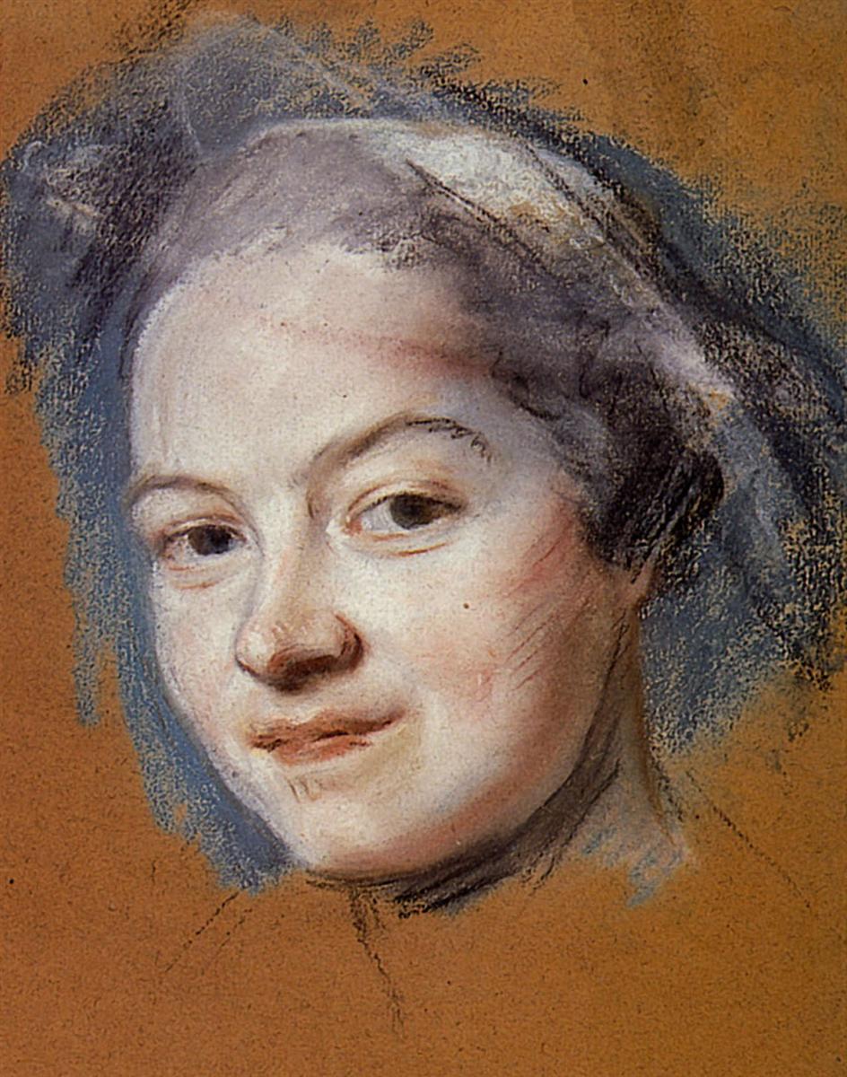
During the 18th century, an artist by the name Maurice Quentin de La Tour who was very brilliantly known for his drawings in pastels and chalks. His drawings show large interests in the way his mark-makings work well with the mediums. La Tour started bringing colour pastels into portrait drawings in a fresh and expressive way.
You can see an example of La Tour’s drawing of a female face in Fig. 2 “Madame Favart (Date Unknown)“, below.
Fig. 2 Madame Favart, Date Unknown
During the 19th century, there were a lot of portrait artists that used mixed medias and created portraits in different ways, such as the different techniques styles like the impressionists and realism style. But outstood was a great artist that we all may know as Edgar Degas, he is recognized for his pastel drawings of dancers and portraits. He showed great value in mixed colours and deep compression mark-makings.
Here we can see Degas pastel drawing of a male portrait depicting such striking mark-makings and out bursting colours, Fig. 3 “Zacherie Zacharian (1886)“, below.
Fig. 3 Zacherie Zacharian, 1886
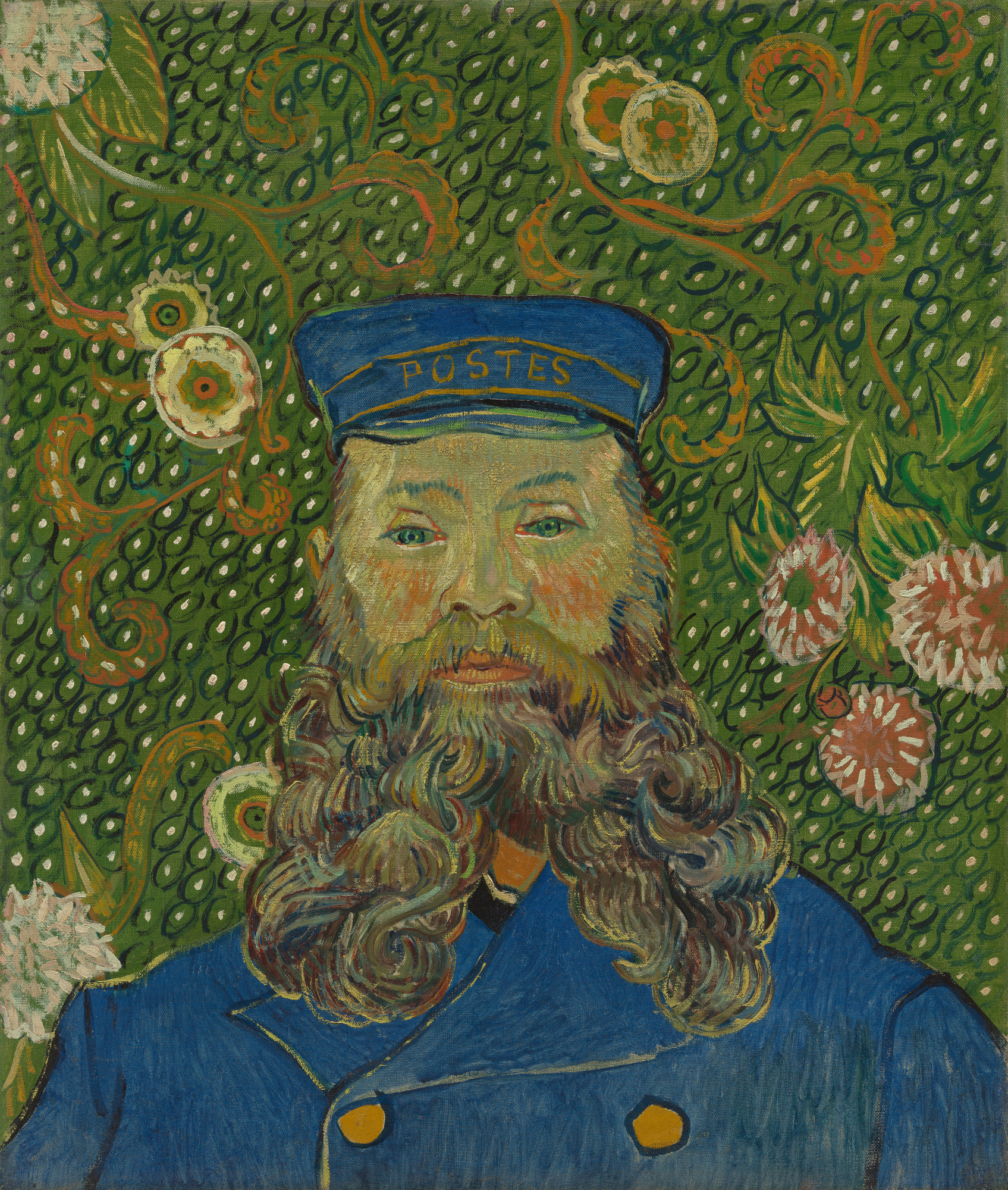
Next is also Vincent van Gogh, whose artworks followed a very different way with opposite colours, he mostly painted his portraits in unusual striking bold colours with wonderful background patterns. His portraits also showed a lot of different marks and capturing light well.
Here we can see one of van Gogh’s portrait in Fig. 4 “Joseph Roulin (Early 1889)“, below.
Fig. 4 Joseph Roulin, Early 1889
In the early 20th century, there was a little known artist named Giovanni Boldini, who did quick sketches with water colour and pencils, just like mixed media style. His style was very different and striking expressive movements.
Here we can see Boldini’s water colour paint and pencil sketch of a lady, which I assume to be Consuelo Vanderbilt, the Duchess of Marlborough, Fig. 5 “Head of a woman, looking to the left (1906)“, below.
Fig. 5 Head of a woman, looking to the left, 1906
During the 20th century, there was a pop art culture movement that was inspired my Andy Warhol, who did a lot of abstract portraits. Bright, bold and explosive style in most of his pop art portraits.
Here we can see a pop art portrait by Warhol in Fig. 6 “Marella Agnelli (1973)“, below.
Fig. 6 Marella Agnelli, 1973
Contemporary Artists
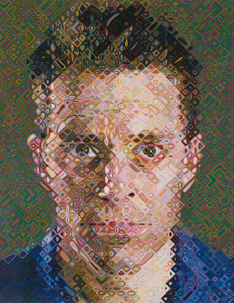
Here is a great contemporary artist by the name Chuck Close, whose recognized for his large size portraits with different shapes, illusions and tones of mixed colours that end up looking realistic once finished.
You can see one of Chuck Close large interesting portrait in Fig. 7 “James (2002)“, below.
Fig. 7 James, 2002
Here is another favourite contemporary artist of mine, who has similar style to the other two artists Graham Little and Elizabeth Peyton, but this artist by the name Howard Tangye has more sensual feelings and delighted colours, created by mixed medias.
You can see one of Tangye’s artworks in Fig. 8 “A Stranger Came (2018)“, below.


.jpg)
.jpg)

.jpg)