I enjoyed the process finding new ways to build a stronger foundation of understanding how part four has asked me to do many researches and learning new challenges, which this shows me on how important that resources and images can give me a new direction on what’s going to happen in the next part. In this part four so far, it has broken some boundaries that I refused to go any further over my drawing comfort zone. For example such as I like to be very detailed in my drawings, but I had to forced myself to break away from being too detailed in some exercises and be a bit loose in my drawings, which this has made me to develop another comfort zone and therefore I feel stronger and relaxed in moving forward onto the next part. I have learnt to face the struggling challenges throughout drawing one so far and following my tutor advices with helpful tips from the previous assignments reports. So now I’m prepared to take another big challenging step into the next new part, which is part five, and learn to develop more ideas and sharing my thoughts in contexts.
Assessment Criteria Points:
Demonstration of technical and visual skills – materials, observational skills, visual awareness and compositional skills (35%).
For this part four so far has given me the understanding of developing new skills in the technical and visual side, with the use of different mediums. I also have placed myself in between the technical and visual skills by combining them to blend into each other together by allowing my observational skills develop more and giving my drawings more accurate and well compositional.
I made sure that whenever I struggled or made a mistake in a skill in the exercises, I will tell myself to go back and start it over again with the help of my visual acknowledge skills, that help to point me out to the skills that needed to be fixed or practiced a bit more, for example do more preliminary drawings.
Quality of outcome – content, application of knowledge, presentation of work in a coherent manner, discernment, conceptualisation of thoughts, communication of ideas (20%).
Looking back at the two A1 size assignment drawings that I have produced, which was a very exciting experience at same time with very strong communication ideas and thoughts that are developed by different materials and research resources. The most astonishing fact about the assignment four that has given me a new understanding foundation is that this was my first time doing larger size drawings, which I have never drawn anything larger than an A2 size since beginning of drawing one, part one.
I find the quality outcome as a strongly influenced by seeing other old and modern artworks from the research points that inspired me throughout part four and helped me in assignment four. My knowledge and presentation of the work in a coherent manner is developed by how much I understand which media will work in the final drawings and, picturing in my mind on how I want it’s final results to turn out in an interesting and expressive manner, that will show the viewers how much I have learnt from this drawing one course. There are areas within part four, that I wished to share it in contents and thoughts more in the assignment four, so for my next assignment, I will show the developing quality of outcome with the use of information.
Demonstration of creativity – imagination, experimentation, invention, development of a personal voice (25%).
In the part four so far, I have seen a great chance on the way that I layout my plans for the demonstration of creativity, with the use of different resources and materials, such as inventing different mediums and ideas in my sketchbook and writing down how I see my own imagination ideas relate to some inspired artworks from the research points.
I have created a new personal voice within the assignment four, which I see my voice as a freed and exciting style, I also started experimenting on a new skill which is to be less detailed and be more loose with using different expressive marks.
Context reflection – research, and critical thinking (learning logs and, at second and third level, critical reviews and essays) (20%).
I found it interesting in the research points throughout this part four, it has shared the same interest that I favour at doing, which is portraiture and figures. I find my essays have become less written information, which is good fact for not making it look too jumbled up with too many unnecessary words, but also not impressive as I have seen a weaken side in writing down the important facts that would make my essay a strongly interest to look at.
I try keep my critical thinking and critical reviews in a simple context and not making it overflow in a controlling way, I made sure that if I’m criticized for an drawing, then I don’t let it affect me as I will fix it myself. I find motivational critical reviews helpful and pushes me forward into a better direction. I haven’t had the chance to visit any galleries or exhibitions due to the outbreak of Covid-19, but my research points has given me a reflection on how I can picture these artworks and their information in a gallery or exhibition.
For this assignment four, it was very interesting at how all three drawings results came out. I find doing the preliminary drawing studies and notes with some research on inspiring artists as very helpful tips for this assignment.
For the A1 seated and reclining drawings, I used live models, who were friends of mine and were glad to pose for the assignment drawings.
1. Figure Study using Line (A1) – Seated Model in an Upright Chair.
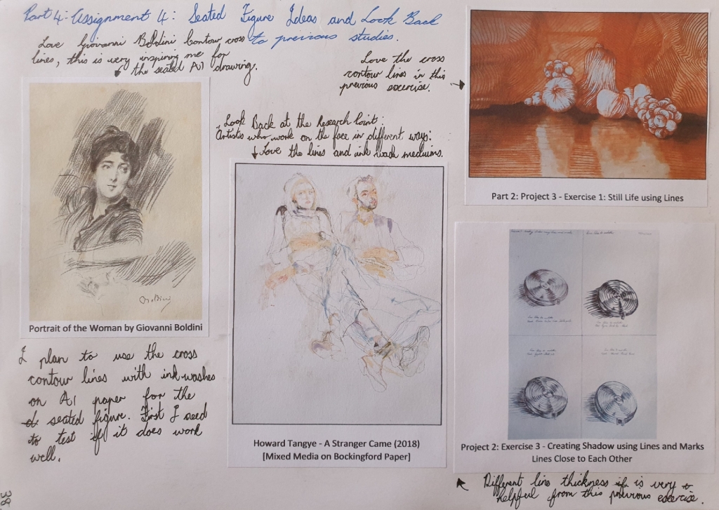
First I did some look back at my previous studies and research points to collect ideas and inspirations. I came across a line style that I used in previous exercises called Cross Contour Lines, which seems perfect for my final seated pose drawing.
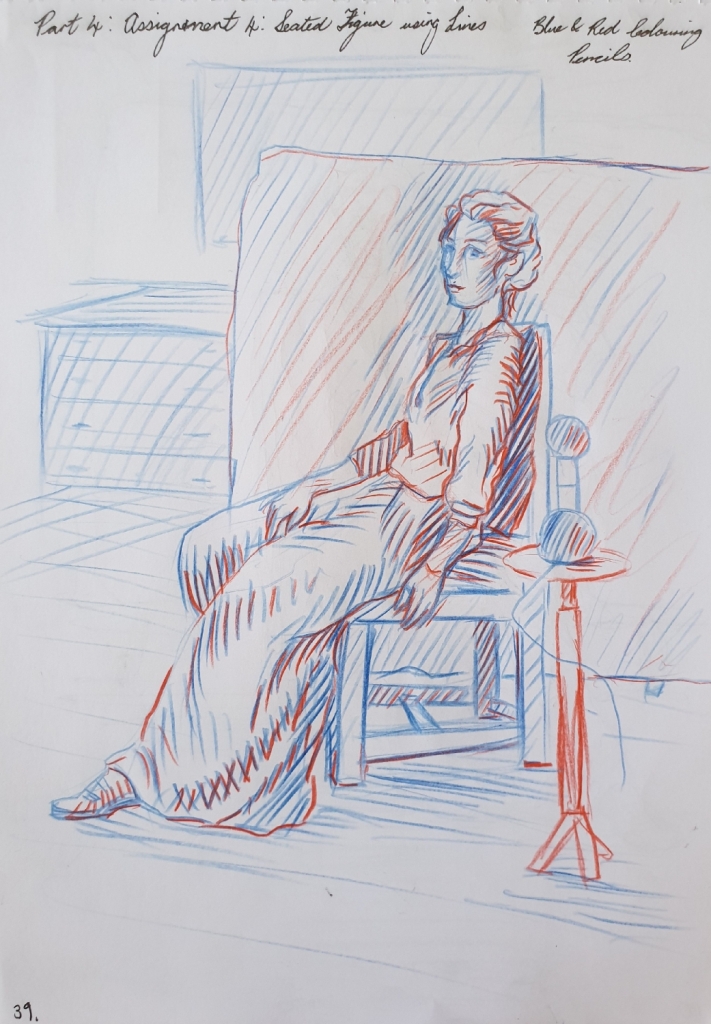
I first used my female friend Tessa as the model for the first view preliminary sketches, but then she couldn’t pose for the longer pose for some reasons, so I got my male friend Chad who was willing to pose for the view more preliminary sketches and the final drawing pose.
Here you can see the different line style preliminary drawings of Tessa, below.
First drawing is done with a blue and red colouring pencil in the A4 sketchbook on page 39, see in Fig. 2 “Preliminary Sketch of Tessa – Blue and Red Pencil in A4 Sketchbook, Page 39“, below.
Fig. 2 Preliminary Sketch of Tessa – Blue and Red Pencil in A4 Sketchbook, Page 39
For the second drawing of Tessa, I used black, blue and red gel pens in this drawing. See in Fig. 3 “Preliminary Sketch of Tessa – Blue, Black and Red Gel Pen in A4 Sketchbook, Page 40“, below.
Fig. 3 Preliminary Sketch of Tessa – Blue, Black and Red Gel Pen in A4 Sketchbook, Page 40
In this final preliminary drawing of Tessa, I used a 2mm graphite clutch 2B pencil in the A4 sketchbook on page 41, see in Fig. 4 “Preliminary Sketch of Tessa – 2mm Graphite Clutch 2B Pencil in A4 Sketchbook, Page 41“, below.
Fig. 4 Preliminary Sketch of Tessa – 2mm Graphite Clutch 2B Pencil in A4 Sketchbook, Page 41
Preliminary Drawings of Chad – A4 Sketchbook
When Tessa couldn’t pose for any longer for some reasons, I managed to have my male friend Chad to pose for the rest of seated preliminary sketches and the final drawing.
First sketch of Chad was done with a black gel pen in the A4 sketchbook on page 42. I love this pose view point as it shows great foreshortening, which I will use the same pose in the final A1 seated drawing. You can see it in Fig. 5 “Preliminary Sketch of Chad – Black Gel Pen in A4 Sketchbook, Page 42“, below.
Fig. 5 Preliminary Sketch of Chad – Black Gel Pen in A4 Sketchbook, Page 42
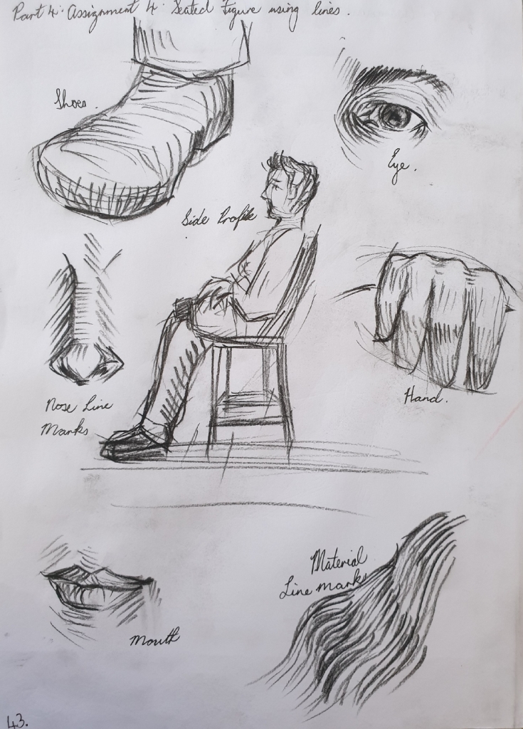
In the second drawing, I used a black Conte pencil and loved the medium, so looking forward to using it in the A1 final drawing. These show some of the feature areas with using the cross contour lines style. You can see it in Fig. 6 “Preliminary Sketch of Chad – Black Conte Pencil in A4 Sketchbook, Page 43“, below.
Fig. 6 Preliminary Sketch of Chad – Black Conte Pencil in A4 Sketchbook, Page 43
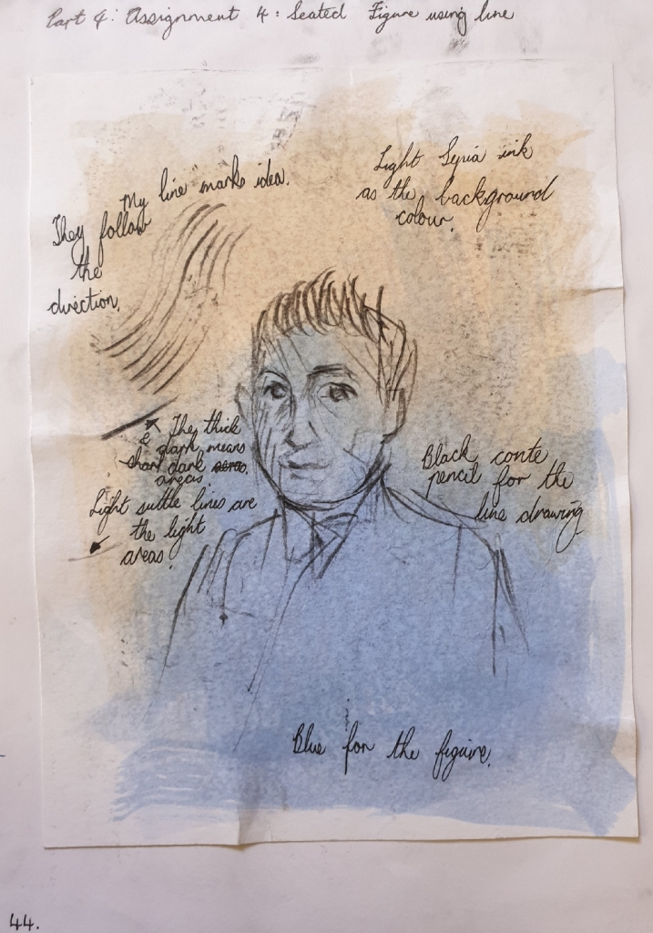
For the final preliminary sketch of Chad, I tried the black Conte pencil with sepia and navy blue acrylic drawing ink washes. I love how these mediums combine together and it shows great expressive feelings. I will be using these mediums in the final A1 drawing. See in Fig. 7 “Preliminary Sketch of Chad – Black Conte Pencil and Ink Wash in A4 Sketchbook, Page 44“, below.
Fig. 7 Preliminary Sketch of Chad – Black Conte Pencil and Ink Wash in A4 Sketchbook, Page 44
So finishing off with the preliminary drawings and updating my log book with written notes. Then I started on the A1 size final seated drawing of Chad.
Final Drawing (A1) – Seated Model using Lines
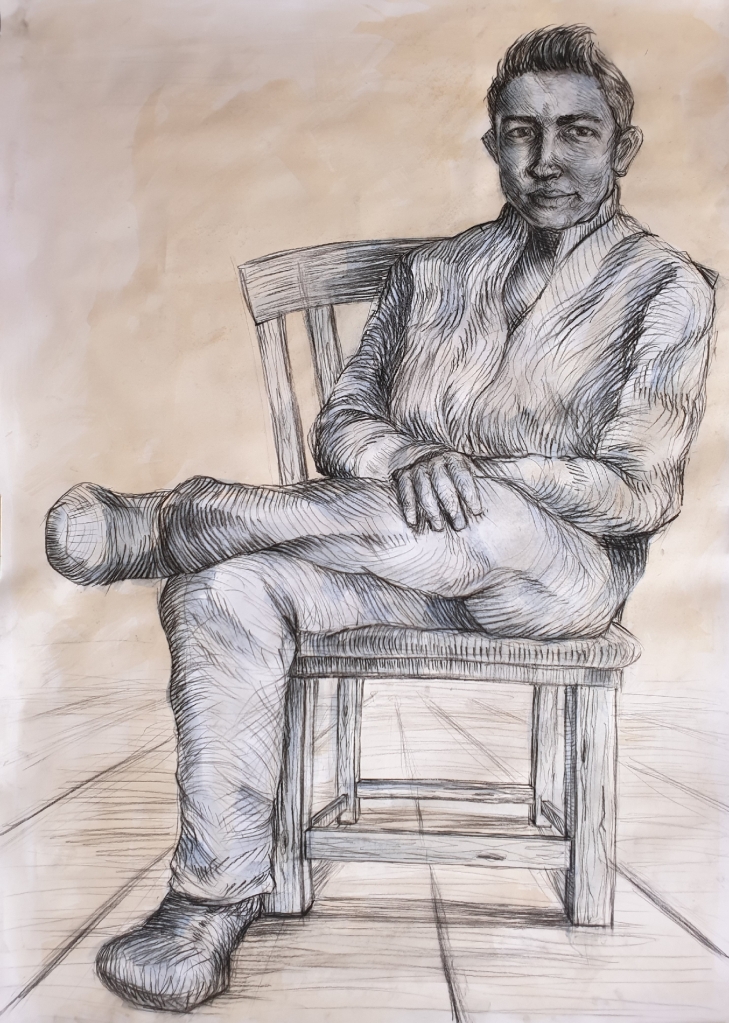
For the final drawing, I asked Chad to do the same pose as he did in one of the preliminary sketches as seen in Fig. 5 “Preliminary Sketch of Chad – Black Gel Pen in A4 Sketchbook, Page 42“, but this time, I used the natural sunlight source from the window.
I first painted the sepia and navy blue acrylic drawing ink washes on the A1 white cartridge paper 280gsm, which was mounted to a board. After doing the ink washes, I went to draw in the the big shapes like for example the chair and figure outlines with the black Conte pencil lightly.
After getting the shapes well proportioned, I then went into the figure with cross contour lines with the compression of the black Conte pencil or stick. Wide dark lines are for the shaded areas and light thin lines are the light areas. Bare in mind that my friend Chad is a short height person with a larger face.
Finishing this drawing was the best feeling and I love the outcome results of it, there is so much inspirations and techniques that stand out in this drawing. The way the cross contour lines follow the movement of the material and folds, has really well balanced the atmosphere of Chad’s figure.
There was a stage where I struggled in this drawing, which was trying to avoid of going into details with Chad’s face, because I feared that this drawing would end up as a portrait. But looking at it, all I can see is a seated figure who seems to have been very relaxed and enjoying the conversation that we shared during the 2-hours timeframe.
You can see the final A1 seated Chad using lines in Fig. 8 “Final Drawing of Chad Seated – Black Conte Pencil with Sepia and Navy Blue Ink Washes, A1 White Cartridge Paper, 280gsm“, below.
Fig. 8 Final Drawing of Chad Seated – Black Conte Pencil with Sepia and Navy Blue Ink Washes, A1 White Cartridge Paper, 280gsm
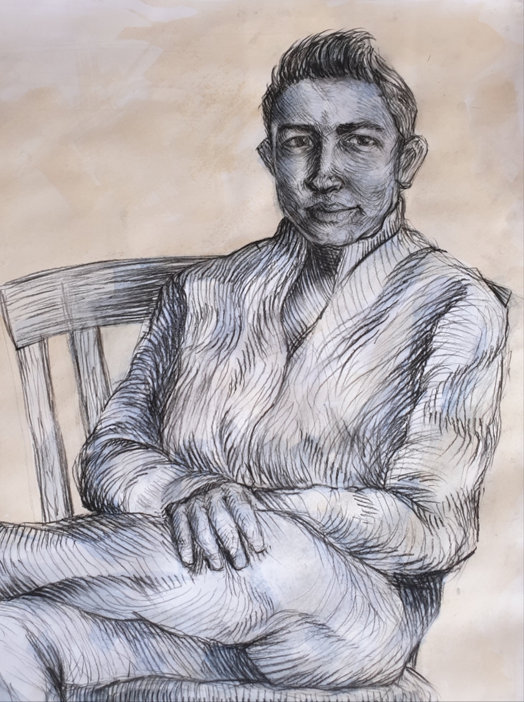
Here is a close up of Chad’s face and torso in Fig. 9 “Final Drawing of Chad, Close Up of the Details – Black Conte Pencil with Sepia and Navy Blue Ink Washes, A1 White Cartridge Paper, 280gsm“, below.
Fig. 9 Final Drawing of Chad, Close Up of the Details – Black Conte Pencil with Sepia and Navy Blue Ink Washes, A1 White Cartridge Paper, 280gsm
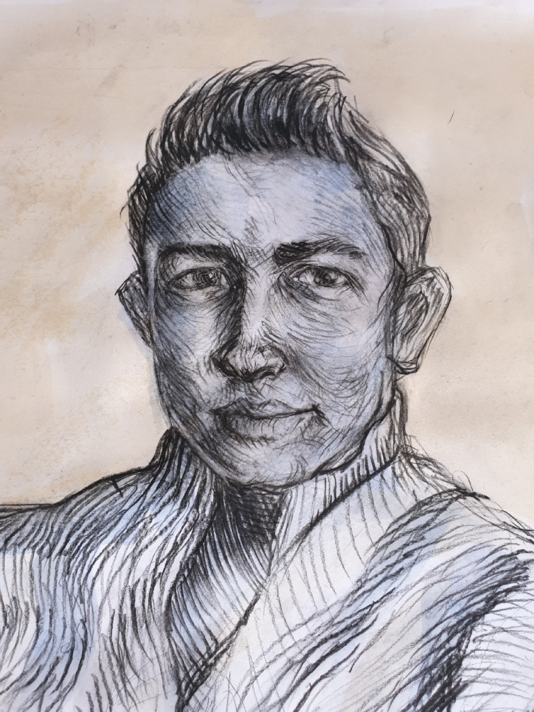
Here is also another close up of Chad’s face details, which gives a clear understanding of the cross contour line mark-makings. See in Fig. 10 “Final Drawing of Chad, Close Up of Face Details – Black Conte Pencil with Sepia and Navy Blue Ink Washes, A1 White Cartridge Paper, 280gsm“, below.
Fig. 10 Final Drawing of Chad, Close Up of Face Details – Black Conte Pencil with Sepia and Navy Blue Ink Washes, A1 White Cartridge Paper, 280gsm
Log Book Notes for the Seated Model using Lines
See in Fig. 11 “Log Book Notes“, below.
Fig. 11 Log Book Notes
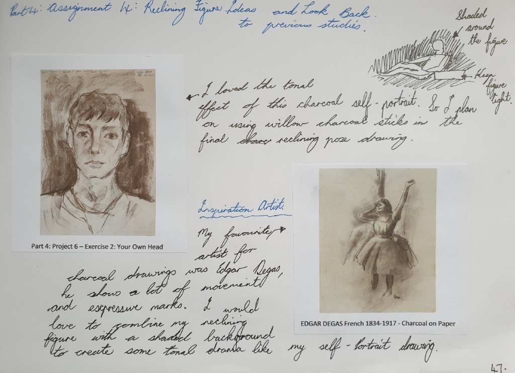
2. Figure Study using Tone (A1) – Reclining Model.
For this reclining pose drawing, I used my artist friend Calista to pose for me as she was happy to do so.
I did some look back at my previous studies and research points to collect ideas and inspirational ideas. I found an inspirational artist known for his expressive tonal charcoal drawings, which was Edgar Degas, here you can see a charcoal drawing in the link here: https://dygtyjqp7pi0m.cloudfront.net/i/35689/30744696_1.jpg?v=8D5E8FC771EC0E0 (Accessed 17/10/2020).
You can see my ideas in my A4 sketchbook on page 47, see in Fig. 12 “Look Back Notes, Ideas and Inspirations – A4 Sketchbook, Page 47“, below.
Fig. 12 Look Back Notes, Ideas and Inspirations – A4 Sketchbook, Page 47
Here is also link from previous study in Part 4: Project 6 – Exercise 2, that I used the charcoal expressive style idea for the final reclining pose drawing.
Preliminary Drawings of Reclining Calista – A4 Sketchbook (Page 45)
I did a page in the A4 sketchbook of preliminary sketches of Calista and getting the idea of which view angle will work for the A1 final reclining pose drawing. I also found the willow charcoal stick still the best medium to use for giving great tonal values and expressive marks, which I will use as my final A1 drawing medium.
Here you can see the preliminary sketches in Fig. 13 “Preliminary Sketches – Charcoal Pencil, Black Conte Pencil and Graphite Pencil, A4 Sketchbook, Page 45“, below.
Fig. 13 Preliminary Sketches – Charcoal Pencil, Black Conte Pencil and Graphite Pencil, A4 Sketchbook, Page 45
Final Drawing – Calista Reclining Pose
I first had Calista to do a reclining pose, wearing her black pants and light cream jersey, she also was instructed to rest her right arm on a fabric draped cardboard box. The light source came from natural sunlight from the window for this drawing.
I first drew the large body shapes lightly with the willow charcoal stick, then after that I went and blocked in the mid and dark tonal areas by using the flat side of the willow charcoal stick. When finished with using the willow charcoal stick, I then used a putty eraser to lift up the charcoal in some areas where there was some light source shining on, for example the face and jersey.
I love the results of the shaded dramatic tonal background, it makes the figure to be the main attention of the audience. The tonal values are well balanced and seeing this drawing as less detailed information makes it a very interesting reclining subject. Her figure size is well proportioned and her character can be seen clearly as a gentle lady.
You can see the final A1 reclining pose drawing in Fig. 14 “Final Drawing ‘Calista Reclining’ – Willow Charcoal Sticks on A1 White Cartridge Paper, 280gsm“, below.
Fig. 14 Final Drawing ‘Calista Reclining’ – Willow Charcoal Sticks on A1 White Cartridge Paper, 280gsm
Here is a close up of the final drawing, see in Fig. 15 “Final Drawing ‘Calista Reclining’ Close Up – Willow Charcoal Sticks on A1 White Cartridge Paper, 280gsm“, below.
Fig. 15 Final Drawing ‘Calista Reclining’ Close Up – Willow Charcoal Sticks on A1 White Cartridge Paper, 280gsm
Log Book Notes
Here is my written log book notes for the reclining pose drawing, see in Fig. 16 “Log Book Notes“, below.
Fig. 16 Log Book Notes
3. A Portrait or Self-Portrait Combining Line and Tone.
For this part of the assignment, I chose to do a self-portrait, but in a different subject style.
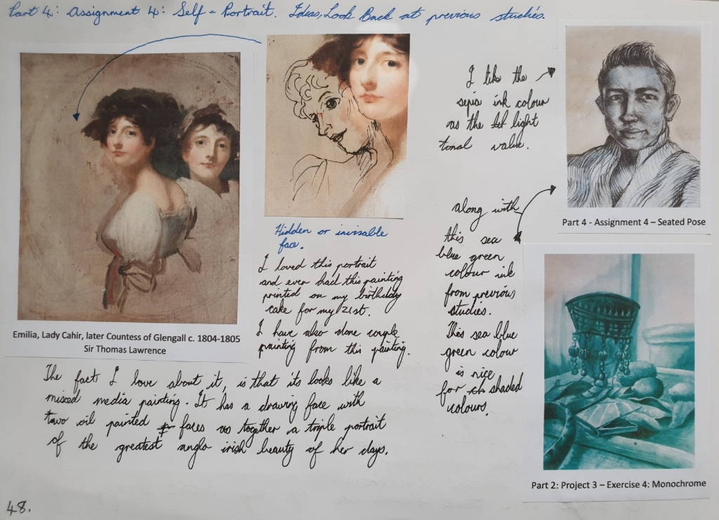
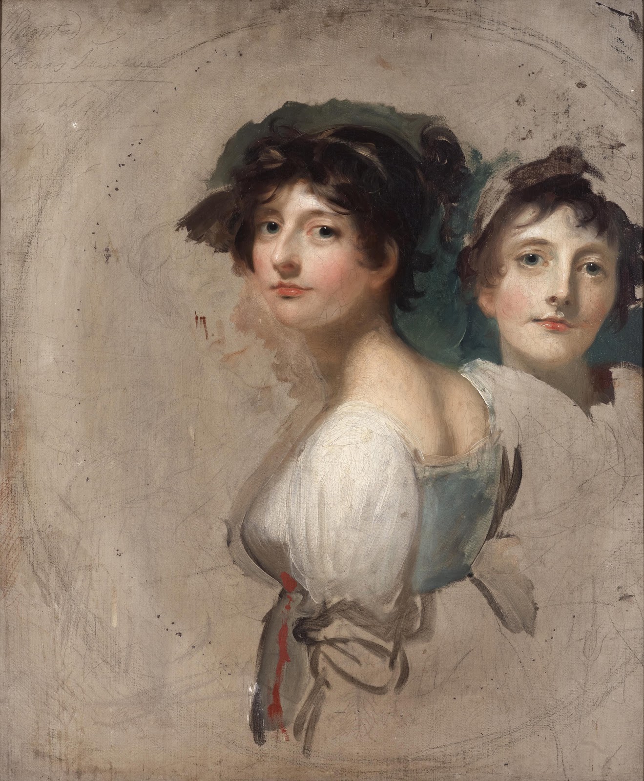
So firstly before I did some look back at my previous studies or researches, this image idea came into my mind and the idea is a triple self-portrait.
The triple portrait idea was an artwork of one of my ancestors by the celebrated artist Sir Thomas Lawrence, who has painted a couple of portraits of my ancestors in his days, so this triple portrait of my family ancestor Emilia Butler, Lady Cahir, later Countess of Glengall (1776-1836) c. 1804-1805, was the inspirational artwork of my childhood. It such an elegant artwork, that looks like a mixed media painting and was done with charcoal, pastel and oil paint.
You can see my written ideas for the self-portrait part of this assignment in Fig. 17 “Look Back Notes, Ideas and Inspirations – A4 Sketchbook, Page 48“, below.
Fig. 17 Look Back Notes, Ideas and Inspirations – A4 Sketchbook, Page 48
Here is also link from previous study in Part 2: Project 3 – Exercise 4 that I used the sea blue green ink colour idea for the final triple self-portrait drawing.
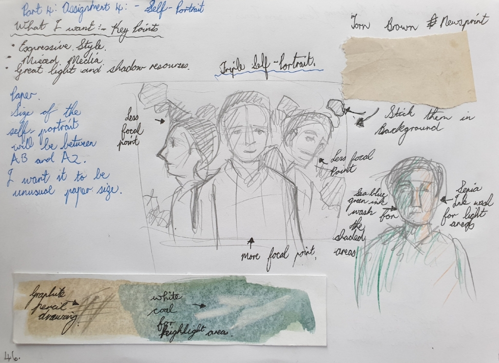
Preliminary Drawing for Triple Self-Portrait – A4 Sketchbook (Page 46)
I did a preliminary drawing and test on the colours and mediums that are combining together for the final drawing. I plan to use old newsprint paper and tear them up to stick in the background of the triple self-portrait. My chosen ink colours are the sepia for light areas and sea blue green for shadow areas. I also planned on using a graphite 4B pencil and white coal stick for adding highlights on top the dried ink at the end of the drawing.
You can see the preliminary drawing with mediums for the final drawing in Fig. 18 “Preliminary Sketches – A4 Sketchbook, Page 46“, below.
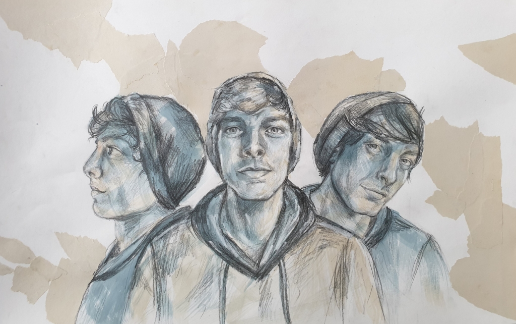
I started drawing the big shapes in like my three faces with the graphite pencil lightly, at the same time I used a mirror to look at while drawing, but I used a photo reference for the side profile face. After drawing in the three face shapes, then next is the overlaying line marks and shading the tonal areas.
After finishing the graphite pencil drawing, I used fixative spray to fixative the graphite medium before going over with the two ink colour washes, sepia for the light areas and sea blue green for the shaded areas. The ink washes create a good sense of feeling, like there is energy exploding from three different directions.
Lastly was the old torn up newsprint paper that I wanted to combine the same colour of Sir Thomas Lawrence’s triple portrait background into my triple self-portrait. But doing the tear up effect in the background makes it more abstract with a twist of old colour.
You can see the final self-portrait drawing in Fig. 19 “Final Self-Portrait Drawing – Graphite Pencil 4B, White Coal, Ink Washes and Torn Up Newsprint Paper on White Cartridge Paper 37 x 58cm, 280gsm“, below.
Fig. 19 Final Self-Portrait Drawing – Graphite Pencil 4B, White Coal, Ink Washes and Torn Up Newsprint Paper on White Cartridge Paper 37 x 58cm, 280gsm
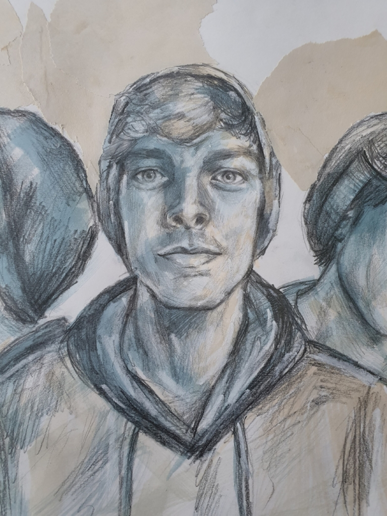
Here is a close up of the looking ahead face from the final triple self-portrait, see in Fig. 20 “Final Self-Portrait Drawing ‘Looking Ahead’ – Graphite Pencil 4B, White Coal, Ink Washes and Torn Up Newsprint Paper on White Cartridge Paper 37 x 58cm, 280gsm“, below.
Fig. 20 Final Self-Portrait Drawing ‘Looking Ahead’ – Graphite Pencil 4B, White Coal, Ink Washes and Torn Up Newsprint Paper on White Cartridge Paper 37 x 58cm, 280gsm
Here is a close up of the slight angle face from the final triple self-portrait, see in Fig. 21 “Final Self-Portrait Drawing ‘Slight Angle’ – Graphite Pencil 4B, White Coal, Ink Washes and Torn Up Newsprint Paper on White Cartridge Paper 37 x 58cm, 280gsm“, below.
Fig. 21 Final Self-Portrait Drawing ‘Slight Angle’ – Graphite Pencil 4B, White Coal, Ink Washes and Torn Up Newsprint Paper on White Cartridge Paper 37 x 58cm, 280gsm
Here is a close up of the side profile face from the final triple self-portrait, see in Fig. 22 “Final Self-Portrait Drawing ‘Side Profile’ – Graphite Pencil 4B, White Coal, Ink Washes and Torn Up Newsprint Paper on White Cartridge Paper 37 x 58cm, 280gsm“, below.
Fig. 22 Final Self-Portrait Drawing ‘Side Profile’ – Graphite Pencil 4B, White Coal, Ink Washes and Torn Up Newsprint Paper on White Cartridge Paper 37 x 58cm, 280gsm
Log Book Notes
Here is my written notes for the triple self-portrait drawing, see in Fig. 23 “Log Book Notes“, below.
For this exercise, I decided to draw a female portrait from imagination. I always have this habit of drawing a beautiful young female face in a regency era hairstyle, this would often depict her face features with a beautiful nose and eyes that catch your attention.
I’m very used to drawing faces from my own vision or imagination, which I have been doing since a little child.
First Drawing – Final Drawing
For the first drawing in the A4 sketchbook, which I call this one as the final drawing. I used a black Conte pencil to do this drawing.
I love her piercing beautiful eyes and the elegant nose that draws your attention towards her eyes, she also is shown in an inspired regency hairstyle that appeared during the 1790’s. You can see this drawing in Fig. 1 “Imagination Portrait – Black Conte Pencil in A4 Sketchbook, Page 35“, below.
Fig. 1 Imagination Portrait – Black Conte Pencil in A4 Sketchbook, Page 35
Second Drawing
For the second drawing which I used a 2mm graphite clutch pencil 2B in the A4 sketchbook. This shows her face in a slight turned angle and looking up in a calming mood. You can see the drawing in Fig. 2 “Imagination Portrait – 2mm Graphite Clutch Pencil 2B in A4 Sketchbook, Page 36“, below.
For this drawing, I used a black gel pen in the A4 sketchbook. These show my imaginative lady in her different mood looks and these were quick sketches. You can see them in Fig. 3 “Imagination Portrait Different Moods – Black Gel Pen in A4 Sketchbook, Page 37“, below.
Fig. 3 Imagination Portrait Different Moods – Black Gel Pen in A4 Sketchbook, Page 37
Log Book Notes
Here is a page from my log book, these are the answers for the questions that were asked in the exercise 3 on page 110. You can see it in Fig. 4 “Log Book Note“, below.
Research artists’ self-portraits. Begin by looking at historic examples, such as Rembrandt and van Gogh, and then use the reading list and other resources at your disposal to look at some self-portrait styles that have emerged in contemporary art. How do contemporary artists approach tone, medium, pose, story, etc., in self-portraiture. Make notes in your learning log.
Historical Artists Self-Portraiture
In the early centuries, artists would often paint themselves in a religious and classical style, such as the Renaissance era, where the subject was based on religions. Here we can see below in Fig. 1 “Albrecht Dürer Self-Portrait” (1500), this was painted by the classical German Renaissance artist Albrecht Dürer, who seems to look like a very religious artist of his time. You can see the deep tonal values that surrounded his head, while great light source casts over his face that brings out more sharp details.
Fig. 1 “Albrecht Dürer Self-Portrait” (1500)
Here moving on towards the 18th century where artists would paint or draw themselves in different emotions such as horror, flirty, playful and theatrical facial expressions. Here is a great self-portrait drawing by Sir Joshua Reynolds, showing off his horror facial expressions. You can see the drawing below in Fig. 2 “Self-Portrait as a Figure of Horror” (c. 1784).
Fig. 2 “Self-Portrait as a Figure of Horror” (c. 1784)
Moving towards the 19th century, during the early 19th century, this is where artists would change the facial expression to a calm and romanticism style. Here is an good self-portrait drawing of the celebrated artist John Constable who is showing off his handsome romanticism facial expressions in a striking contrast pose, see below in Fig. 3 “Self-Portrait” (1806).
Fig. 3 “Self-Portrait” (1806)
During the mid towards the end of the 19th century, artists would paint themselves in their studios or surround by a theme or subject that they often enjoyed painting or drawing. This also was an era where many art movements became involved in their own painting and drawing styles, such as the impressionist fleeting brush strokes.
Here we can see a very interesting self-portrait by Henri Fantin-Latour, who has a slight twist style that related to contemporary artists, we can see the atmosphere he has going on in his art studio. The artists’ painting style gives a sense as if he is trying to hide away, but also intends to look at himself in the mirror. It’s a loose and expressive artwork. You can see it below in Fig. 4 “Self-Portrait” (1860).
Fig. 4 “Self-Portrait” (1860)
During the 20th century, self-portraits came in many different roles such as an artist would paint themselves with someone else in the artwork, but still called it as a self-portrait. Here is a charming example of an artist by the name Christian Schad with a nude female, the artist stands out as a focal point, because of his glaring eyes that catch your attention, see the artwork below in Fig. 5 “Self-Portrait” (1927).
Fig. 5 “Self-Portrait” (1927)
During the mid towards the end of the 20th century, artists used different mix medias in their self-portraits, such as art movement Pop Art came into popularity, if we look at artist Andy Warhol’s self-portrait using different mediums such as screenprint and acrylic paints on canvas. His colours are approached in three tones that are bright and bold, giving a pop twist of fun.
You can see the Warhol’s self-portrait below in Fig. 6 “Self-Portrait” (1967).
Fig. 6 “Self-Portrait” (1967)
From the pop art style, this is when contemporary art ideas started developing and moving into the 21st century as an important new foundation.
Contemporary Artists SELF-PORTRAITURE
If we look at Tracey Emin’s self-portrait below in Fig. 7 “Self Portrait in Mirror” (2014), we can see the violence ink marks as if she was so frustrated, this falls under the modern art and contemporary art style. In her artworks, there is a story being told by it’s tones, colours and bold marks that shows her emotions and meaning that play a role in her life.
Fig. 7 “Self Portrait in Mirror” (2014)
Here is another contemporary self-portrait by artist Piet van den Boog, who shows himself as Vincent van Gogh in his self-portrait, giving the idea of a modern and historical style that been plotted into one piece of work. He has shown bold striking colours and some of these colours are related to the artist Vincent van Gogh. You can see the self-portrait below in Fig. 8 “Self Portrait as Vincent” (2017).
Fig. 8 “Self Portrait as Vincent” (2017)
That’s the end of the research point about artists self-portraiture.
For this exercise, I posed myself in front of a mirror and drew my own head from different angles in the A3 sketchbook with the use of different mediums such as graphite, charcoal and Conte black pencil.
In the A3 sketchbook, each of these several drawings were done within five-minutes. In the beginning, I had some struggling moments with trying to get some likeness of myself in the drawings, but I knew it didn’t have to be accurate, but then in the later stage drawings, I started picking up my likeness well.
First – Sketchbook A3 – Self-Portrait Drawings
First Self-Portrait Drawing
For the first drawing, I did it with a willow charcoal stick and a putty eraser in the A3 sketchbook on page seven, this view was from looking straight at the mirror. I love the energy and tonal values in this self-portrait, but it doesn’t have my likeness, or maybe I’m just looking at myself when I was ten years younger, which is pretty harsh to say about myself, haha.
You can see the drawing in Fig 1 “Front View Self-Portrait – Willow Charcoal Sticks, A3 Sketchbook (Page 7)“, below.
For the second self-portrait drawing, I used a Conte 4B black compressed charcoal stick in the A3 sketchbook on page eight. I find it very uncomfortable to used a charcoal compressed stick than a willow charcoal stick. The likeness is nothing like me and I find myself not impressed with the facial proportions, the eyes are too big and out of space. But it also shows wonderful expression in the face like I’m looking very curious about what’s going on in my drawing.
You can see this drawing in Fig 2 “Slight Angle View Self-Portrait – Black Conte Compressed Charcoal 4B, A3 Sketchbook (Page 8)“, below.
In this drawing, I used a black Conte Pierre Noire pencil in the A3 sketchbook on page nine. I love this drawing, because I kept my pencil moving around the drawing. I find my likeness way better here, also I can recognized my high cheekbones. My eyes capture the mood expression that I’m feeling. The tonal values and mark-makings are great and the light source makes sense to me in my self-portrait.
You can see this drawing in Fig. 3 “Tilted Back View Self-Portrait – Black Conte Pierre Noire Pencil, A3 Sketchbook (Page 9)“, below.
Fig. 3 Tilted Back View Self-Portrait – Black Conte Pierre Noire Pencil, A3 Sketchbook (Page 9)
Fourth Double Self-Portrait Drawings
In this drawing I used a 2B graphite 2mm clutch pencil without using the eraser in my A sketchbook on page ten. Each of these two drawings were done within five-minutes. I find the top looking down view point drawing better and has my likeness also. But the bottom drawing doesn’t have any likeness and no tonal shadings or shapes structure.
You can see the two drawings in Fig 4 “Two Different Views Self-Portrait – 2B Graphite Clutch Pencil 2mm, A3 Sketchbook (Page 10)“, below.
Fig 4 Two Different Views Self-Portrait – 2B Graphite Clutch Pencil 2mm, A3 Sketchbook (Page 10)
Notes for the A3 Sketchbook Self-Portrait Drawings
I find these drawings great for learning to warm-up and be prepared for the second drawing.
They give me some thoughts on what mark-makings will work for the second drawing.
This helps me to identify the proportion errors that I need to be prepared to fix before going onto the next drawing.
Second –Final Self-Portrait Drawing
For the second interesting self-portrait drawing, I used acrylic drawing inks, sepia micron pen and black gel pen on an A3 white cartridge paper, 200gsm. I wanted to create some atmosphere with a lot of emotions in my self-portrait. I love using colour ink washes and pens as mark-making tools. So I planned on using the lines and cross-hatching mark-makings for this drawing.
The ink colours were navy blue, orange, sepia, black and olive. I used a sepia micron pen mostly in the face areas, because it blends well with the skin tones. Then I use the black gel pen for the hair and the green jersey. I find all these mediums wonderful and they give a very calming movement style.
The proportions and likeness is great, but I feel like I made my nose a bit longer in the drawing. This self-portrait drawing was done within 30-minutes. I find this drawing the most favourite so far in this exercise, it just captures my art style, my feelings and colours.
You can see this drawing in Fig 5 “Final Self-Portrait – Ink Washes, Sepia Micron Pen & Black Gel Pen, A3 White Cartridge 200gsm“, below
Fig 5 Final Self-Portrait – Ink Washes, Sepia Micron Pen & Black Gel Pen, A3 White Cartridge 200gsm
Here is a close-up details of the mark-makings of the second final drawing, see in Fig. 6 “Final Self-Portrait (Close-Up) – Ink Washes, Sepia Micron Pen & Black Gel Pen, A3 White Cartridge 200gsm“, below.
Fig. 6 Final Self-Portrait (Close-Up) – Ink Washes, Sepia Micron Pen & Black Gel Pen, A3 White Cartridge 200gsm
Log Book Notes
Here is my log book written notes for this exercise, see in Fig. 7 “Log Book Notes“, below.
For this exercise, I looked at myself, in magazines and internet photos of people faces. I did all the drawing studies in the A4 sketchbook with a 2B 2mm graphite clutch pencil. This is a wonderful and simple exercise to practice different facial areas. Whenever I begin on painting a new portrait, I first always do some sketches from a live model to get the sense of shapes and also a good way to warm-up myself.
My favourite drawing subject is portraits and figures, I always like to draw portraits, which I have been doing since five years old. I mostly enjoy sketching from old portraits, such artists like Sir Thomas Lawrence P. R. A., John Singer Sargent or other 19th and early 20th century portrait artists.
For the mark-makings in these drawings are great, also I used different types of mark-makings such as hatching, lines and cross-hatching marks. The line marks follow the same direction that the folds and curves in the facial areas.
Eyes and Eyebrows
Here you can see the eyes and eyebrows sketches in Fig. 1 “Eyes and Eyebrows – 2B 2mm Graphite Clutch Pencil, A4 Sketchbook (Page 30)“, below.
For this exercise, I did this drawing in the A4 sketchbook on page 29 at Moffett on Main Lifestyle Centre, which is a shopping centre where I work. This was during the afternoon around two o’clock when I did this drawing. I didn’t take any photos, but drew it from life like I do at live nude figure drawing classes.
I first positioned myself on a step and looked towards the supermarket which is in the far background, this was a nice view point. I first did quick scribble like sketches on the page with a 2B graphite pencil and no eraser was used for this exercise.
After doing the quick sketches in pencil, I went over with a black gel pen in the foreground and little in the middle ground, then I left the graphite pencil marks in background the same as it is. The reason I went with the black gel pen with more information in the foreground figures, so it can create a sense of movement and noise that’s coming towards the viewer.
Here you can see the groups of figures drawing in the A4 sketchbook on page 29 in Fig. 1 “Groups of Figures at Shopping Centre – Black Gel Pen and 2B Graphite Pencil, A4 Sketchbook (Page 29)“, below.
Fig. 1 Groups of Figures at Shopping Centre – Black Gel Pen and 2B Graphite Pencil, A4 Sketchbook (Page 29)
Log Book Notes
Here you can see my log book notes in Fig. 2 “Log Book Notes“, below.
For this exercise, I did sketches of my sister Kelly, who did some moving movements like spinning and rotating like a ballerina. I did this in my A4 sketch book on page 28. I used a black gel pen as it’s great for doing quick sketches. I told my sister to keep rotating while I sketched and eyeing on her body movement at the same time.
I find her movements in the drawings exciting and joy. The mark-makings style captures her movement well, even the way her long hair follows the rotation movement.
You can see the single moving figure drawing in Fig. 1 “Single Moving Figure Drawings – Black Gel Pen, A4 Sketch Book (Page 28)“, below.
Fig. 1 Single Moving Figure Drawings – Black Gel Pen, A4 Sketch Book (Page 28)
How well have you managed to create the sense of a moving figure rather than a static pose?
I managed to create a great sense of joy and excitement in the moving figure, this is by looking at the drawing mark-making style, then way my black gel pen lines continuously moves with the movement directions. I find the moving figure drawing part has more life and expressive vision to seek than a static pose, which gives no live performance to visualize.
For this exercise, I did these drawings at the live nude figure drawing class that I attend on Saturday mornings. This time, we had two models, one a female Aneesa and the other was a male Keagan.
The female model Aneesa had to leave earlier for emergency reasons, so she only posed for hour and half for us, so Keagan the male model, managed to help us by posing for another 2-hours.
Several Two-Minute Sketches
First I started with the two-minute sketches in the A3 sketchbook, I did drawings of Aneesa in the top right area on page 6. Then later on after Aneesa hour lounging pose had ended and she had to leave. Then I went on to carry on with more sketches on the same page of Keagan’s standing and seated poses. I find these quick and rough two-minute studies useful, it’s good to warm-up my mark-makings and tones.
You can see the 2-minute quick studies in Fig. 1 “Quick Rough 2-Minute Sketches – Cretacolor Monolith 2B Pencil, A3 Sketch Book (Page 6)“, below.
For the lounging pose, I used a Cretacolor monolith 6B pencil on an A2 white cartridge paper 200gsm. This was a one hour pose, so it gave me plenty time to draw in good tones and mark-makings in this drawing. I love how I captured her foreshortening pose and the depth of her body weight sinking into the large pillows. I struggled with her hand, so I left it alone and decided to not overwork it anymore, also I kept her face less detailed. The best thing about looking at this drawing after finishing it, was that I realized that I was sitting in a good position, because I had great light source.
The medium is wonderful and can be very tricky to erase it after making a mistake. So I recommend to start from a light pencil towards dark.
You can see this lounging pose drawing in Fig. 2 “Lounging Pose – Aneesa Lounging – Cretacolor Monolith 6B Pencil, A2 White Cartridge Paper, 200gsm“, below.
Fig. 2 Lounging Pose – Aneesa Lounging – Cretacolor Monolith 6B Pencil, A2 White Cartridge Paper 200gsm
Standing Pose
For the standing pose, we had Keagan our male model to stand after Aneesa left for emergency reasons, so this was a 45-minute long pose. Keagan stood against a plain screen divider, which gave me a good casting shadow from the figure against the screen divider. I used a Cretacolor monolith 6B pencil on an A2 white cartridge paper 200gsm in this drawing.
This pose was very tricky, because we had a 10-minute break for the model to stretch a bit, so after the break, the pose wasn’t exactly the same as before. So this made me struggle with the legs, which I ended up not getting good information in the feet, but still there’s plenty information in them.
I love the tonal values and mark-makings that settle against the screen divider that also helps to represent the body weight of Keagan. You can see this standing pose drawing in Fig. 3 “Standing Pose – Keagan Standing – Cretacolor Monolith 6B Pencil, A2 White Cartridge Paper, 200gsm“, below.
Fig. 3 Standing Pose – Keagan Standing – Cretacolor Monolith 6B Pencil, A2 White Cartridge Paper 200gsm
Seated Pose
For the seated pose, which was a 45-minute long pose with one 10-minute break between. I drew this from side angle, the reason is that he had good light source and character motion happening from this view point. I used Cretacolor monolith 8B pencil and 2B clutch pencil on an A2 white cartridge paper 200gsm in this drawing.
I enjoy how the drawing finished results came out, it’s such an interesting view point with a lot of open space surrounding a peaceful Keagan who seems to wander off into a deep thoughtful conversation on his phone.
You can see the seated pose drawing in Fig. 4 “Seated Pose – Keagan Seated – Cretacolor Monolith 8B Pencil & 2B Clutch Pencil, A2 White Cartridge Paper, 200gsm“, below.
How accurately did you depict the overall proportions of the figure?
I believe in myself that I have managed to capture the body proportions well and giving them enough information within the muscles, tonal-values and mark-makings with the best chosen mediums.
Did imaging the sitter’s skeleton and muscles help you to convey the figure’s structure and form?
I find that if you have great light source on the figure, you will be able to understand the underlying skeleton of the figure clearly and this helped me to understand how to capture the body weight from the figure. The form part was created by the mark-makings and the way the marks direction follows the bent or curves, helps to give the structure a well more balanced understanding.
Artworks the depict the underlying structure of the human body in the art world has been going on since from the medieval times, mostly it was important to medical doctors. The most recognized early artist for doing a lot of anatomy drawings was Leonardo Da Vinci, he was a great art master of his time, whose been heard a lot in the art world.
We can see an interesting drawing by Leonardo Da Vinci, depicting a male figure, you can see the structure in a very motive pose with the central axis line. This can be seen in Fig. 1 “Anatomy of a Male Nude, (c. 1504-1506)”, below.
Fig. 1 Anatomy of a Male Nude, (c. 1504-1506)
Another great artist was the French Romanticism artist Eugène Delacroix, who played also a big role in the underlying structure of bodies. He would mostly do drawings from medical corpses, by studying the muscles, tissues and bones.
Here you can see a drawing by Delacroix of a dead man’s torso by exposing the muscles and tissues that are running down his arm. You can see this drawing in Fig. 2 “Écorché: Three Studies of a Male Cadaver, (Date Unknown)”, below.
Fig. 2 Écorché: Three Studies of a Male Cadaver, (Date Unknown)
Here is a fantastic contemporary Italian artist Valerio Carrubba who does his artworks in a surrealism movement style. His artworks show the underlying structure of the body in bright bold striking and sharp colours that blend well with the scene and subject.
Here we can see one of Valerio Carrubba’s vibrant and unusual anatomy experienceful artwork in Fig. 3 “Bird Rib, (2007)”, below.
Fig. 3 Bird Rib, (2007)
That’s the end of the research point so far for this post.


