Drawing 1: Part 3 – Assignment Three

For this assignment three, I looked through all the previous exercises of part 3, and therefore I put together some ideas and tips for the final drawing. These ideas and tips are based on the mark-makings, colours, mediums, materials and etc.

My chosen subject for this assignment is based on my garden and the vegetable greenhouse. I find the greenhouse full of interesting natural objects such as pots, shrubs and plants. The fact that why I chose this subject, is because I can combine a building such as the greenhouse with a nature scene, which is the garden and the distance lawn. The view also gives the understanding of aerial and linear perspective, which also shows the three different ground levels and depth in the distance.

So before getting into this assignment, I first did preliminary sketches in the A4 sketchbook and keeping my log book up to date.

Stage One – Preliminary Sketches

The preliminary sketches were all done in the A4 sketchbook in the morning on a sunny, clear sky with cold breezes. I planned on doing a landscape format in this assignment, because why, the nice thing of doing a landscape format, is that you have more perspective and depth options. Also there is wide range of different objects that can be moved or taken out of the view. The landscape format can also give me the option of expanding my mark-makings in different sizes across the drawing.

First preliminary sketch was done with the black gel pen in the A4 sketchbook on page 18. I love the cross hatching mark-makings on the greenhouse, also the favourite thing about this view is that there is a nice perspective and depth in this view. I find the black gel pen really nice to create a nature atmosphere feeling, but also it would be better with colour ink washes.

You can see the result in Fig. 1 “First Preliminary Sketch with Black Gel Pen – A4 Sketchbook (Page 18)“, below.

First Preliminary Sketch with Black Gel Pen - A4 Sketchbook (Page 18)
Fig. 1 First Preliminary Sketch with Black Gel Pen – A4 Sketchbook (Page 18)

Second preliminary sketch was done with the HB graphite pencil in the A4 sketchbook on page 19. I find this drawing the least favourite view, it’s boring, less exciting and the greenhouse shade has covered up the most interesting plants in this view. But on the other side is that it has a good perspective to draw from. So this view point is not well suited for the final drawing.

I also don’t like the use of the HB graphite pencil, but also could’ve used a 2B or 4B graphite pencil for the dark tonal areas.

You can see the result in Fig. 2 “Second Preliminary Sketch with HB Graphite Pencil – A4 Sketchbook (Page 19)“, below.

Second Preliminary Sketch with HB Graphite Pencil - A4 Sketchbook (Page 19)
Fig. 2 Second Preliminary Sketch with HB Graphite Pencil – A4 Sketchbook (Page 19)

Third preliminary sketch was done with the black Conté pierre noire H pencil in the A4 sketchbook on page 20. This view point is nice and also has interesting perspective to deal with. The one main issue I struggled was the three steps in the foreground, this could probably be caused by having a lot of horizon lines in the three different ground levels. I also lacked the interest in not having the feeling connection in this drawing, I find it very contrast as this was a very shaded area.

You can see the result in Fig. 3 “Third Preliminary Sketch with Black Conte Pencil – A4 Sketchbook (Page 20)“, below.

Third Preliminary Sketch with Black Conte Pencil - A4 Sketchbook (Page 20)
Fig. 3 Third Preliminary Sketch with Black Conte Pencil – A4 Sketchbook (Page 20)

Stage Two – Broad Sketches

For the broad sketches part, I did the broad sketches with diluted black acrylic drawing ink and oriental brush in the A4 sketchbook on page 21. I focused on the two preliminary sketches in stage one for the broad sketches. The two selected stage one preliminary sketches view points are, Fig. 1 “First Preliminary Sketch with Black Gel Pen – A4 Sketchbook (Page 18)” and Fig. 3 “Third Preliminary Sketch with Black Conte Pencil – A4 Sketchbook (Page 20)“.

I wanted to see which view from the two preliminary sketches will really work well for my final assignment drawing.

The main things I looked out for are:

  • Natural Objects that interest me.
  • Good linear perspective and composition to draw from.
  • Depth and distance in the three ground levels.
  • Shapes and sizes that work well in the subject and atmosphere.

So I drew two frames on one page in my A4 sketchbook and filled them with the two view points by using the diluted black ink and oriental brush. I only focused on the composition, tonal values and the main big object shapes.

By doing this way, I found my selected view point for the final drawing, which is frame one sketch, also same view as the stage one preliminary sketch Fig. 1 “First Preliminary Sketch with Black Gel Pen – A4 Sketchbook (Page 18)“.

I love the view of this broad sketch, I also found the perspective and composition great. The tonal values came out correct and it has a more balanced depth than frame two sketch below frame one sketch.

You can see the broad sketches in Fig. 4 “Broad Shapes Preliminary Sketch with Black Diluted Ink & Chinese Brush – A4 Sketchbook (Page 21)“, below.

Broad Shapes Preliminary Sketch with Black Diluted Ink & Chinese Brush - A4 Sketchbook (Page 21)
Fig. 4 Broad Shapes Preliminary Sketch with Black Diluted Ink & Chinese Brush – A4 Sketchbook (Page 21)

Stage Three – Test with Colour Inks and Black Gel Pen

I decided to do a quick test on mixing ink colours and going over with the black gel pen in the A4 sketchbook on page 22. I chose these two mediums for my final drawing, because they have many ways to explore the feelings by doing different mark-makings. Also inks have nice colours to create a bold, characteristic and different feelings that relate to the subject. So these two mediums have same characteristics to blend well in many ways.

It turns out that I really like the colours and the gel pen results.

You can see the tests results in Fig. 5 “Tests on Diluted Ink Colours & Chinese Brush with Black Gel Pen – A4 Sketchbook (Page 22)“, below.

Tests on Diluted Ink Colours & Chinese Brush with Black Gel Pen - A4 Sketchbook (Page 22)
Fig. 5 Tests on Diluted Ink Colours & Chinese Brush with Black Gel Pen – A4 Sketchbook (Page 22)

Final Drawing:

For the final drawing stage, I was very impressed with all the previous stages drawing results of this assignment so far. Ready to start the final drawing and it was nearly afternoon with warm breeze, sunny and cloudy, when I started the final drawing. I went outside with my A2 white cartridge paper 200gsm taped to the drawing board and a HB graphite pencil to draw the linear perspective, composition and large shapes in soft faint lines. This way helps me to make sure that the perspective, composition, distance and object sizes are all in the right stage to go into detail with diluted inks.

After doing the graphite pencil drawing stage, I went over the large open spaces in diluted colour inks with oriental brush, these large areas were such as the sky, grass, green house netting shades and the field. After filling the large open spaces, I went on in with the mid tones ink colours, and then after that was the dark tone ink colours.

Finishing the inks colours stage and waited for it to dry, before I went over with the black gel pen across the whole drawing with different mark-makings. After doing the mark-makings with the black gel pen, I stood back and looked at my drawing to double check what really need to be fixed or added. There were some areas where they need more darker ink colours and other areas needed a bit more touch of marks. Then I took another step back and looked at my drawing again, then I realized that I’m 100% happy with the results so far. I also warned myself to not overwork it, just like my tutor told me before.

You can see the final drawing results in Fig. 6 “Final Drawing “My Veggie Garden with Greenhouse” – A2 White Paper, Diluted Ink & Oriental Brush, Black Gel Pen“, below.

Final Drawing My Veggie Garden with Greenhouse - A2 White Paper, Diluted Ink & Oriental Brush, Black Gel Pen
Fig. 6 Final Drawing “My Veggie Garden with Greenhouse” – A2 White Paper, Diluted Ink & Oriental Brush, Black Gel Pen

The facts that I love about the final drawing results, is that I really have the atmosphere feeling of home and it’s warm welcoming, no matter it’s still winter here. I love the mark-makings, as they describe my emotions of being happy with bright colours. The perspective and composition of the greenhouse is what I was looking forward at the end of this drawing, because that was my main focal point. The sky is full of energy and movement. The lawn is always half green and half dry, as it has been like this when living in South Africa’s climate. The depth in this drawing makes it more interesting because of the tree in middle ground and background trees in the far distance helps to give this drawing some atmosphere space.

The mediums I used for this drawing was inspired from a previous exercise final drawing that I did in Kimberley. The inspired drawing link is below:

Link: https://tristanfineart.wordpress.com/2020/07/06/part-3-project-5-exercise-1-sketchbook-of-townscape-drawings/ for the  Exercise 1: Sketchbook of Townscape Drawings – final drawing Fig. 3 – “Final Drawing “The Western Looking Town Street” – A4 Sketchbook (Page 7)“.

Close-Ups of Final Drawing in Fig. 6 “Final Drawing “My Veggie Garden with Greenhouse” – A2 White Paper, Diluted Ink & Oriental Brush, Black Gel Pen

Close Up of the Final Drawing My Veggie Garden with Greenhouse No. 1
Close-Up of the Final Drawing My Veggie Garden with Greenhouse No. 1
Close Up of the Final Drawing My Veggie Garden with Greenhouse No. 2
Close-Up of Fig. 6 Final Drawing “My Veggie Garden with Greenhouse” No. 2
Close Up of the Final Drawing My Veggie Garden with Greenhouse No. 3
Close-Up of Fig. 6 Final Drawing “My Veggie Garden with Greenhouse” No. 3

Log Book Photos:

Log Book - First Page for Assignment 3
Log Book – First Page for Assignment 3
Log Book - Second Page for Assignment 3
Log Book – Second Page for Assignment 3

My Assessment Reflection Criteria Points is on it’s own page, here is the link for the page – Link: https://tristanfineart.wordpress.com/2020/07/19/drawing-1-part-3-expanse-reflection-assessment-criteria/

Part 3: Project 5 – Exercise 4: Statues

For this exercise so far, I find drawing statues very interesting, because they show more textures, some erosion details and they don’t usually move, except the sunlight and shadows direction changes around them. It’s a nice practice for warming up and investigating new techniques.

I did the whole exercise in my A4 sketchbook with the use of black ink gel pen, graphite pencil and acrylic drawing ink wash.

My first two drawings are based on two statues in Port Elizabeth, but in Port Elizabeth, South Africa, there isn’t very many statues like in the Europe countries. So for my final drawing, I used a photo reference that I took a couple years ago while in England for a wedding.

First Drawing

My first drawing was based on a sculpture called “Untitled” by Anton Momberg, Donkin Reserve, Port Elizabeth, South Africa. I did this in my A4 sketchbook on page 15 with the use of graphite pencils HB and 4B.

I love the background bushes results, as this gives the sculpture a more focus point. I find the mark-makings on the sculpture perfect, because it gives the depth, curve, the smooth metal medium and formation of this sculpture.

You can see the results in Fig. 1 “Anton Momberg Sculpture, Donkin Reserve, Port Elizabeth (A4 Sketchbook – Page 15)“, below:

Drawing - Anton Momberg Sculpture, Donkin Reserve, Port Elizabeth (A4 Sketchbook - Page 15)
Fig. 1 – Anton Momberg Sculpture, Donkin Reserve, Port Elizabeth (A4 Sketchbook – Page 15)

One disappointment thing is that I forgot to take a photo of the sculpture. So I have used a photo from a website, so you can get the idea of what the sculpture looks like. You can see it in Fig. 2 “Momberg, Anton (Unknown) Untitled Sculpture. [Medium Unknown]“, below:

Photo - Anton Momberg Sculpture
Fig. 2 Momberg, Anton (Unknown) Untitled Sculpture. [Medium Unknown] At: https://portelizabethdailyphoto.blogspot.com/2014/03/ (Accessed 14/07/2020).

Second Drawing

The second drawing was based on the Queen Victoria Statue, Central City, Port Elizabeth, South Africa. This statue is made from Sicilian marble, it was sculpted by E. Roscoe Mullin. I did this in my A4 sketchbook on page 16 with using the a black ink gel pen.

I love how my mark-makings give the effect of the queen posing in a strict, but an elegant way at the same time. I did this while standing and drawing. But the middle drawing was done while sitting on the floor and looking up.

You can see the results in Fig. 3 “Queen Victoria Statue, Central City, Port Elizabeth (A4 Sketchbook – Page 16)“, below:

Drawing - Queen Victoria Statue, Central City, Port Elizabeth (A4 Sketchbook - Page 16)
Fig. 3 – Queen Victoria Statue, Central City, Port Elizabeth (A4 Sketchbook – Page 16)

Here is a photo of the statue I took with my Samsung phone camera, you can see it in Fig. 4 “Queen Victoria Statue, Central City, Port Elizabeth (Samsung Phone Camera)“, below:

Photo - Queen Victoria Statue, Central City, Port Elizabeth
Fig. 4 – Queen Victoria Statue, Central City, Port Elizabeth (Samsung Phone Camera)

Final Drawing

For the final drawing was based on the statue called “Quadrica”, Wellington Arch, London. I did this in my A4 sketchbook on page 17 with the use of navy blue acrylic drawing ink wash and the black ink gel pen. I used a photo reference from a photo that I took a couple years ago, when I was in London for a wedding. I thought this was a lovely statue to do, because it has elegance, age and a lovely pose to drawing from.

I love the results in this drawing. I first started with the black ink gel pen and later on I went over in the background sky with navy blue acrylic drawing ink wash to make the statue as the main focal point. The mark-makings is my favourite part, because it shows strength of the lady and also the rough texture due to the rust on this statue.

You can see the final drawing results in Fig. 5 “Final Drawing – Quadriga, Wellington Arch, London (A4 Sketchbook – Page 17)“, below:

Final Drawing - Quadriga, Wellington Arch, London (A4 Sketchbook - Page 17)
Fig. 5 – Final Drawing – Quadriga, Wellington Arch, London (A4 Sketchbook – Page 17)

Close-Up of the final drawing Fig. 5 “Final Drawing – Quadriga, Wellington Arch, London (A4 Sketchbook – Page 17)“, seen in Fig. 6 “Close-Up of Final Drawing (Fig. 5), (A4 Sketchbook – Page 17)“, below:

Final Drawing - Quadriga, Wellington Arch, London (A4 Sketchbook - Page 17) Close Up
Fig. 6 – Close-Up of Final Drawing (Fig. 5), (A4 Sketchbook – Page 17)

Here is two photos of the statue that I took with my Samsung phone camera, seen in Fig. 7 “Photo Reference – Quadriga, Wellington Arch, London (Samsung Phone Camera)” and Fig. 8 “Photo – Quadriga, Wellington Arch, London (Samsung Phone Camera)“, below:

Photo - Quadriga, Wellington Arch, London Reference
Fig. 7 – Photo Reference – Quadriga, Wellington Arch, London (Samsung Phone Camera)
Photo - Quadriga, Wellington Arch, London
Fig. 8 – Photo – Quadriga, Wellington Arch, London (Samsung Phone Camera)

Part 3: Project 5 – Exercise 3: A Limited Palette Study

I focused on doing this exercise in the A4 sketchbook with different mediums. I used the same location, which is the mining town museum called “The Big Hole” in South Africa, the museum’s location is based in Kimberley, Northern Cape Province in South Africa. This was done on a recent trip to Kimberley.

My selected building for this exercise is the “Occidental Bar”. I love the angle of this bar and the surrounded shades from the trees.

Palette Test with the Traditionally Three Colours

Before I started doing some sketches, I first decided to do some test on the traditionally three colours with different mediums in little square frames in the A4 sketchbook. This is to help me to find the right medium that is comfortable to use for this exercise. The selected mediums in this palette study are: Conte sketching pencils (Sepia & Sanguine), Cretacolor pastel dry pencil (Sepia Dark), Conte pierre noire black pencil and Derwent coloursoft pencils (Dark Brown, Black & Dark Terracotta).

The chosen mediums for the final drawing are the Conte Pierre Noire H Black pencil and the Conte Sketching Pencil (Sanguine). These two mediums are nice on the A4 sketchbook white paper. They also blend well with the age of the building, black for the dark tones, sanguine for the mid tones and white paper as the light tones.

You can see the results in Fig. 1 “Palette Colours – A4 Sketchbook (Page 12)“, below:

Palette Colours - A4 Sketchbook (Page 12)
Fig. 1 – Palette Colours – A4 Sketchbook (Page 12)

Quick Sketches

Next stage, I used the two selected mediums from the palette test Fig. 1 “Palette Colours – A4 Sketchbook (Page 12)” for doing these two quick sketches to get the feeling of mark-makings and texture. So I drew two square frames and practiced them with the use of lines, which were the vertical, horizontal, diagonals and eye level lines. I found the “Occidental Bar” building as my favourite subject, so I will be using that building for the final drawing. You can see the results in Fig. 2 “Quick Sketches for Final Drawing – A4 Sketchbook (Page 13)“, below:

Quick Sketches for Final Drawing - A4 Sketchbook (Page 13)
Fig. 2 – Quick Sketches for Final Drawing – A4 Sketchbook (Page 13)

Final Drawing “The Occidental Bar”

For the this final drawing, I’m very impressed with the chosen two mediums on the white paper in the A4 sketchbook on page 14. These two mediums, which were the Conte Pierre Noire H Black and the Conte Sketching Pencil (Sanguine) worked really well with the tonal values and capturing the mood feeling.

The outcome results of the hatching mark-makings works really well with describing the age, weather and the structure of this old bar that sits alone in the corner up the street.

The favourite part about this drawing, is how I have captured my mood into this drawing, because I admired the angle of this building that I was surrounded by trees, giving me a welcoming feeling.

I’m really happy also with the sense of depth using my limited palette colours.

You can see the results in Fig. 3 “Final Drawing “The Occidental Bar” – A4 Sketchbook (Page 14)“, below:

Final Drawing - A4 Sketchbook (Page 14)
Fig. 3 – Final Drawing “The Occidental Bar” – A4 Sketchbook (Page 14)

Close-Ups of the Final Drawing (Fig. 3) “The Occidental Bar”

Close-Up Final Drawing - A4 Sketchbook (Page 14) 1
Close-Up Final Drawing – A4 Sketchbook (Page 14) 1
Close-Up Final Drawing - A4 Sketchbook (Page 14) 2
Close-Up Final Drawing – A4 Sketchbook (Page 14) 2


Part 3: Project 5 – Exercise 2: Study of a Townscape Using Lines

For this exercise, I really had so much fun doing preliminary sketches before going into the final drawing in the A4 sketchbook.

The preliminary sketches did really help me a lot with finding new tips and information such as:

  • Finding the perfect mark-makings for the final drawing.
  • Finding the right medium that works well for doing quick sketches and the final drawing.
  • Helpful for finding the best viewpoint that interests me a lot.
  • Helpful for correcting the composition and perspective.
  • Helpful for choosing whether to keep some objects or remove them out the drawing.
  • Helps to discover my mood feelings, primary focus, three grounds (Foreground, Middle Ground and Background) and dealing with the weather conditions.

I used my A4 sketchbook throughout this exercise with the use of a black ink gel pen. The gel pen was my first choice that I wanted to focus and discover more ideas with this new medium. I find the gel pen really worth a try for dealing in hot climate areas and doing outdoor sketches.

My location for this exercise was the mining town museum called “The Big Hole”, a western looking town that was once the famous mining town in South Africa during the 1870’s. But now it’s a museum town, the location is based in Kimberley, Northern Cape Province in South Africa. This was done on a recently trip to Kimberley.

Preliminary Sketches

My first sketch was based on the old building that caught my attention. I started this drawing around 14:30 in the afternoon, the weather conditions was warm, light and fewer clouds. My mood feeling was exciting and adventurous, which is why I wanted the mark-makings to match my mood. One thing that I lacked a feeling for this view, which was the need of some figures to create the tourist atmosphere with excitement.

This preliminary sketch was done on page 8 in the A4 sketchbook with a black ink gel pen. You can see it in Fig. 1 “Preliminary Sketch with Black Ink Gel Pen – A4 Sketchbook (Page 8)“, below:

Rough Sketches - A4 Sketchbook, Page 8
Fig. 1 – Preliminary Sketch with Black Ink Gel Pen – A4 Sketchbook (Page 8)

My second sketch was based on the old building that looks like the town hall. I started this drawing around 14:46 in the afternoon, the weather conditions was warm, light and fewer clouds. My mood feeling was still excited and adventurous, which I decided to try quick line scribbles mark-makings, to see if it gives the character and the mood feeling that I was looking for. I love the mark-makings in this sketch, it creates the effect and character of a mining town. One thing that I lacked a feeling again for this view, which I wanted the view to have a road to help balance the composition and perspective.

This preliminary sketch was done on page 9 in the A4 sketchbook with a black ink gel pen. You can see it in Fig. 2 “Preliminary Sketch with Black Ink Gel Pen – A4 Sketchbook (Page 9)“, below:

Rough Sketches - A4 Sketchbook, Page 9
Fig. 2 – Preliminary Sketch with Black Ink Gel Pen – A4 Sketchbook (Page 9)

Final Drawing

For the final drawing part, I added the two things that I lacked in the two preliminary sketches, those were the need of figures and road. I also kept the same building that I did in my first sketch Fig. 1 “Preliminary Sketch with Black Ink Gel Pen – A4 Sketchbook (Page 8)“, you can see the building is on the right page of Fig. 3 “Final Drawing “The Big Hole Town Entrance” with Black Ink Gel Pen – A4 Sketchbook (Page 10 & 11)“, below.

The medium is perfect for the final drawing, it captures the mood of adventurous, excitement and movement. I find the composition and perspective great, even adding figures in the drawing helps to give a more balance ground in the drawing.

The mark-makings also blend well with the age of this town, also it creates the afternoon weather. I love the lines marks on the buildings.

Next time I would like to add some colour ink washes in the drawing, this will help to make it more a joyful mood.

I love this final drawing that I did on page 10 and 11 in the A4 sketchbook with the black ink gel pen. You can see the final results in Fig. 3 “Final Drawing “The Big Hole Town Entrance” with Black Ink Gel Pen – A4 Sketchbook (Page 10 & 11)“, below:

Final Drawing - A4 Sketchbook, Page 10 & 11
Fig. 3 – Final Drawing “The Big Hole Town Entrance” with Black Ink Gel Pen – A4 Sketchbook (Page 10 & 11)

Close-Ups of Final Drawing in Fig. 3 “Final Drawing “The Big Hole Town Entrance” with Black Ink Gel Pen – A4 Sketchbook (Page 10 & 11)“:

Final Drawing, Left Page - A4 Sketchbook, Page 10
Close-Up – Final Drawing Left Side, Page 10
Final Drawing, Right Page - A4 Sketchbook, Page 11
Close-Up – Final Drawing Right Side, Page 11

Log Book Information:

Log Book - First Page for Exercise 2
Log Book – First Page for Exercise 2
Log Book - Second Page for Exercise 2
Log Book – Second Page for Exercise 2

Part 3: Project 5 – Exercise 1: Sketchbook of Townscape Drawings

In this exercise so far, I love the establishing ideas of doing the two 10 cm square block drawing studies. My location was based in a mining town museum called “The Big Hole” which is an 1870’s western looking town that was once a mining town, but now it’s a museum town, this location is based in Kimberley, Northern Cape Province in South Africa. I did this exercise on a recent trip to Kimberley, the weather was hot, even some days felt a bit humid, so I had to be aware of not being in the sun or heat all times. So to stay out of the heat and sun, I used some photos that I took to help me with finishing my final drawing. The rough sketches were done while I was outside and seated to sketch my viewpoints.

3B Graphite Pencil Sketches

I focused on this one particular 1871 museum building, which was called the “Occidental Bar”. I did these two 10 cm squares at different times during the day in my A4 sketchbook on page 5. You can see the results in Fig. 1 “Detailed Studies, 3B Graphite Pencil – A4 Sketchbook (Page 5)“, below.

My first 10 cm square drawing was done in the morning at 09:45, this was when it was warm and lot of sunlight shining on the building.

My second 10 cm square drawing was done at 12:30, just before afternoon. The weather was still warm and more shadow casting on the building, due to the sunlight changing it’s direction.

I like the second drawing, because it has more character when there is shadow on the building.

Detailed Study, 3B Pencil - A4 Sketchbook, Page 5
Fig. 1 – Detailed Studies, 3B Graphite Pencil – A4 Sketchbook (Page 5)

Rough Sketches

Before I started my final drawing, I decided to take a different viewpoint for my final drawing, I wanted this view to have more buildings and a road. So I walked around the museum streets and doing quick rough sketches on one page in my A4 sketchbook (page 6) to get the connection feeling for my final drawing. I plan to use acrylic drawing ink washes and a black gel ink pen for my final drawing. These rough sketches can be seen in Fig. 2 “Rough Sketches – A4 Sketchbook (Page 6)“, below.

Rough Sketches - A4 Sketchbook, Page 6
Fig. 2 – Rough Sketches – A4 Sketchbook (Page 6)

Final Drawing

For my final drawing that I did in my A4 sketchbook on page 7 in Fig. 3 “Final Drawing “The Western Looking Town Street” – A4 Sketchbook (Page 7)“, was this view point of a western looking town street. I first drew the big shapes in, such as the road and buildings with an HB pencil before I went into details with my ink colours and pen.

The mediums used for this drawing were acrylic drawing ink washes and black gel ink pen on top the ink washes. I used my A4 sketchbook page for my final drawing. I love the finished results, as the mediums gave me that feeling of an Victorian era western style. The colours and mark-makings give the weather feeling which was hot and a bit of humid. I’m also very happy with the likeness texture of these museum buildings with their old rustic and flaking paint structures.

The direction of my mark-makings, gives the atmosphere some age, beauty and an adventurous character that never dies out.

Final Drawing - A4 Sketchbook, Page 7
Fig. 3 – Final Drawing “The Western Looking Town Street” – A4 Sketchbook (Page 7)

Here is Close-Ups of the Final Drawing “The Western Looking Town Street”:


Here is my Log Book Pages:

Part 3: Project 5 – Research Point – John Virtue

John Virtue

(1947 – )

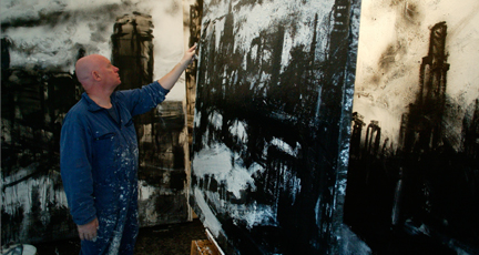
Fig. 1 Photographer Unknown (2003-2005) John Virtue at work in his studio. [Photo] At: https://www.nationalgallery.org.uk/learning/associate-artist-scheme/john-virtue (Accessed 24/06/2020)

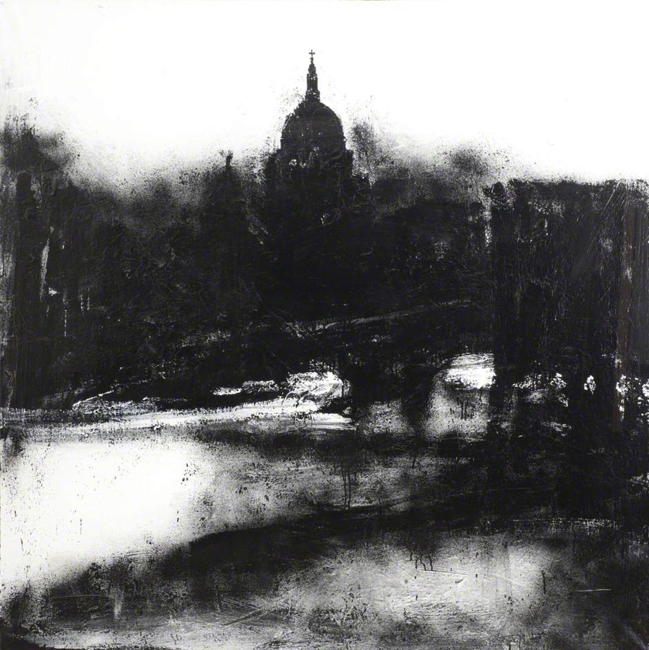
John Virtue is a landscape painter whose work rides a fine line between abstraction and figuration. His paintings have empathy with oriental brush-painting and American abstract expressionism, but above all, they relate closely to the great English landscape painters, Turner and Constable, whom Virtue admires enormously. He also refers constantly to the Dutch and Flemish landscapes of Ruisdael, Koninck and Rubens. He works mostly in black and white. All of his paintings are executed on canvas, using white acrylic paint, black ink and shellac.

Website Biography Link Information At:

https://www.nationalgallery.org.uk/learning/associate-artist-scheme/john-virtue (Accessed 24/06/2020)

John Virtue’s Landscapes:

Landscape No. 739

Fig. 2 Virtue, John (2004) Landscape No. 739. [acrylic & shellac on canvas] At: https://artuk.org/discover/artworks/landscape-no-739-219454 (Accessed 24/06/2020)

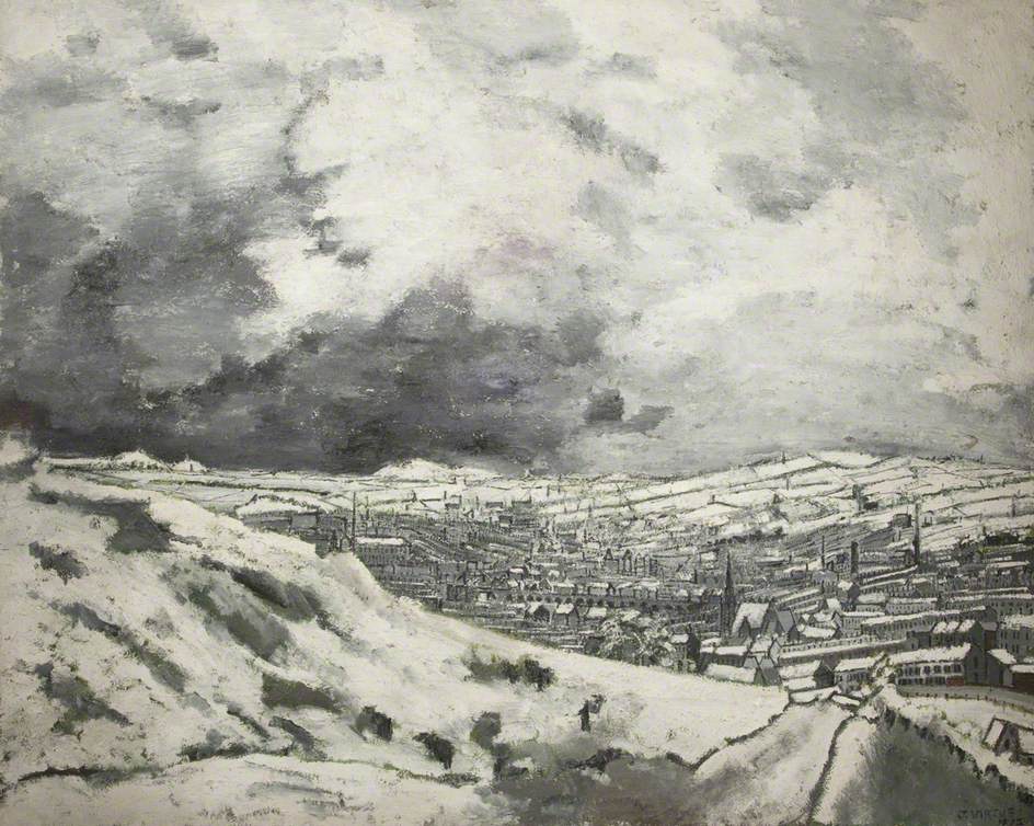
Accrington from the Coppice

Fig. 3 Virtue, John (Date Unknown) Accrington from the Coppice. [oil on canvas] At: https://artuk.org/discover/artworks/accrington-from-the-coppice-150919/search/actor:virtue-john-b-1947-61730/page/1/view_as/grid (Accessed 24/06/2020)

Fig. 4 Virtue, John (1974) Houses on the Moor. [pen, ink and watercolour] At: https://www.clark-art.co.uk/exhibitions/459/7546/a-decade-in-hale-houses-on-the-moor (Accessed 24/06/2020)

John Virtue - Old Fever Hospital

Fig. 5 Virtue, John (1974) Old Fever Hospital. [mixed media on paper] At: https://www.clark-art.co.uk/artists/3600/15742/john-virtue/old-fever-hospital?r=artists%2F3600%2Fjohn-virtue (Accessed 24/06/2020)

Inspiration Ideas from Virtue’s Artworks:

I find Virtue’s dark mediums interesting, strong and bold. I love how he captures the weight in the sky, also he shows layers of different mark-makings. I really admire the idea of his two drawings (Fig. 4 and Fig. 5) mediums and the pen mark-makings. In those two drawings, he gives the sky some colour and less details. Then he gives the landscape no colour with more details and marks to capture your attention. I would try this technique in my drawings, but in a loose style, where it’s not overcrowded around the the main subject with too many mark-makings.

Other Examples:

These other artworks have such lovely effects and tonal gradations that inspire me. I love the idea of the mediums, composition and perspective that would suit a townscape drawings.

Fig. 6 Ackroyd, Norman (1995) Thimbleby in Winter. [watercolour] At: http://www.normanackroyd.com/prints/ (Accessed 24/06/2020)

Fig. 7 Ackroyd, Norman (1997) Harewood in Autumn. [watercolour] At: http://www.normanackroyd.com/prints/ (Accessed 24/06/2020)

Fig. 8 Richter, Gerhard (1968) Stadtbild Madrid. [oil on canvas] At: https://www.gerhard-richter.com/en/art/paintings/photo-paintings/townscapes-24/townscape-madrid-5896?&categoryid=24&p=1&sp=32&tab=notes-tabs (Accessed 24/06/2020)


Part 3: Project 4 – Exercise 3: Aerial or Atmospheric Perspective

For this exercise is all about drawing the tonal gradation, distancing and detailing in a rural landscape or an urban landscape. I found it very challenging at drawing buildings from an aerial or atmospheric perspective, but a good lesson is that doing a difficult subject, always teaches me a new lesson and techniques. I found it much easier in doing a rural landscape drawing, because you can get to see the tonal values more clearly and the three ground levels, which are the Foreground, Middle Ground and Background.

My first two quick drawings were done in the A4 sketchbook, I did them before moving onto my final A3 drawing.

Quick A4 Sketchbook Drawings:

My first quick drawing was captured in Central Hill, Port Elizabeth, South Africa. The view point was hill’s downtown area. I did this quick drawing with a black Conté stick in the A4 sketchbook on page 3, I found the medium fun and nice at achieving a historical and old feeling for this historic looking street. You can see the drawing results in Fig. 1 “Quick Drawing of Central Hill Downtown (A4 Sketchbook – Page 3)“, below.

Central Hill Downtown Drawing - Conte Stick
Fig. 1 – Quick Drawing of Central Hill Downtown (A4 Sketchbook – Page 3)

My second quick drawing was also done in same location as the first drawing that I did. I drew this while standing on the Donkin Reserve Hill that overlooks the bustling city of Port Elizabeth and it’s ocean view in the far background. I did this with a Cretacolor graphite stick in the A4 sketchbook on page 4. I found this medium not suitable and has no emotional feelings towards the subject, that I was drawing from. You can see the drawing results in Fig. 2 “Quick Drawing of Donkin Reserve Hill (A4 Sketchbook – Page 4)“, below.

Donkin Reserve Hil - Cretacolor Graphite Stick
Fig. 2 – Quick Drawing of Donkin Reserve Hill (A4 Sketchbook – Page 4)

Final Drawing:

For the final drawing, I focused on a rural landscape subject instead a city landscape view. I did this drawing of The Vanderkloof Dam, Northern Cape Province, South Africa while on a recently trip to Kimberley. We stopped at this stunning landscape view, that shows great distancing scenery. It was a mixed temperature day, where I felt cold and warm, also it was late afternoon where the sun had cast it’s large shade over the landscape. But what I loved about this view is that there was great tonal gradations and the three different ground levels, even the dam river water was a light tone and gleaming.

I did this on an A3 white cartridge paper 200gsm with the Conté stick, that I had used in the Fig. 1 “Quick Drawing of Central Hill Downtown (A4 Sketchbook – Page 3)” drawing in my A4 sketchbook.

I love the medium in my final drawing, it gives that mixed temperature feeling and the contrast of the afternoon shade in the foreground and middle ground. My favourite thing about this drawing is the results of achieving the gleaming light of the river. The sky was heavy and light at the same time. You can see the final drawing results in Fig. 3 “The Vanderkloof Dam, Northern Cape Province, South Africa (A3 White Cartridge Paper 200gsm)“, below.

The Vanderkloof Dam, Northern Cape Province, South Africa
Fig. 3 – The Vanderkloof Dam, Northern Cape Province, South Africa (A3 White Cartridge Paper 200gsm)

Here is a photo of the view taken in a slight different view than my drawing view point. Also the photo was taken earlier in the day before I did the drawing when the afternoon shade cast over the landscape. You can see the photo in Fig. 4 “Photo of The Vanderkloof Dam, Northern Cape Province, South Africa, (Samsung Smartphone Camera)“, below.

Photo - The Vanderkloof Dam, Northern Cape Province, South Africa
Fig. 4 – Photo of The Vanderkloof Dam, Northern Cape Province, South Africa, (Samsung Smartphone Camera)

Part 3: Project 4 – Exercise 2: Angular Perspective

For this exercise was fun, as I love drawing buildings from corner-on views. But on the other side for me was that the trickiest thing, is that in the beginning of the drawing process, I didn’t use a ruler or eraser. I drew the whole building without using a ruler, but then at the end, I used a ruler to rule straight lines in some areas.

My subject was based on this heritage site of the Victoria House Number 2, Constitution Hill, Port Elizabeth Central, Eastern Cape, South Africa. This house was built during the 1820’s by settlers, but in 1999, it was left to decay overtime until 2018, a fund was raised to repair it to it’s former glory, which stands today. This is a beautiful building settled in central city of Port Elizabeth where a lot of the 1820’s settlers houses were built. I took this photo with the use of my Samsung smartphone camera.

Victoria House Number 2, Constitution Hill, Port Elizabeth Central, South Africa
Fig. 1 – Victoria House Number 2, Constitution Hill, Port Elizabeth Central, South Africa (Samsung Smartphone Camera)

Drawing:

Here is my final angular perspective drawing, that I did in my A4 sketchbook on page two with an HB graphite pencil. I used a blue pen to draw the nearest vertical corner of the house. Then I used a blue pencil to draw the other main receding vertical and horizontal lines that lands onto the eye level line and disappear into the vanishing point. The eye level line is done with a red pen. This house was set up on a rise in the ground, so the horizon is very low in the drawing, just below the steps.

Angular Perspective Drawing
Fig. 2 – Angular Perspective Drawing of the Victoria House (A4 Sketchbook – Page 2)

Here is a close up of the Fig. 2 final drawing:

Angular Perspective Drawing Close Up
Fig. 2 – Angular Perspective Drawing Close-Up of the Victoria House (A4 Sketchbook – Page 2)

Part 3: Project 4 – Exercise 1: Parallel Perspective – An Interior View

In this exercise, I found it very tricky doing the drawing without using a ruler or an eraser. But also at the same time, it was interesting to learn perspective using eye level and by drawing freely and loose lines, instead perfect straight. I also did add some tones in some areas to help balance the floor and wall levels.

The interior view that I selected is looking through the kitchen door towards the long corridor, I put a small rectangular mat to help me guide the tiled floor to look flat.

I did the drawing in my A4 sketchbook with an HB graphite pencil.

Beginning Drawing Stage:

I took a good look at the viewpoint and where my eye level is. First thing was to draw the doorframe as the main key in this drawing. Then I started drawing in lines from the mat towards the floor, wall and ceiling areas. The less important objects such as the framed picture and ceiling lights came in the drawing later on. I shaded some areas to help balance the floor, wall and ceiling to be leveled.

Beginning Drawing Stage (A4 Sketchbook Page 1)
Fig. 1 – Beginning Drawing Stage (A4 Sketchbook – Page 1)

Final Drawing:

In the final stage drawing, I used a red pencil for drawing the main receding lines against the horizontal and vertical lines of the doorframe. I also drew my eye level line with the red pencil. I noticed that the red pencil lines all connected well at the eye level line in the center of the drawing. But then looking at the other receding lines that are done in graphite pencil, are all in variety places in the drawing.

Final Drawing - Receding Lines (A4 Sketchbook Page 1)
Fig. 2 – Final Drawing – Red Pencil for the Receding Lines (A4 Sketchbook Page 1)

Log Book Notes:

I made notes in my log book about my experience with this exercise as you can see in Fig. 3 “Log Book Notes“, below.

Log Book - Notes
Fig. 3 – Log Book Notes

Part 3: Project 3 – Exercise 2: Foreground, Middle Ground, Background

In this exercise, I chose a photo that was taken from a recent trip to Oudtshoorn, South Africa. The photo is taken from looking over a cliff that I stood on The Swartberg Pass Road, Great Karoo, Western Cape in South Africa. This view was a perfect reference due to the three ground levels and light source from the sun. The selected medium is the graphite pencils HB and 2B, also using a putty eraser and normal eraser on an A3 white cartridge paper 240gsm.

Here is the photo of “The Swartberg Pass, Great Karoo, Western Cape in South Africa”, seen in Fig. 1 “The Swartberg Pass, Great Karoo, Western Cape, South Africa. (Pentax “Optio” Camera)“, below.

The Swartberg Pass, Great Karoo, Western Cape, South Africa
Fig. 1 – The Swartberg Pass, Great Karoo, Western Cape, South Africa. (Pentax “Optio” Camera)

My mark-makings were based on the direction of the hills and mountains. The light and dark tonal values was more lighter in the foreground. Then the middle ground became a bit darker than the foreground. The background was much lighter than the foreground and middle ground. The detailing stage, there is more information and details in the foreground where the rocks and bushes on the edge of the cliff ground, that I was standing on. Then the details started to become more less from the middle ground towards the background where is fades in the further distance.

I also made sure I didn’t overwork and going too detailed all over the drawing, as I was warned by my tutor Adam.

I did some research on John Constable’s landscape sketches, to see how the light and dark tonal values appear in all three grounds. It was helpful to just take quick look at his landscape drawings, and understanding how much information and details he puts in his landscape sketches.

Here is my drawing of “The Swartberg Pass”, done with graphite pencil HB & 2B on a white cartridge paper A3 240gsm, seen in Fig. 2 “The Swartberg Pass, Graphite Pencil HB & 2B, White Cartridge Paper A3“, below.

The Swartberg Pass, Graphite Pencil HB & 2B, White Cartridge Paper A3
Fig. 2 – The Swartberg Pass, Graphite Pencil HB & 2B, White Cartridge Paper A3

I love the results of this drawing, it was also tricky to understand the tonal values, when it comes to doing landscape drawings, where there are the three grounds happening. I love the results of the details and mark-makings in the foreground. The middle ground results are nice and loose marks, also the direction of my marks on the hills is well balanced. The background results help to make the foreground more of the focal point, also when it’s light and loose, this make the landscape carrying on for miles without stopping.

The ‘Tip’ Section (Page 70) Answered Questions:

  • How did you simplify and select? Were you able to focus on simple shapes and patterns amid all the visual information available to you?

In my exercise 1, it was simple and more understanding, as I got to draw from life, which this was much easier to focus on the large to small shapes with the shading process and the way my patterns were create with the different textures using mixed mediums. But for the exercise 2, it was more important to understand what shapes with different patterns, tonal values that needed to be simple and selected to blend in with the composition of the landscape drawing.

  • How did you create a sense of distance and form?

In both exercises was same with the distance style, I focused on making sure that it was more detailed in the foreground and it’s less details in the further distance. Also I kept the further background distance light and fading. The middle distance form was created with the direction of my mark-makings.

  • Was I able to use light and shade successfully?

I was able to use light and shade in both exercises in a successful way, I made sure the light was coming from the right direction, also using light colours to help the light areas to stand out. The shade areas were focused of the direction of my shading mark-makings and also the compression of the medium I used.

  • What additional preliminary work would have been helpful towards the larger study?

I find this exercise 2 work helpful for doing larger drawing, but I also like the fact of exercise 1 quick sketches process, it was very helpful to do warm up small sketches to be able find a nice view point for a larger drawing.